
Super Curious Font Free Download
Is Super Curious free to download?
Super Curious is a commercial font sold on Creative Market, so the full version needs a paid license. Get it from the official listing: Super Curious font download.
Need something free? These handwritten fonts from Google Fonts are free for personal and commercial use:
Design style
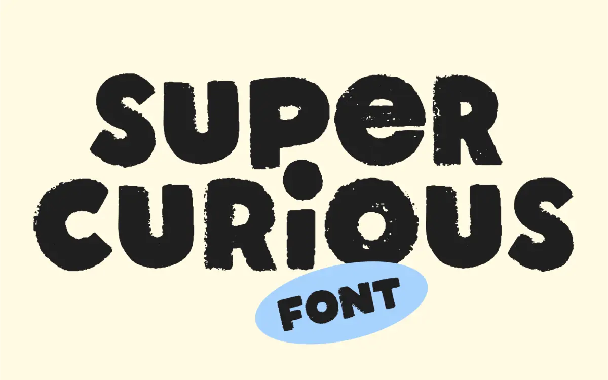
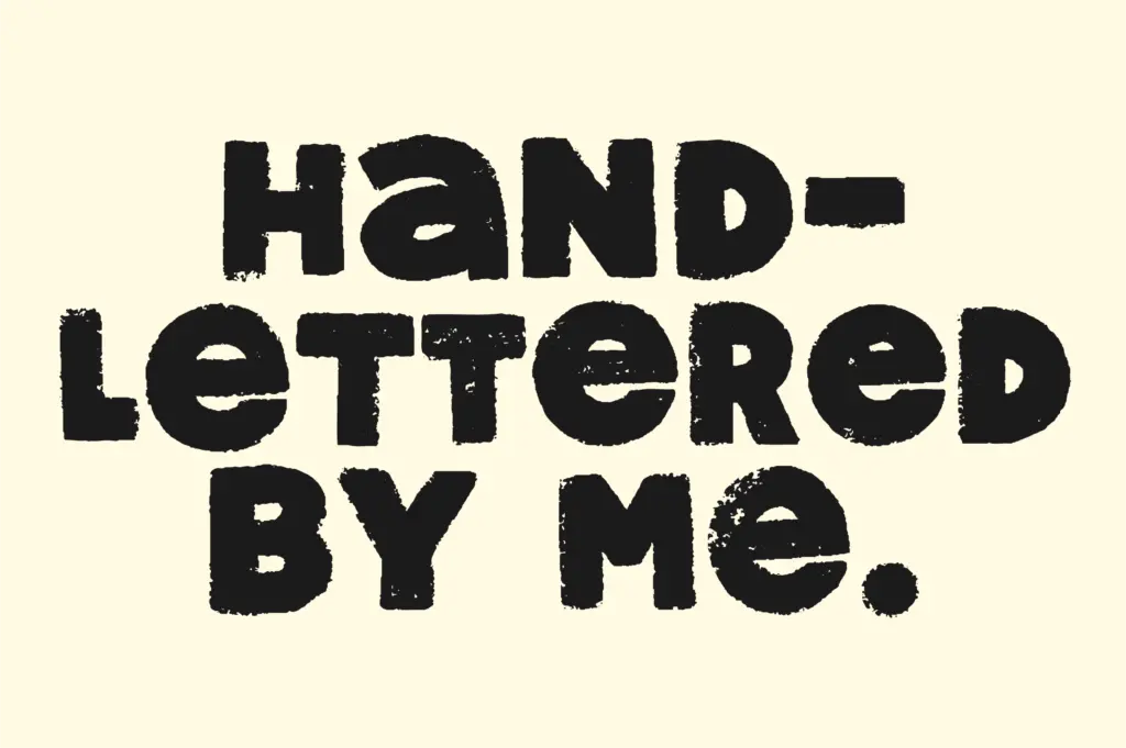
Super Curious is a hand-lettered unicase display face, which means there’s no separate upper and lower case — one set of letterforms doing the work of both. That decision shapes everything else about it. The shapes lean toward vintage print: uneven baselines, rough edges, letters that look printed with a bit too much ink or not quite enough. Each character was drawn individually, and it shows in the small inconsistencies from letter to letter, which is the point rather than a flaw. This isn’t a clean, systemised hand-lettering font pretending to be precise; it wants to look like something stamped or block-printed decades ago and left to fade a little.
The texture is baked into the outlines themselves rather than applied as a separate distress layer, so it holds up consistently across weights of use — it won’t suddenly look sterile at one size and grimy at another. That said, unicase faces ask something of the person setting them. Without the visual hierarchy that case usually provides, word shapes flatten out, and the reader relies more on letter spacing and word breaks to parse a sentence. That’s a deliberate trade here, and it works better in short bursts than in continuous reading.
Character set and features
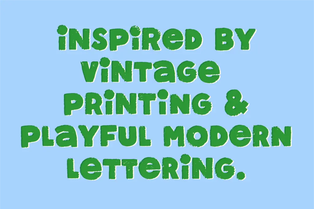
The font covers A–Z, numerals, symbols and punctuation, so basic setting is well covered. Beyond that, it includes alternates and ligatures, which is really where a font like this earns its keep. Swapping in alternates lets you break up repeated letters within a word so the texture reads as handmade rather than mechanically repeated, and the ligatures give certain letter pairs a more connected, lettered feel rather than a typed one. Using these well requires an OpenType-aware layout tool — this isn’t a font you get the full mileage out of by just typing into a basic text box.
Because it’s unicase, there’s no bold or italic companion to lean on for emphasis; variation comes from the alternates and from how you combine sizes, spacing, and colour rather than from a weight axis. Worth knowing going in, especially if you’re used to reaching for a bold cut to make a word pop.
Use cases
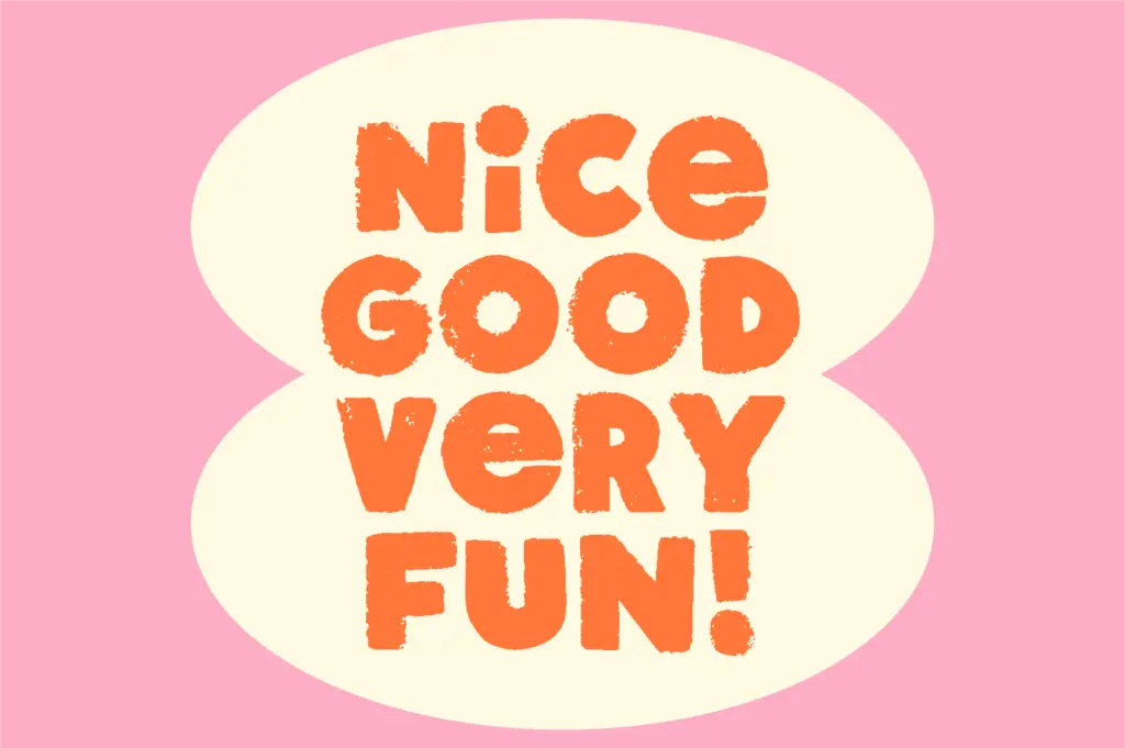
This sits comfortably in short-form, high-personality work: logotypes, badge and sticker designs, hand-drawn quote graphics, packaging accents, titles on a poster or zine cover. It has the kind of texture that photographs and prints well at larger sizes — on a mug, a tote bag, a product label — where its imperfections read as charm rather than noise. It is not built for body copy, captions, or anything requiring fast silent reading; the unicase structure and the roughness of the strokes work against long-form legibility. Where it does its best work is in short phrases of three to six words, set large, where the handmade texture is the main event rather than something the reader has to parse quickly. Anyone doing retro-leaning branding, market-stall signage, or craft-adjacent product design will get more out of it than someone needing a workhorse text font.
What we liked, and what we didn’t
Strengths
- Individually drawn letterforms give genuine, consistent texture rather than a distress filter
- Alternates and ligatures let repeated letters vary so words don't look mechanically stamped
- Reads well at large sizes on physical goods like packaging, stickers and signage
Trade-offs
- Unicase structure and rough edges make it a poor choice for anything beyond short phrases
- No bold or weight variation, so emphasis has to come from size and spacing alone
Super Curious is a well-executed piece of textured hand lettering with real character, best kept to short display phrases where its roughness reads as charm. The unicase structure and lack of a weight range limit how far it stretches, but for logos, badges and product accents it does exactly what it sets out to do.

Tmfonts writes independent reviews of typefaces: what each font does well, where it falls short, what it suits, and where it is sold.