
Brenelsa Font Free Download
Is Brenelsa free to download?
Brenelsa is a commercial font sold on Creative Market, so the full version needs a paid license. Get it from the official listing: Brenelsa font download.
Need something free? These script fonts from Google Fonts are free for personal and commercial use:
Design style
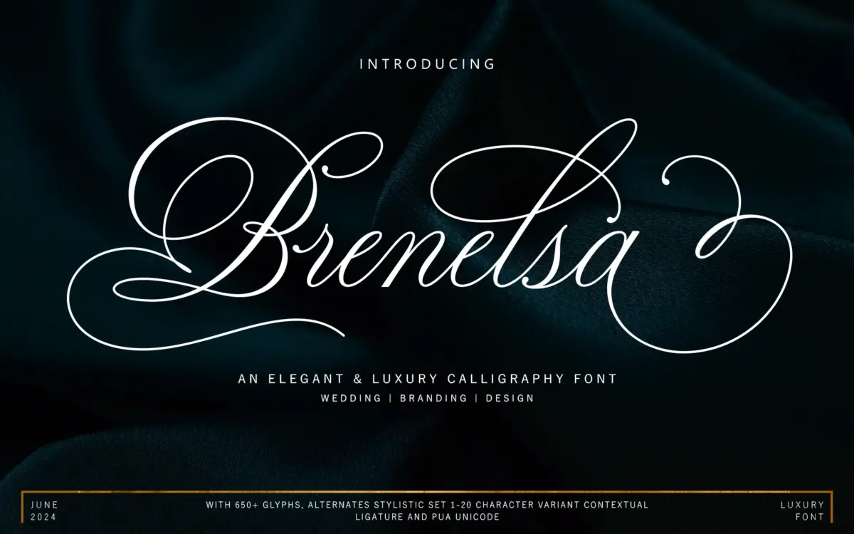
Brenelsa sits in the well-populated field of connected calligraphy scripts, drawn with a broad, ink-brush feel rather than the thinner, ribbon-like strokes seen in a lot of wedding-market fonts. The contrast between thick downstrokes and thin connectors is pronounced, which gives the face weight and presence on a page rather than a whispery, delicate quality. Letters lean forward at a consistent angle, and the baseline has a light bounce to it — not the exaggerated up-and-down jump you see in more casual hand-lettered scripts, but enough movement to keep long words from reading as mechanical.
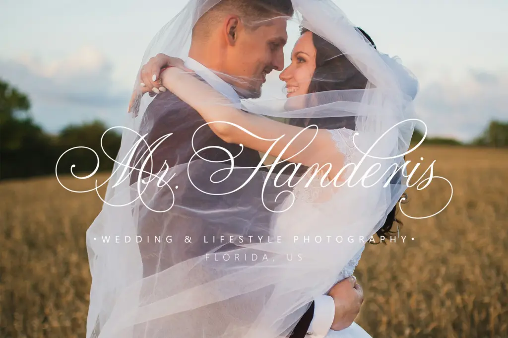
The swash work is where the design puts most of its energy. Capital letters carry extended entry and exit strokes that loop well above and below the x-height, and several lowercase letters have matching long-tail variants for word endings. This is a font built around flourish, and it shows: even in restrained settings, the letterforms want room to breathe. Where it’s more conservative is in the basic skeleton of the letters themselves — the underlying structure is fairly traditional copperplate-adjacent calligraphy, so nothing here will surprise a designer who has used scripts in this genre before. That’s not a knock so much as a description of its ambition: it’s refining a familiar mode rather than reinventing it.
Character set and features
The glyph count is substantial, with over 650 characters split across swash variants, stylistic sets, stylistic alternates, and contextual alternates. In practice, this means you’re not stuck with a single look for each letter — there are twenty numbered stylistic sets to pick through, plus contextual substitution that should smooth out awkward letter collisions automatically in OpenType-savvy software. Uppercase and lowercase are both covered, along with punctuation, numerals, and international characters, so the font isn’t limited to English-only projects.
PUA Unicode encoding is included, which matters more than it sounds — it means the alternate and swash glyphs are reachable through Character Map or Font Book even without a full OpenType-aware application. That’s a genuinely useful inclusion for anyone using Word or a program without stylistic-set support, and it saves the frustration of a font that
What we liked, and what we didn’t
Strengths
- PUA Unicode encoding makes alternates accessible even without OpenType-aware software
- Large glyph set with twenty stylistic sets gives real variation across repeated letters
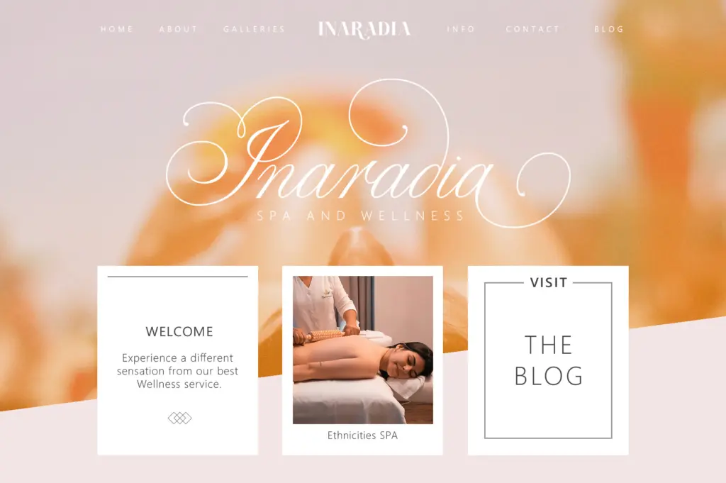
- Strong swash capitals suit logotypes and invitation lettering specifically
Trade-offs
- Getting a clean result requires manual glyph substitution rather than working well out of the box
- The underlying letter structure is conventional, offering little that departs from familiar calligraphy scripts
Brenelsa is a solidly drawn, traditionally-styled calligraphy script with generous alternates and swashes for anyone doing invitation or branding work. It won't surprise you stylistically, but the glyph coverage and PUA support make it genuinely usable rather than just decorative. Best reserved for display sizes and short phrases where the flourishes have room to work.

Tmfonts writes independent reviews of typefaces: what each font does well, where it falls short, what it suits, and where it is sold.