
Aqualim Signature Font Free Download
Is Aqualim Signature free to download?
Aqualim Signature is a commercial font sold on Creative Market, so the full version needs a paid license. Get it from the official listing: Aqualim Signature font download.
Need something free? These serif fonts from Google Fonts are free for personal and commercial use:
Design style
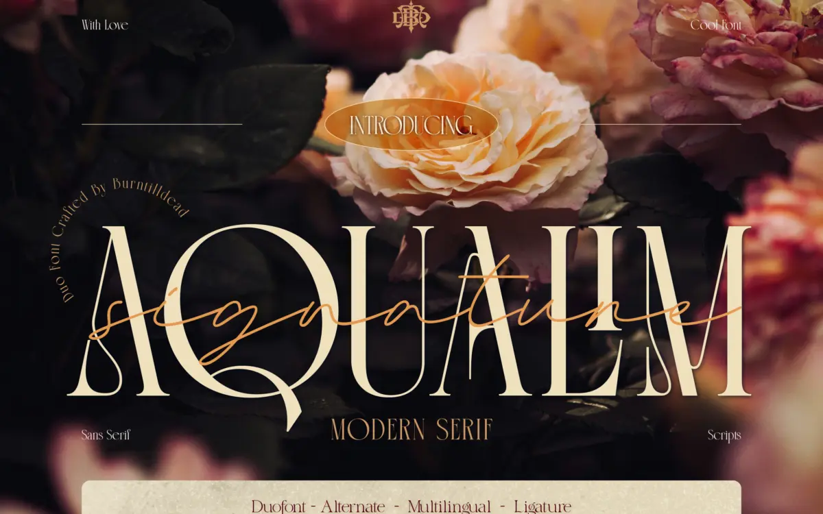
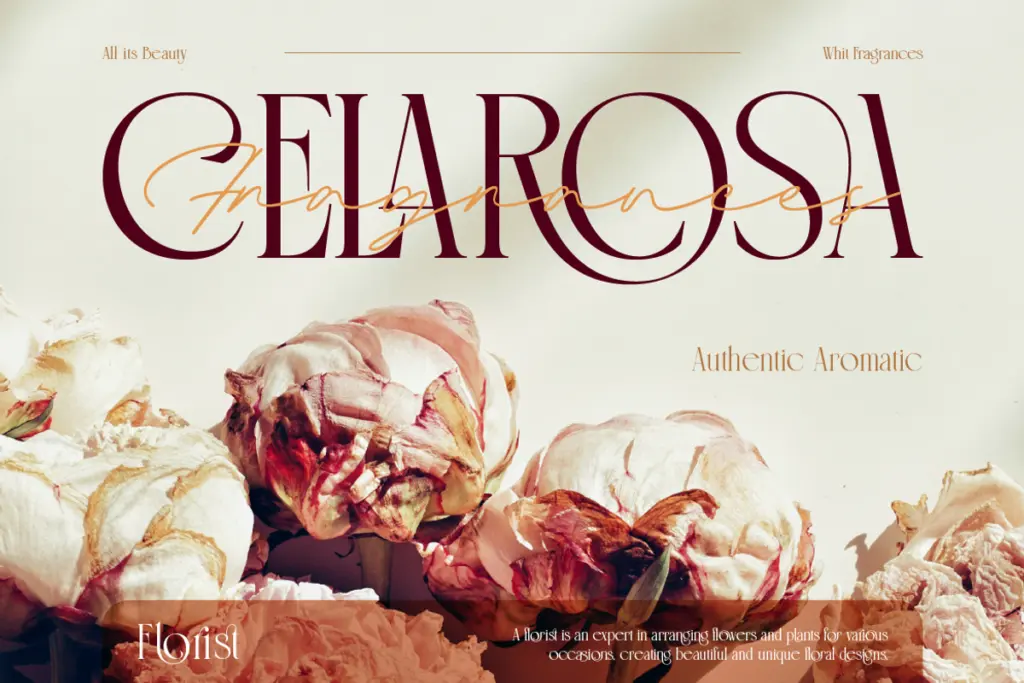
Aqualim Signature is a two-part release: a serif built for structure and a companion script that carries the personality. The serif half is the quieter of the pair, a fairly traditional letterform with moderate contrast and a warm, slightly condensed feel that reads as classic rather than contemporary. It’s not trying to be a display face on its own; it’s there to hold headlines together and give the script something solid to sit next to.
The script is where the actual design work has gone. Strokes have a fluid, brush-adjacent swing to them, with connecting forms that lean casual-elegant rather than formal copperplate. It sits in the same territory as most signature-style scripts sold as wedding fonts: a bit loose, a bit romantic, meant to read as handwriting rather than lettering. The pairing logic is straightforward — serif for support text, script for the emotional line — and it does that job competently, though it doesn’t push the genre anywhere new.
Character set and features
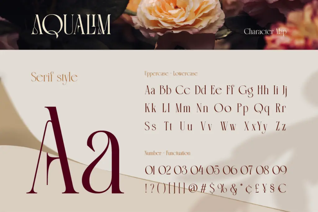
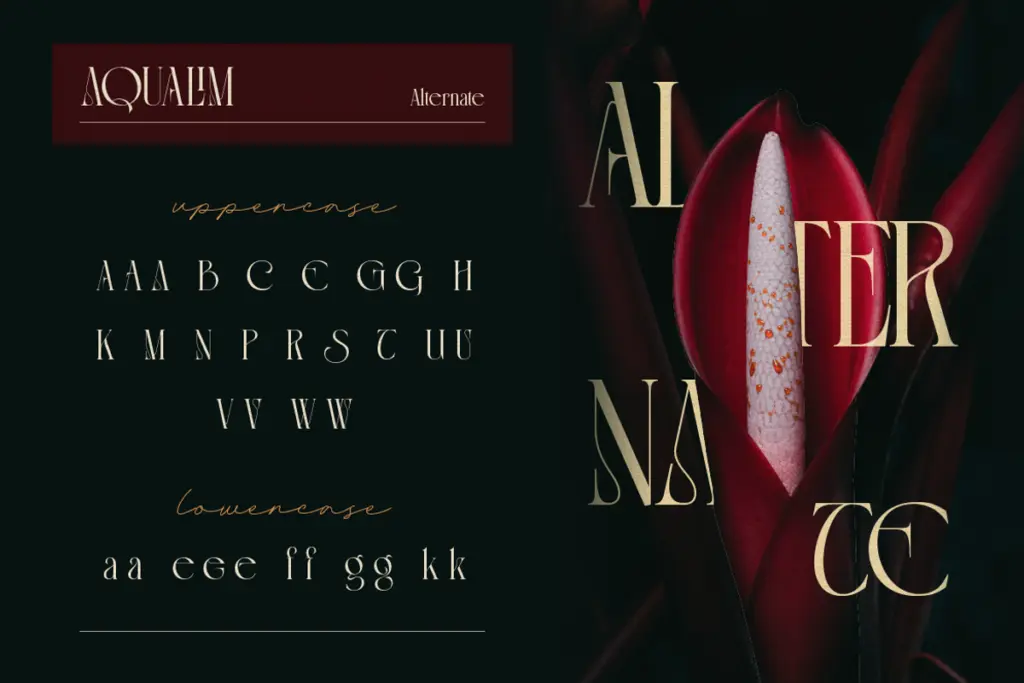
Both fonts cover uppercase and lowercase, numerals and standard punctuation, with alternates and ligatures included to soften the repetition scripts are prone to. That matters more here than usual: without swapped forms, a signature script starts looking mechanical the moment the same letter repeats twice in a name, and the alternates are what keep phrases like double-letter surnames or short quotes from feeling stamped out. The ligature set helps smooth over a few of the trickier joins, though as with most scripts in this style, tight tracking and careful kerning by hand will still get you a cleaner result than typing and walking away.
Files come in OTF, TTF and WOFF for both members of the duo, plus a character map PDF, which is genuinely useful here — a script with alternates is only as good as your ability to find them, and glyph panels in most design software are not designed for browsing on the fly.
Use cases
This is a font for occasions rather than systems. Wedding invitations are the obvious fit, and it will do fine there — the script for names and dates, the serif for venue details and RSVP copy. It extends reasonably well to product packaging with a boutique or artisanal angle, quote graphics, and short editorial headlines where warmth matters more than neutrality.
It’s less suited to anything that needs to run long: body copy, UI text, or dense marketing collateral will expose the script’s legibility ceiling fast, and the serif alone, while usable, isn’t distinctive enough to carry a brand system on its own without the script attached. Treat it as a headline-and-accent pairing rather than a full typographic toolkit, and it earns its keep.
What we liked, and what we didn’t
Strengths
- Alternates and ligatures genuinely reduce repetition in the script
- Character map PDF makes the alternate glyphs usable in practice
- Serif half is calm enough to support the script without competing
Trade-offs
- Serif on its own lacks enough personality to anchor a full brand system
- Script legibility drops quickly past short phrases and names
Aqualim Signature does what a wedding-market serif-script duo is supposed to do, competently and without much surprise. The script carries the design weight and is well supported by alternates and ligatures, but the pairing stays within familiar territory rather than pushing it. Good for invitations, packaging accents and short headlines; not a system builder.

Tmfonts writes independent reviews of typefaces: what each font does well, where it falls short, what it suits, and where it is sold.