
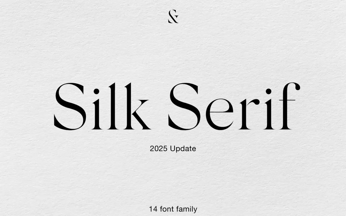
Silk Serif: a high-contrast editorial serif with 14 weights for fashion and luxury branding
Design style
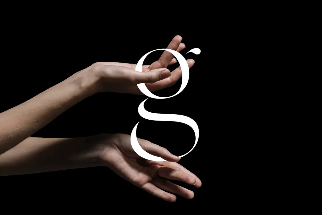
Silk Serif belongs to the high-contrast family that has become shorthand for fashion and beauty branding — thin, pointy serifs, generous bracketing, and ball terminals dropped in where the letterforms need a bit of punctuation. What sets it apart from the crowd of similar releases is a small structural trick: in several letters the bowl doesn’t actually touch the stem. It sits close enough that the eye reads a connection, but there’s a sliver of air there. At display sizes this gives the face a slightly open, breathing quality rather than the tightly welded look of most contrast serifs.
The contrast itself is steep — thin strokes thin enough to disappear at small sizes, thick strokes doing most of the structural work. This is a typeface built for confidence at large sizes rather than quiet performance at small ones, and it knows it. The bracketing on the serifs is generous enough to stop the thin serifs looking brittle, which is a common failure point in this genre.
Character set and features
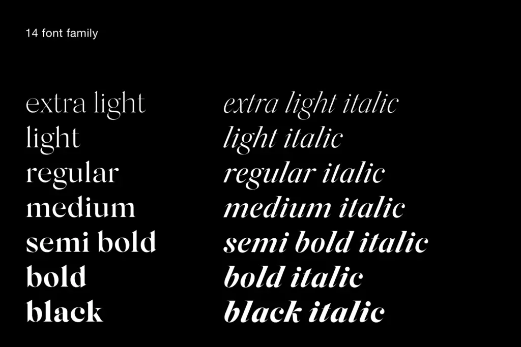
Fourteen styles cover Extra Light through Black, each with a matching italic — so the family runs the full weight spectrum rather than offering just a light/regular/bold trio with italics bolted on. The italics are described as true italics rather than slanted romans, and a recent update reworked their forms alongside general spacing improvements. Standard ligatures and a set of decorative shapes were added in the same update, giving the family a bit more texture for headline and lockup work without requiring a separate ornaments font.
The disconnection between bowl and stem is consistent across weights, which matters — in a family this large, a signature detail that only survives in the middle weights would read as inconsistent. Here it holds from Extra Light, where it’s barely visible, through to Black, where the gap becomes a genuine visual feature rather than a technical footnote.
Use cases
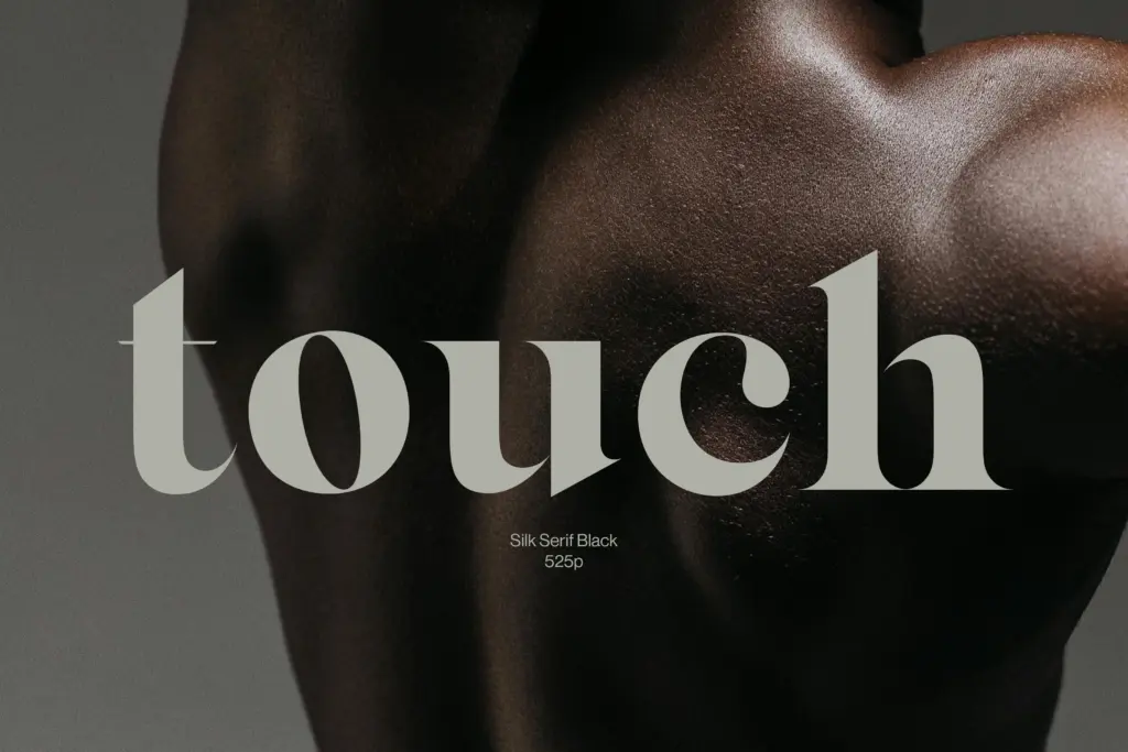
This is a headline and branding typeface first. The lighter weights, in particular Thin and Extra Light, are made for large-scale editorial mastheads, fashion logotypes, and packaging where a single word or short lockup needs to feel expensive without shouting. The heavier weights — Bold through Black — work as covers, drop caps, or short display lines where the contrast can really assert itself; at body-copy sizes the thin strokes will simply vanish, so this isn’t a face to set paragraphs in regardless of what the weight range might suggest.
The italics extend the family’s use in editorial contexts — pull quotes, captions, the kind of secondary text that benefits from a change of texture rather than a change of typeface. For signage, the bracketed serifs hold up reasonably well at a distance, though the thinnest weights will lose definition faster than the mid-range ones once you’re dealing with real viewing distances and material constraints. Anyone building a fashion or luxury identity system will find plenty of range here; anyone needing a workhorse text face for long-form reading should look elsewhere in their type library.
What we liked, and what we didn’t
Strengths
- The bowl-stem gap gives the letterforms a distinctive, slightly open quality that survives across all 14 weights
- Full range from Extra Light to Black with matching true italics offers genuine flexibility within a single family
- Recent update added standard ligatures and decorative shapes, useful for headline and lockup work
Trade-offs
- Thin strokes disappear at small sizes, so lighter weights are unusable for body text
- The high-contrast fashion-serif look is now common enough that the style itself won't stand out on its own
Silk Serif is a competent, well-drawn entry in the high-contrast fashion-serif category, distinguished mainly by its subtle bowl-stem disconnection detail. It's built for headlines, logotypes and short editorial passages rather than body text, and the weight range gives designers real flexibility within that lane. Nothing here reinvents the genre, but the execution is careful and the recent update addressed some real rough edges.
Verdict

Tmfonts reviews typefaces in depth — every font is tested in real branding, editorial and screen layouts before a word gets written. 555+ fonts reviewed and counting.