
Peach Sunset Script: casual handwriting script for cards and branding
Design style
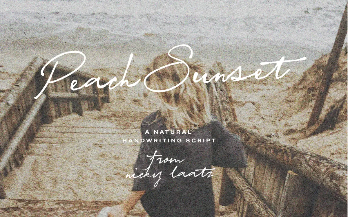
Peach Sunset Script sits in the casual-handwriting camp rather than the formal calligraphic one. The strokes have the loose, slightly uneven pressure of a felt-tip or brush pen rather than the tapered control of pointed-nib scripts. Letters lean forward at a gentle, consistent angle, and joins between characters are kept fairly tight, which gives lines of text a continuous, scrawled feel rather than a series of isolated words.
The x-height is generous for a script, which keeps lowercase passages from collapsing into illegible loops, but ascenders and descenders still get enough room to swing. Nicky Laatz has kept the overall texture even: no single letter jumps out as overworked, and the rhythm reads as handwriting rather than as a font pretending to be handwriting — up to a point, which the alternates exist to push further.
Character set and features
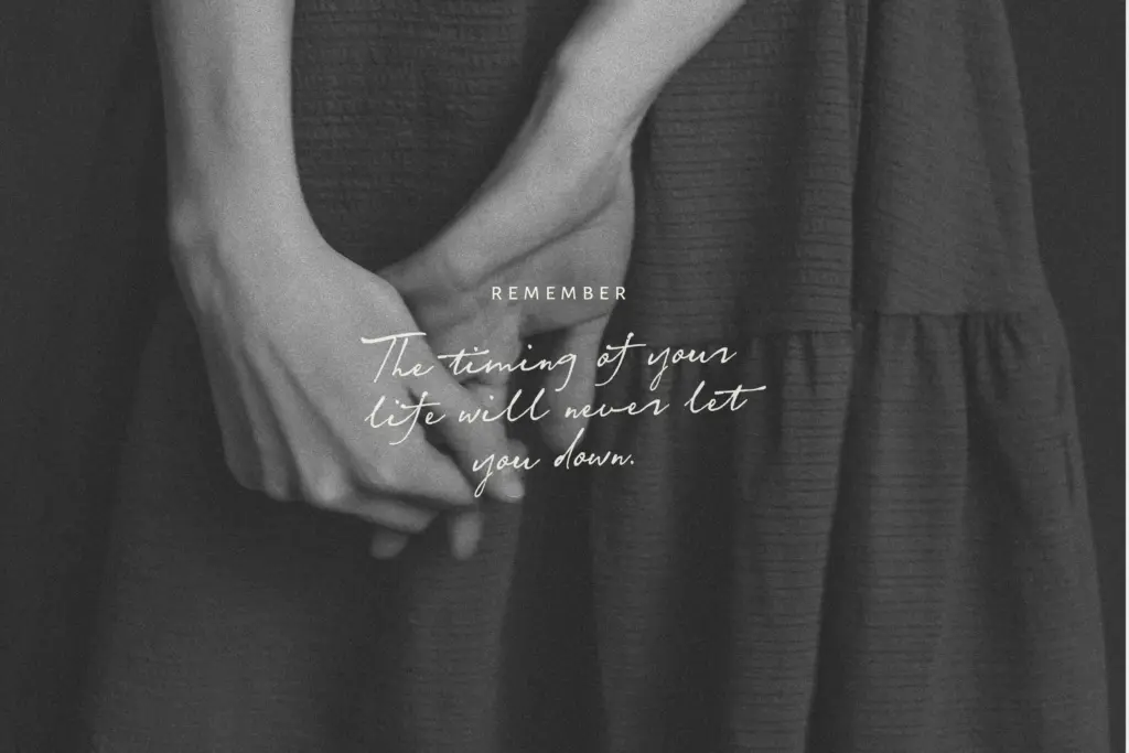
The typeface ships as three separate weights of height rather than three weights of stroke — Flat, Slightly Taller and Tallest — which is an unusual way to offer variation. Rather than changing boldness, these versions change the vertical proportions of the whole alphabet, effectively giving you three related but distinct handwriting personalities to pick from depending on how compressed or airy you want a line of text to sit.
Each version carries a full set of alternate uppercase and lowercase letters, along with OpenType ligatures that trigger on common double-letter combinations as you type. Used well, this is what keeps a script font from looking mechanically repeated — the same word set twice in a headline won’t look identical if alternates are swapped in. The catch is that this only works automatically in software with OpenType support; elsewhere you’re copying glyphs manually from Glyphs Panel or Character Map, which is workable for a single headline but tedious for anything longer. A set of underlines, hearts and small decorative extras rounds out the character set, useful for finishing off invitations or social graphics without reaching for a separate ornament font.
Use cases
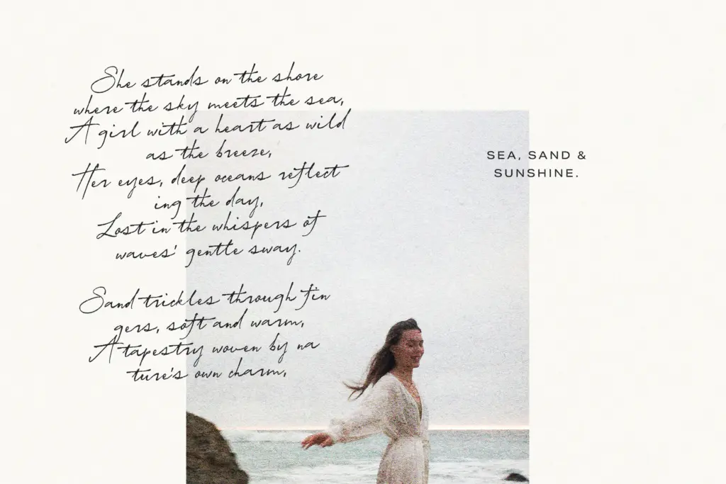
This is a font built for short, set-piece text rather than paragraphs: wedding invitations, greeting cards, Valentine’s graphics, logotypes and packaging accents where a handwritten signature-like mark is wanted. The tight joins and forward lean mean it reads best at display sizes — a few words to a sentence — where the eye can follow the connected strokes without losing its place. At body-copy sizes the joins start to blur and the script’s charm turns into strain.
Because the three height variants exist as separate files rather than a single variable axis, expect to pick one per project and stay with it, rather than mixing weights within a layout the way you might with a family that has a proper light-to-bold range. For anyone producing a run of similar collateral — a wedding suite, a set of product labels — that constraint is barely noticeable. For someone hoping to build a flexible type system around it, it’s a real limit worth knowing before you commit a brand to it.
What we liked, and what we didn’t
Strengths
- Alternate letterforms and automatic ligatures break up repeated words convincingly
- Three height variants offer distinct personalities without leaving the same style family
- Decorative extras like hearts and underlines cover finishing touches without a second purchase
Trade-offs
- Tight joins and connected strokes make it unsuitable for anything beyond short lines of text
- Alternates and ligatures require OpenType-aware software or manual glyph copying to access
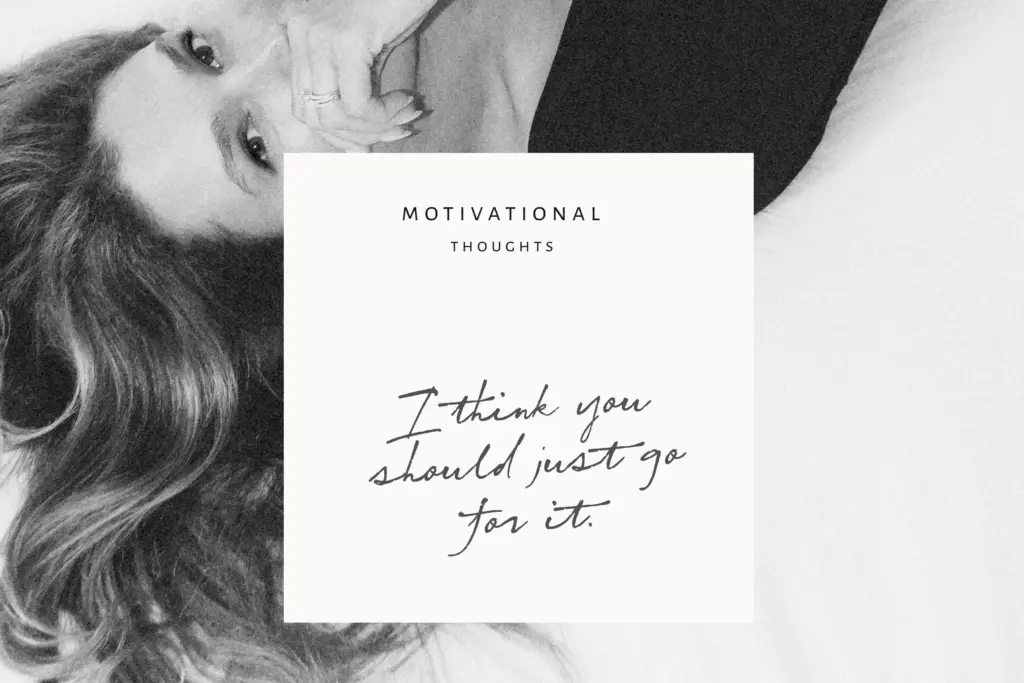
Peach Sunset Script does casual, connected handwriting convincingly at display sizes, and the alternates and ligatures genuinely help avoid repetition across a headline. It's not built for long-form text, and its three-variant structure asks you to commit to one height rather than blend weights, but for cards, invitations and short branding marks it does the job cleanly.
Verdict

Tmfonts reviews typefaces in depth — every font is tested in real branding, editorial and screen layouts before a word gets written. 555+ fonts reviewed and counting.