
Mocha Bubble+Sans: a playful four-font duo for logos and packaging
Design style
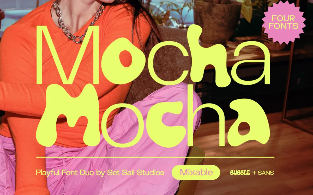
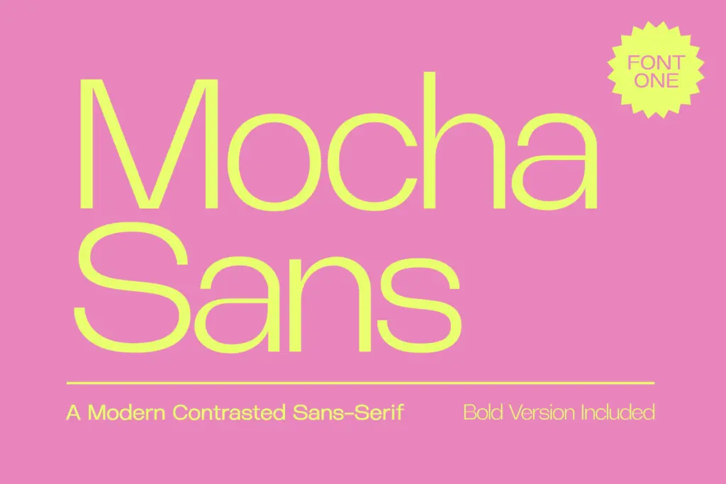
Mocha is a four-font set built around a simple contrast: a plain-spoken sans and a rounded, hand-drawn bubble face, matched in height and width so they sit together without visual friction. The sans is unfussy — even stroke widths, open counters, a slight contemporary squareness to the curves. It doesn’t try to be interesting on its own, and that’s the point. It’s there to hold the page down while the bubble font does the talking.
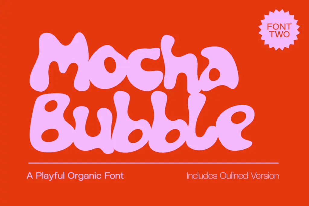
Mocha Bubble is the more distinctive of the two. Letterforms swell and pinch in an organic, almost inflated way, with joints that look drawn rather than constructed. It reads as friendly rather than novelty — closer to a marker-drawn logotype than a balloon-animal typeface, which keeps it from tipping into kitsch. The bold sans and the outline bubble variant round the set out to four weights total, giving you a plain/bold pairing and a solid/outline pairing to layer.
Character set and features
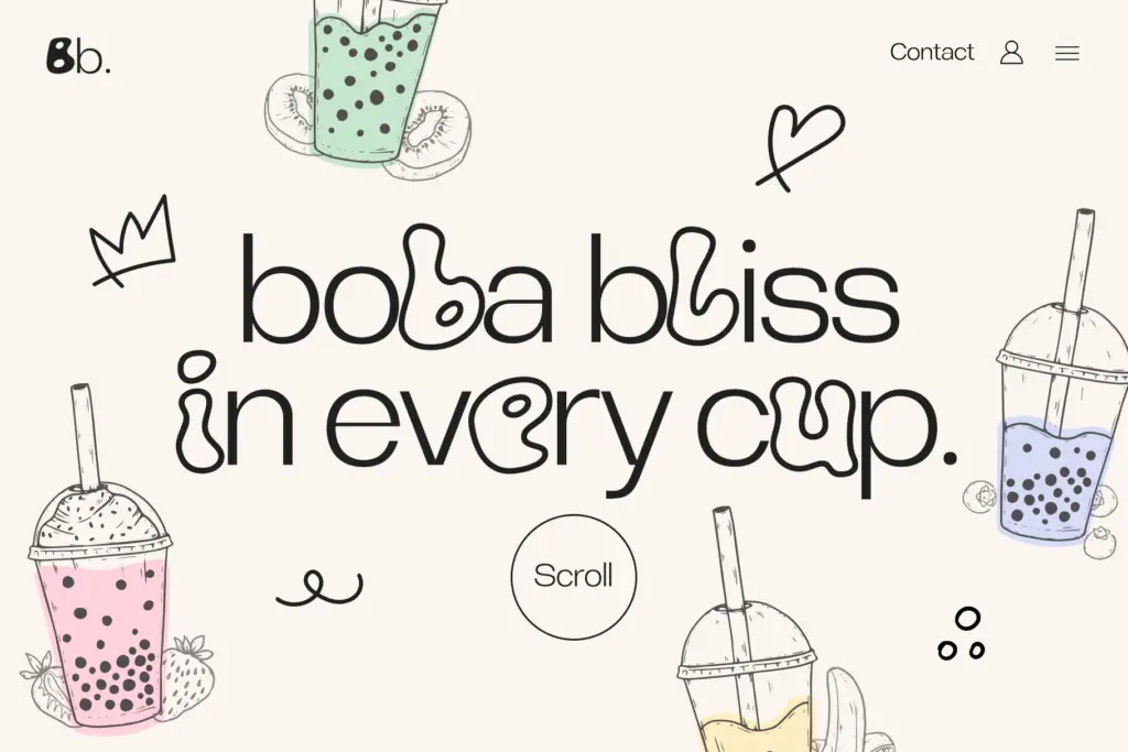
All four fonts include full uppercase, lowercase and punctuation, with language support that covers most Western and Central European languages plus Turkish, Indonesian and Malay — a reasonably wide net for a display-leaning duo. There’s no mention of ligatures, alternates or swash characters here, so what you see in the base character set is what you get; this isn’t a font built around discretionary OpenType flourishes, it’s built around the interplay of its four members.
That interplay is really the feature. Because the bubble and sans share proportions, you can swap letters between them mid-word — set most of a logotype in sans and drop a bubble letter in for emphasis, or vice versa — without the baseline or x-height jumping around. The outline version adds a fifth layering trick: stack it behind the solid bubble for a shadow or offset effect, or use it alone where you want the playfulness without the weight of a filled shape.
Use cases
This is a font for identity work that wants warmth without going fully novelty — kids’ brands, snack and beverage packaging, café and bakery signage, social content headers, anything where
What we liked, and what we didn’t
Strengths
- Bubble and sans share height and width, so mixing letters mid-word doesn't break the baseline
- Outline variant adds a genuine layering option rather than being a token extra
- Wide-ish European language coverage for a display-focused set
Trade-offs
- Bubble face loses clarity at small sizes, limiting it to headline and logo use
- No ligatures or alternate characters, so the four fonts are the whole toolkit
Mocha is a solid, well-matched display duo rather than a groundbreaking one — the bubble face carries the personality while the sans keeps things readable. It earns its keep in playful branding and packaging work but isn't built for small text or formal contexts.
Verdict

Tmfonts reviews typefaces in depth — every font is tested in real branding, editorial and screen layouts before a word gets written. 555+ fonts reviewed and counting.