
Petal & Quill: a rustic wedding script with rounded and regular styles
Design style
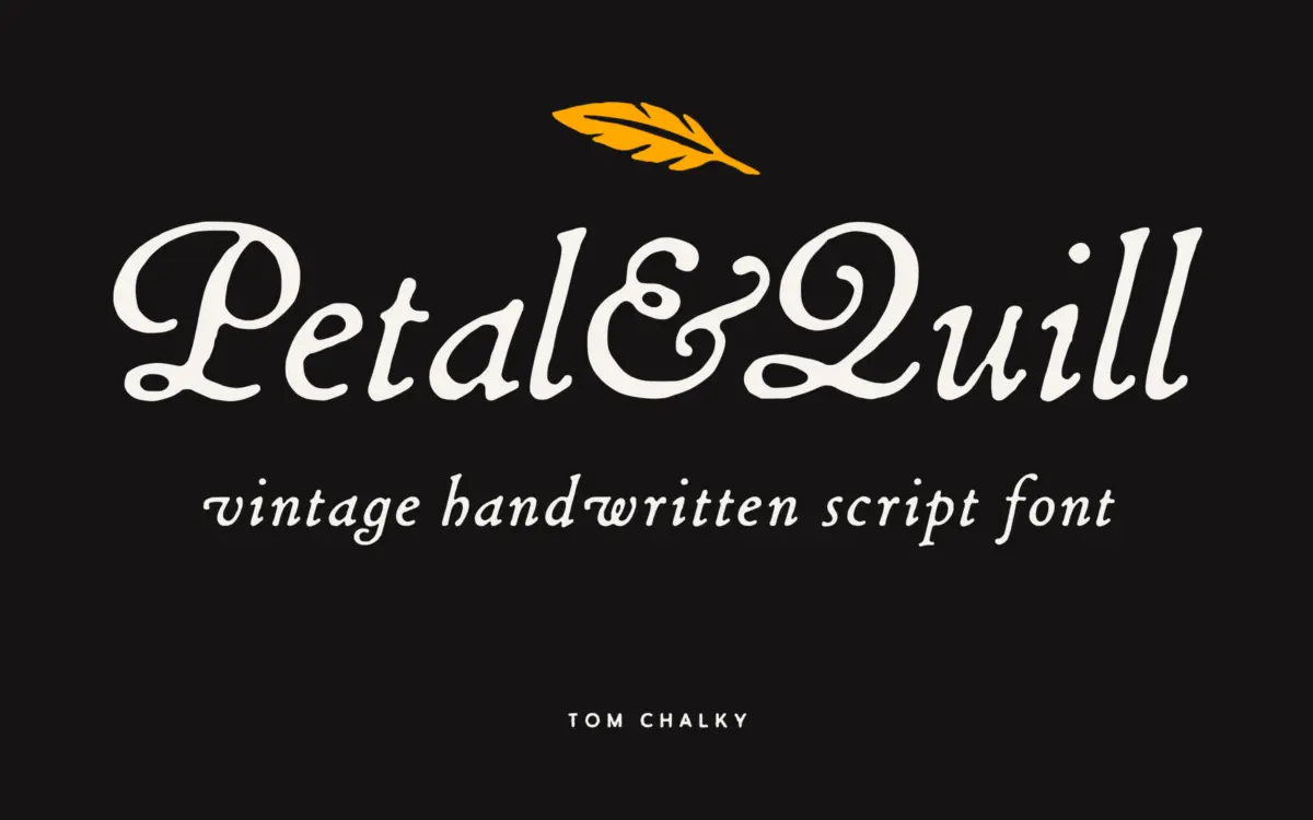
Petal & Quill sits in the crowded field of hand-drawn wedding scripts, but it separates its personality into two distinct styles rather than offering one voice with a bold companion. The Rounded style softens the entry and exit strokes, closes up the counters slightly, and reads as friendlier and more contemporary — the kind of thing you’d put on a candle label or a skincare box. The Regular style is drier and more rustic, with sharper terminals and a bit more looseness in the baseline, leaning into an old-world, letterpress-adjacent feel. Both come in Regular and Bold weights, so you effectively get four related but distinct tools rather than one script stretched thin.
The joins between letters are handled well. Connecting strokes taper convincingly rather than looking like a uniform stroke width pasted between glyphs, which is where a lot of script fonts in this price bracket fall down. The bold weights hold their calligraphic logic rather than just thickening the stems uniformly, so the ink traps and thick-thin contrast stay believable at heavier settings.
Character set and features
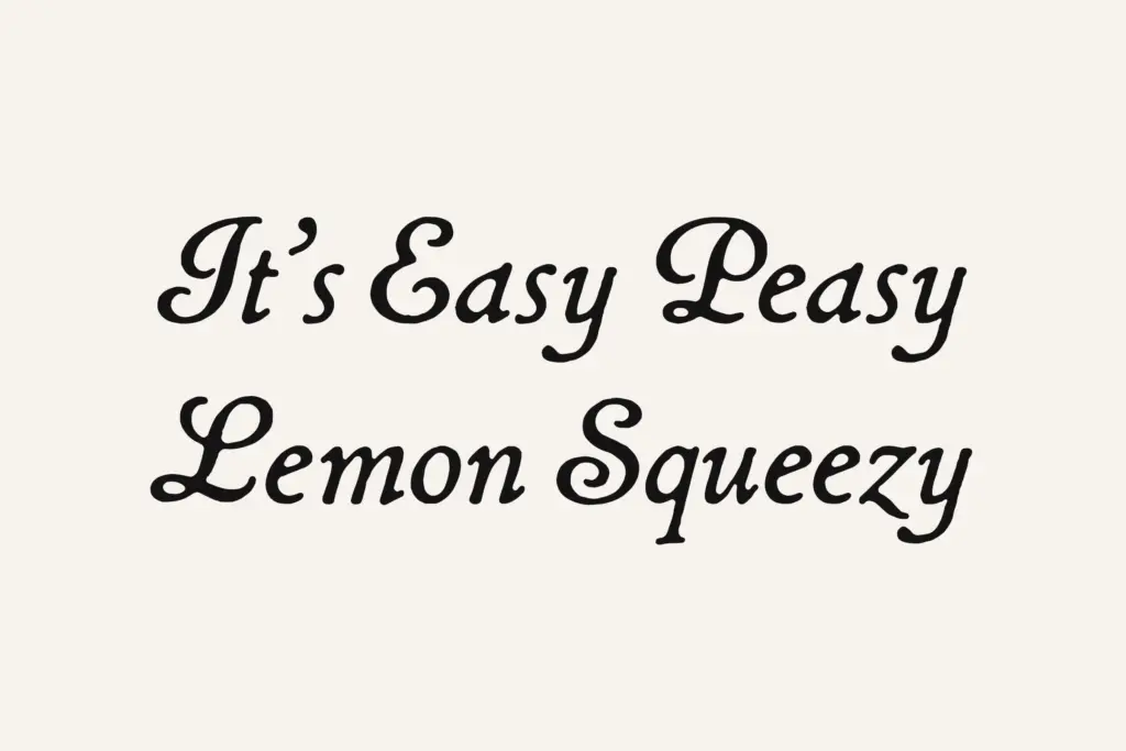
The OpenType feature set is doing real work here rather than sitting unused. Stylistic alternates give you a way to break up repeated letters in a word — useful in a script, where two identical lowercase forms sitting next to each other can look mechanical. Ligatures smooth over some of the more awkward letter pairs that scripts often trip on, and the custom catchwords add a flourish option for closing lines on invitations or signage without forcing you to hand-kern a swash yourself. Latin multilingual support extends the family beyond English-language work, covering accented characters across European and Americas markets, though as with most scripts, heavily accented text will need a slower, more careful setting than plain English does.
Where the character set shows its limits is in long-form use. This is not a font built for paragraphs, and it doesn’t pretend to be — the connecting logic that makes it charming at word and phrase length becomes fatiguing to read once you’re past a sentence or two.
Use cases
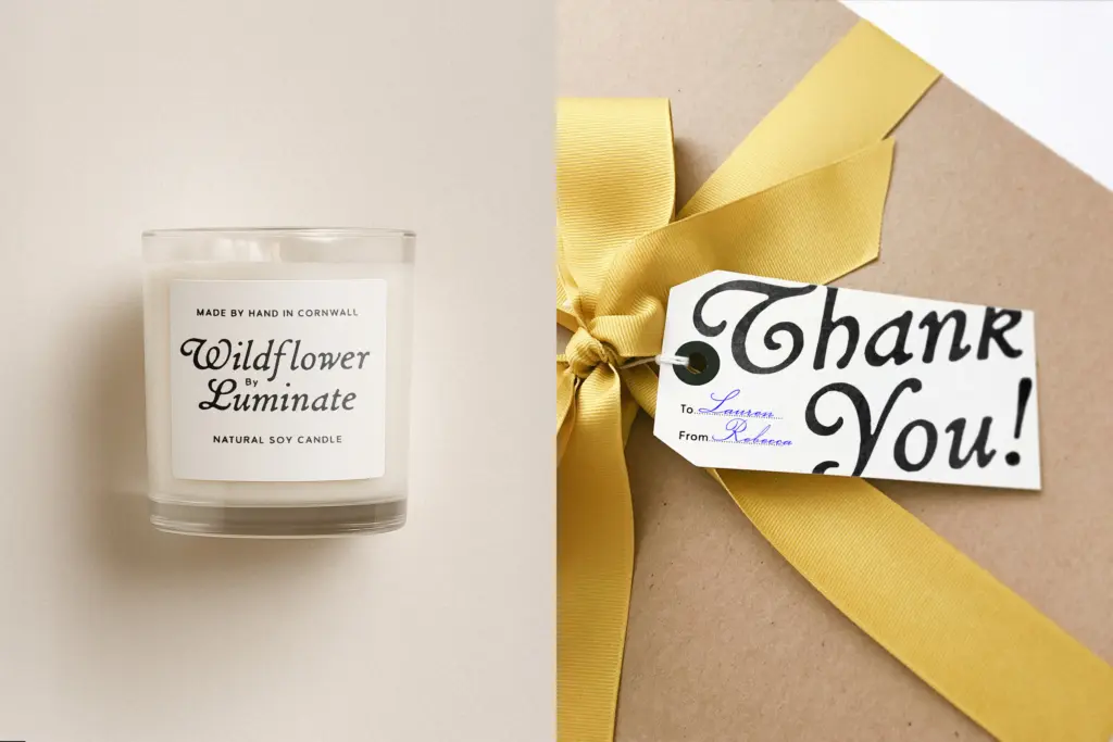
The obvious home for Petal & Quill is exactly what the name implies: wedding stationery, invitation suites, place cards, and the vintage-adjacent packaging that wants a handmade signature without commissioning actual calligraphy. The Rounded style earns its keep in branding contexts — small-batch food packaging, boutique signage, logotypes for shops that want approachable rather than severe. The Regular style is the better pick for anything trying to evoke an older, more artisanal register: labels on preserves, market signage, that sort of thing.
Used as a headline or accent typeface — a few words, a name, a title line — it performs reliably. Push it into body copy, dense menus, or anything a reader has to sit with for more than a few seconds, and the charm curdles into strain. Pair it with a plain, quiet sans or serif for the supporting text and let Petal & Quill do the greeting-card work it’s actually built for.

What we liked, and what we didn’t
Strengths
- Two distinct styles (Rounded and Regular) rather than one script padded out with a bold
- Calligraphic logic holds up in the bold weights instead of just thickening uniformly
- Stylistic alternates and catchwords genuinely help break up repeated letterforms
Trade-offs
- Not suited to body copy or dense text — legibility drops fast beyond short phrases
- Heavily accented multilingual text needs careful, slower setting than the Latin alphabet
Petal & Quill does what a rustic wedding script needs to do: it joins convincingly, it offers two genuinely different moods, and its alternates are actually useful rather than decorative padding. It's a headline and short-phrase font, not a reading font, and buyers should plan their layouts accordingly.
Verdict

Tmfonts reviews typefaces in depth — every font is tested in real branding, editorial and screen layouts before a word gets written. 555+ fonts reviewed and counting.