
Montpellier Script: a flounced calligraphy face for playful invitations
Design style
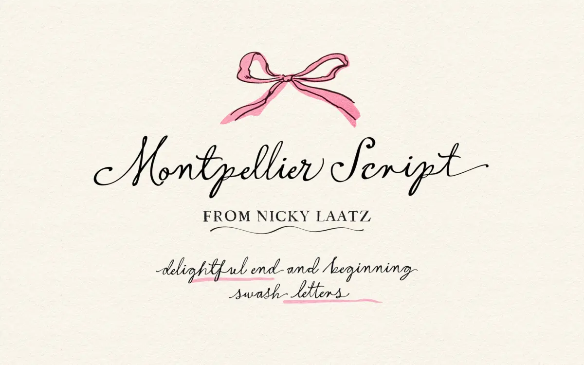
Montpellier Script sits in the lighthearted end of the calligraphy-script spectrum. The stroke has a brush-pen feel rather than a pointed-nib one: contrast is present but not severe, and the letters lean toward a casual, hand-inked energy instead of formal copperplate discipline. Nicky Laatz has given the lowercase a loose, bouncing baseline and let the ascenders and descenders swing out with extra flourish, which is where the font’s personality actually lives. It reads as friendly and a little theatrical rather than restrained.
Where it earns its keep is in the beginning and ending letter alternates. Scripts often fall apart at word starts and word ends because the designer draws one shape and repeats it regardless of context — Montpellier Script instead offers a set of flourished variants specifically for those positions, so a word can open with a curled capital and close with a tail that sweeps back under the baseline. Used with restraint, this is what gives the face its sense of being genuinely handwritten rather than templated.
Character set and features
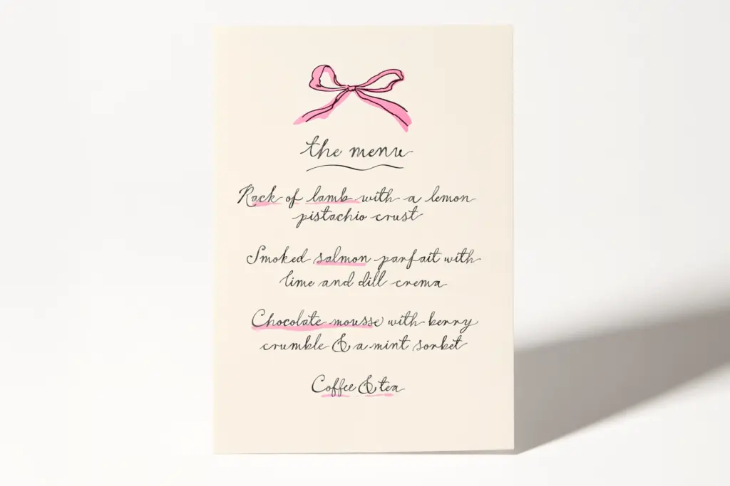
The OpenType set includes standard ligatures for the more awkward letter pairings, plus a broader collection of stylistic alternates beyond just the word-boundary swashes. This means the same word can be set several different ways depending on which alternates you pull in — useful for varying repeated words like
What we liked, and what we didn’t
Strengths
Verdict

Tmfonts reviews typefaces in depth — every font is tested in real branding, editorial and screen layouts before a word gets written. 555+ fonts reviewed and counting.