
Geom Graphic: a squared-off geometric sans built for retro-future branding
Design style
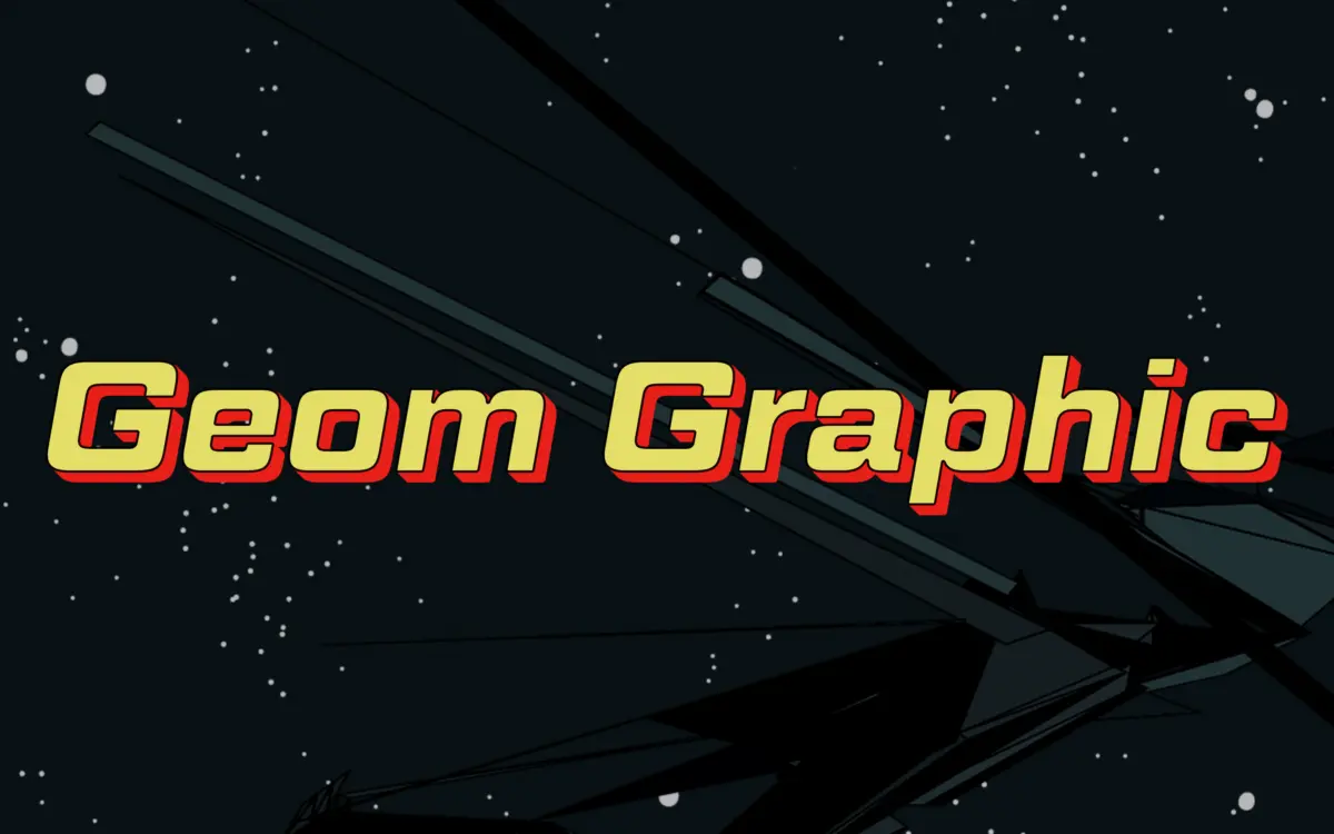
Geom Graphic is a square geometric sans that wears its reference openly: 1980s Japanese mecha animation, the kind of lettering painted on robot armor and title cards. It sits in the same territory as squared industrial sans faces like Eurostile, but pushes the geometry further into the corner. Where Eurostile softens its squares with generous curvature, Geom Graphic keeps its bowls tighter and its corners closer to true right angles, with just enough rounding on the terminals to stop it reading as cold or mechanical.
That rounding is the detail that carries the typeface. Strip it out and this would be a fairly severe, technical-looking sans. With it, the letterforms get a warmth that reads as retro rather than futuristic-clinical — closer to a vintage instrument panel than a modern UI. The stroke widths are even and the x-height is generous, so despite the squared construction the face doesn’t feel cramped or overly geometric-for-its-own-sake. It has a point of view, and it commits to it consistently across the character set.
Character set and features
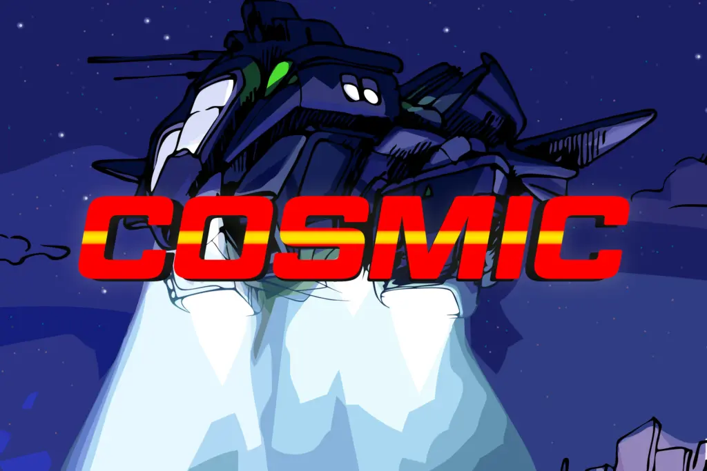
The family comes in four weights, each with a matching italic, which is a reasonable spread for a display-leaning face — enough to build hierarchy without pretending to be a full text system. The italics aren’t dramatic obliques; they follow the same squared logic as the romans, which keeps the family visually unified rather than bolting on a different personality for emphasis.
Language support is described as extensive, which matters more than it might seem for a face this stylised — geometric sans faces often fall apart once you add diacritics or extended Latin characters, because the strict grid construction doesn’t leave much room for accents to sit comfortably. Whether Geom Graphic manages this gracefully across every diacritic is something to check on a specimen before committing to a multilingual project, but the base coverage gives it more reach than a typical display-only release.
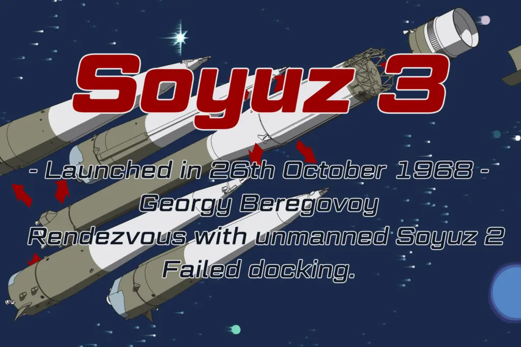
What it doesn’t offer is much subtlety at small sizes. The squared bowls and even stroke weights that make it distinctive at display size start to look heavy and undifferentiated once you shrink it down to body copy — letters like o, e, and c lose some of their identity when the counters get small. This is a face built for size, not for paragraphs.
Use cases
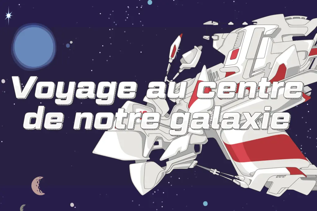
This is a logo and title face first. It suits branding for games, film, and product lines that want a hard-edged, technical mood without going full brutalist — think vehicle badging, sci-fi packaging, event titling, esports branding, anything that wants to nod at 1980s mecha design without directly quoting it. It also works well as a display face in editorial layouts where a section needs a mechanical, engineered feel against otherwise plain body text.
It’s less suited to long-form reading or interfaces where legibility at small sizes is the priority — for that, pair it with a plainer working sans and reserve Geom Graphic for headlines, logotypes, and short bursts of display type where its geometry can actually be appreciated.
What we liked, and what we didn’t
Strengths
- The subtle rounding on squared terminals gives it a warm, retro character rather than a cold technical one
- Four weights with matching italics give it enough range for logo and headline hierarchy
- The mecha-inspired geometry reads as distinctive rather than derivative of Eurostile-style faces
Trade-offs
- Counters and bowls lose definition at small sizes, making it a poor choice for body copy
- The strict squared construction may sit awkwardly with diacritics in some extended-language contexts
Geom Graphic does one thing with conviction: a squared, warm-edged geometric sans that channels 1980s mecha design without becoming a novelty face. It's a strong pick for logos and titling in sci-fi, gaming, or industrial branding, but it's not built for body text and its charm fades fast at small sizes.
Verdict

Tmfonts reviews typefaces in depth — every font is tested in real branding, editorial and screen layouts before a word gets written. 555+ fonts reviewed and counting.