
TAN – Twilight: A Streamlined Blackletter for Logos and Headlines
Design style
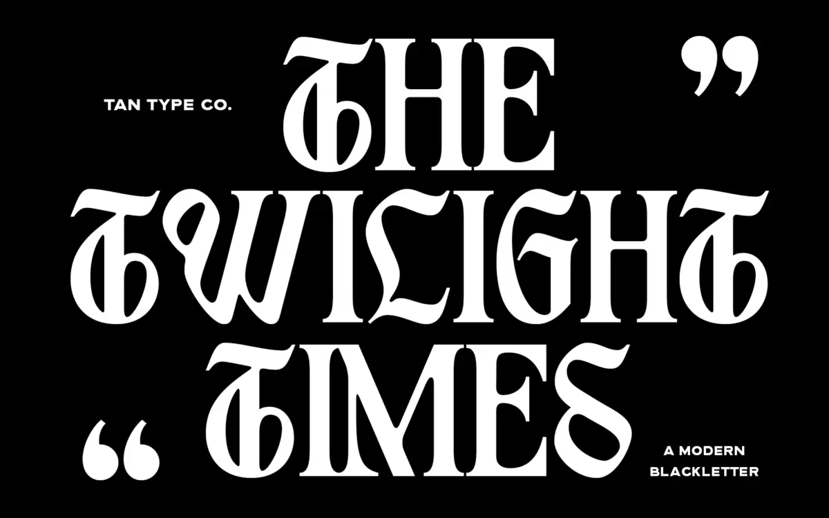
TAN – Twilight takes the bones of blackletter and files down most of the ornament. The double-story structures, sharp diamonds, and fracture strokes that usually signal “gothic” are pared back to a handful of gestures rather than a full historical vocabulary. Verticals stay fairly even in weight, curves are simplified into clean arcs, and the diamond terminals that survive are placed with restraint rather than piled on for effect.
The result reads as blackletter-adjacent more than blackletter proper. It borrows the genre’s density and its sense of occasion, but the letterforms are closer to a modern display sans with a few gothic tells grafted on: a split ascender here, an angled terminal there. That’s a fair trade for a lot of designers, since traditional blackletter is difficult to use outside of very specific contexts, and this version is not. Whether it counts as genuinely dramatic is a separate question — at a glance it can look more like a stylised sans than a face rooted in gothic tradition, and readers expecting real blackletter weight and texture may find it thin.
Character set and features
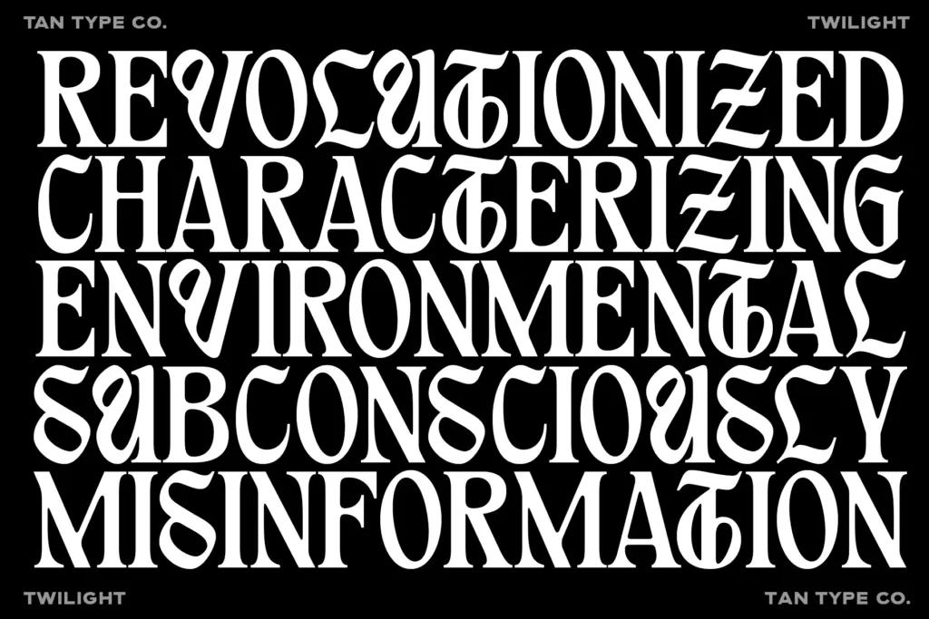
The letters are drawn with consistent stroke contrast and closed, fairly tight apertures, which keeps the face legible even where individual letters flirt with abstraction. Diagonal strokes are kept straight rather than curved, giving the face a slightly angular, constructed feel rather than a calligraphic one — a sensible choice for a display face that needs to hold up at large sizes and in vector logo work.
Spacing is even, without the tight overlaps some blackletter revivals lean on for drama, so word shapes stay readable at a glance rather than dissolving into texture. The seller notes multilingual support and OpenType ligatures, though as with most display faces of this kind, the ligatures need a program that reads OpenType features properly — something worth checking before dropping the font into a template-based tool. At smaller point sizes the simplified curves start to lose the character that makes the face interesting in the first place; this is a face designed to be looked at, not read in paragraphs.
Use cases
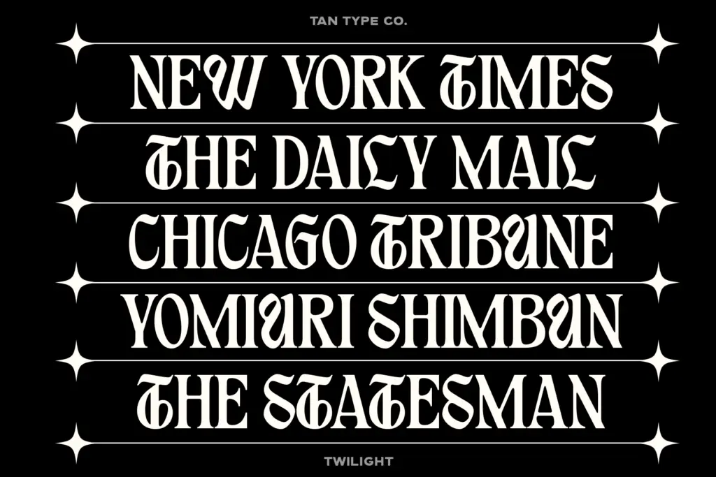
Logotypes and wordmarks are the obvious home for TAN – Twilight, particularly for brands that want a gothic reference without committing to full-strength blackletter gravity — streetwear, fashion labels, music merchandise, the kind of branding that wants edge but not menace. It also works well as a poster or cover headline face, where a handful of large-scale words can carry the design without needing supporting body text.
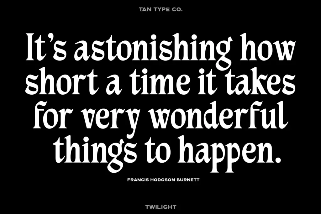
It’s less suited to anything that requires a paragraph or a subhead hierarchy; the face doesn’t offer a range of weights or a companion text style, so pairing it with something for body copy is left entirely to the user. Packaging work, single-word badges, and social graphics are reasonable territory too. Avoid it for long headlines or any context where legibility at small sizes actually matters — that’s not the job it was built for.
What we liked, and what we didn’t
Strengths
- Simplified gothic forms that avoid the heaviness of traditional blackletter
- Even spacing keeps words readable rather than texture-like
- Strong fit for logo and wordmark work in fashion and streetwear branding
Trade-offs
- Loses character and readability at small point sizes
- No accompanying weights or text style for longer copy
TAN – Twilight softens blackletter into something usable for modern branding without losing all of its edge. It's a strong pick for wordmarks and headlines, but it's a one-note display face with no text companion and limited legibility at small sizes.
Verdict

Tmfonts reviews typefaces in depth — every font is tested in real branding, editorial and screen layouts before a word gets written. 555+ fonts reviewed and counting.