
Dark Reborn Typeface Free Download
Is Dark Reborn Typeface free to download?
Dark Reborn Typeface is a commercial font sold on Creative Market, so the full version needs a paid license. Get it from the official listing: Dark Reborn Typeface download.
Need something free? These blackletter fonts from Google Fonts are free for personal and commercial use:
Design style
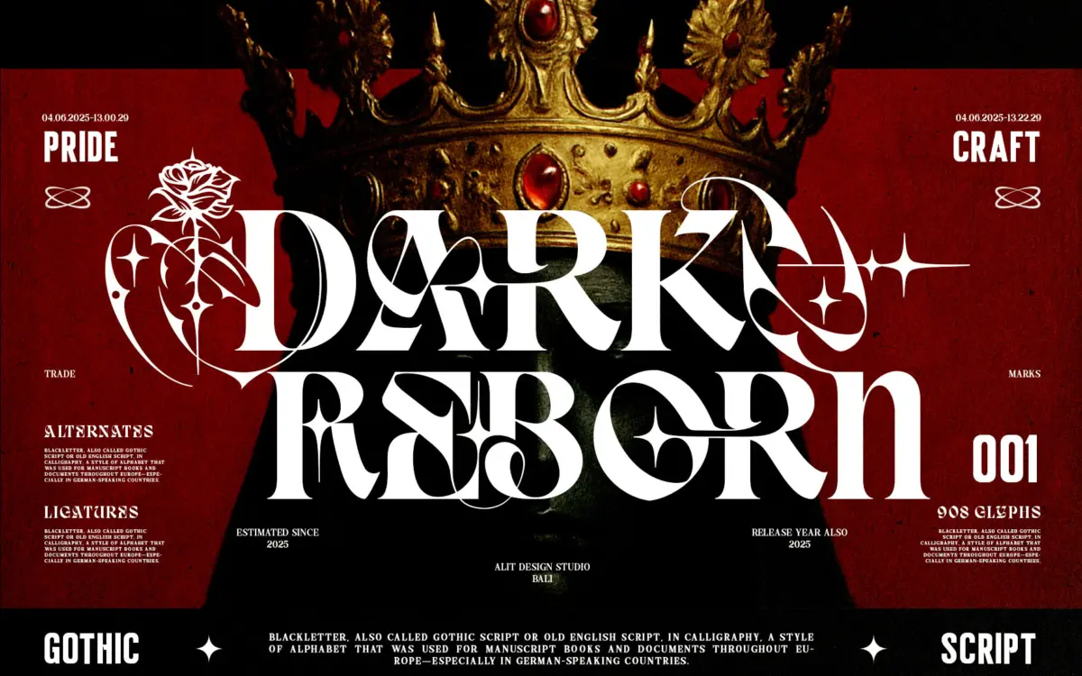
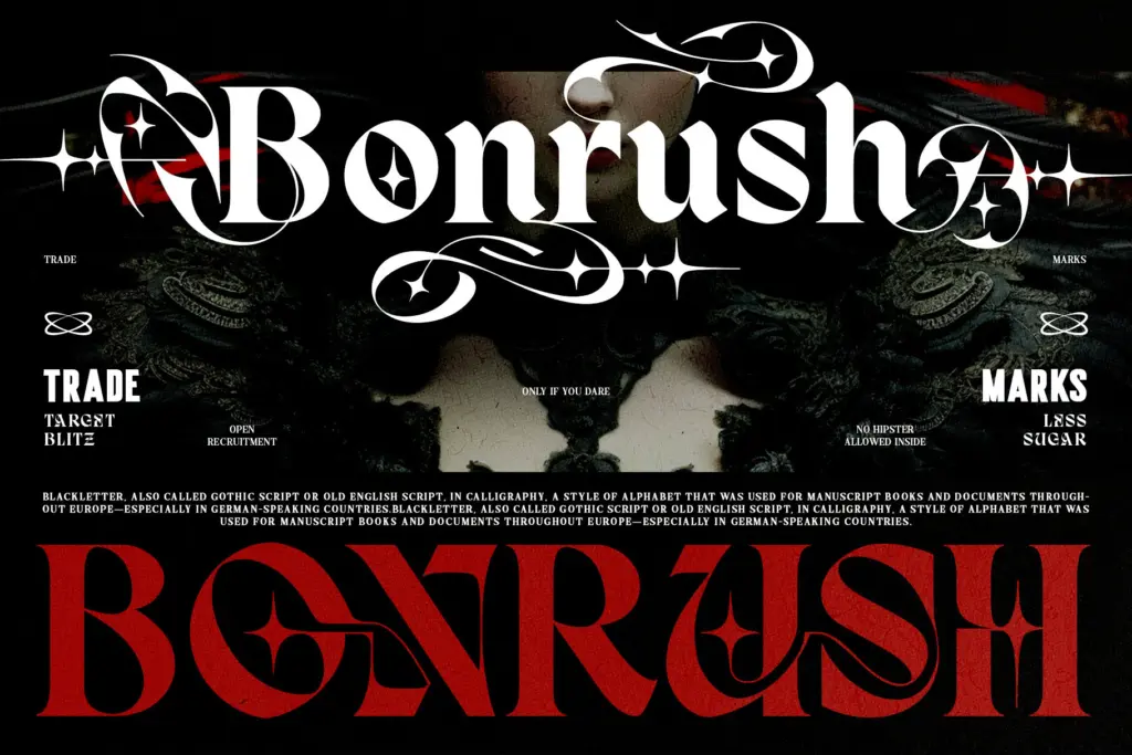
Dark Reborn sits at the collision point of Blackletter and modern serif construction. Rather than the tight, angular texture of a true Old English face, the letters open up: verticals are heavier and blockier, serifs are squared off rather than hairline, and the overall rhythm reads more like a heavy display serif wearing Gothic dress than a manuscript revival. That’s a deliberate move away from historical accuracy and toward something more legible at a glance and more comfortable on a t-shirt or record sleeve.
The tribal-style swashes and rose-derived alternates are where the personality lives. They’re not subtle — these are ornamental flourishes meant to be seen, wrapping around ascenders and stacking off capitals to build a symbolic, almost heraldic mood. Used sparingly, they give a wordmark real presence. Used across every letter of a sentence, they’ll fight each other for attention, and the page starts to feel busy rather than dramatic.
Character set and features
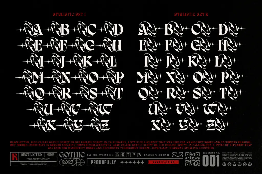
The alternate glyphs are the main functional draw here — swash variants and floral/rose accents that let you dress up a single word or initial without redrawing anything. This is a font built to be art-directed letter by letter rather than typed and forgotten: you pick your hero character, apply an alternate, and leave the rest of the word plain so the ornament actually reads as ornament rather than noise. The high contrast between the bold strokes and the thinner ornamental linework does most of the visual work, and it holds up decently at large sizes.
What the brief doesn’t confirm is broad language support or a full weight range, so treat this as a single-style display face rather than a flexible family. It’s not built for body copy or long-form setting, and nobody should try to use it that way — the density of the strokes and the ornamentation make paragraph-length text a slog to read.
Use cases
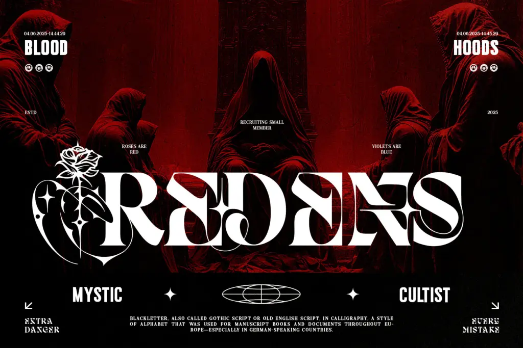
This is a logo and cover typeface first. Album art, band merch, tattoo flash sheets, occult or esoteric branding, streetwear drops — anywhere a single word or short phrase needs to carry weight and a bit of menace. The Gothic-serif fusion also reads well for fashion labels chasing a dark-luxury aesthetic, where a plain Blackletter might feel too costume-y and a plain serif too safe.
It’s less useful anywhere text needs to stay quiet: interfaces, packaging with regulatory copy, editorial body text, anything that needs to be read fast by an unfamiliar audience. Wedding stationery and corporate branding are also poor fits — the tribal and occult overtones are strong enough that they’ll read as intentional statements, not neutral elegance. If your brief calls for one loud word rather than a paragraph, this earns its keep; if it calls for a paragraph, look elsewhere.
What we liked, and what we didn’t
Strengths
- Bold, blocky serif-Blackletter fusion reads clearly at large display sizes
- Swash and rose alternates let you customise individual letters for a hero mark
- Strong fit for music, occult and dark-fashion branding where a plain Blackletter feels too traditional
Trade-offs
- Not usable for body text or anything requiring sustained reading
- Layering too many alternates at once turns the ornamentation into visual noise
Dark Reborn is a confident display face for anyone who needs a single word to look heavy and a little dangerous. It's not a working text font and shouldn't be asked to be one, but for logos, covers and tattoo-adjacent branding it delivers real character.

Tmfonts writes independent reviews of typefaces: what each font does well, where it falls short, what it suits, and where it is sold.