
Slick Font Free Download
Is Slick Font free to download?
Slick Font is a commercial font sold on Creative Market, so the full version needs a paid license. Get it from the official listing: Slick font download.
Need something free? These script fonts from Google Fonts are free for personal and commercial use:
Design style
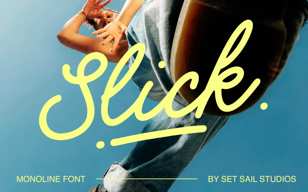
Slick is a monoline cursive script — one stroke weight throughout, no shading or contrast to lean on. That’s a harder job than it looks. Without thick-thin variation to carry the rhythm, the joins have to do all the work, and here they mostly hold up. The baseline sits at a gentle, consistent slant, letters connect without awkward pinch points, and the overall feel is casual rather than formal, closer to a felt-tip note than a wedding invitation script. It reads as friendly and unpretentious, not luxury-brand elegant. That’s a deliberate choice, not a shortcoming, but it does mean the font signals ‘approachable’ before it signals anything else.
The monoline construction keeps the design clean at the expense of drama. There’s no single flourish or letterform that announces itself as the font’s signature move — it’s built for consistency across a paragraph rather than for one showstopping word. That makes it dependable but also a little anonymous next to scripts with a stronger contrast profile.
Character set and features
The package is more generous than the base letterforms suggest. Alongside the regular upper and lowercase set, there’s a full alternate set delivered as a separate font, so swapping letterforms mid-word for variety means switching fonts rather than hunting through a glyphs panel — workable, but an extra step in production.
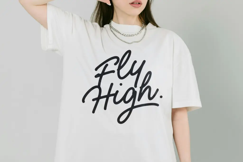
Twenty-six swashes are included, also as their own font, generated by typing a–z, which is a sensible way to keep the swash set separate from the main alphabet rather than cramming it onto punctuation keys. They’re aimed at underlines and word-end flourishes rather than full decorative capitals, and used sparingly they add polish without tipping into clutter.
Twenty-three ligatures cover common double-letter combinations, accessible through OpenType’s Standard Ligatures feature or manually via glyphs. These are the difference between a script that looks assembled letter-by-letter and one that reads as genuine handwriting — double l’s, t’s and similar pairs get custom joins instead of an awkward overlap. Language support runs across most of Western and Central European accented characters, so the font isn’t limited to English-only use.
Use cases
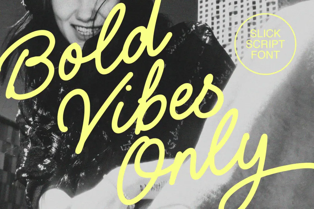
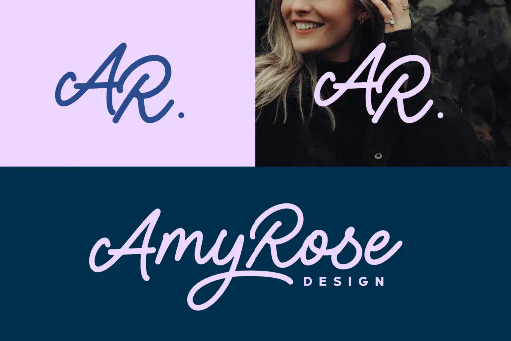
Slick suits the jobs its name implies: packaging copy, merch lettering, social graphics, short quotes, logotypes for brands that want warmth rather than formality. The monoline weight holds up reasonably well at small sizes for a script — there’s no fine hairline to disappear at low resolution — though like any connected cursive it still needs generous tracking and a clean background to stay legible in a single line of body text.
It’s less suited to anything that wants restraint or gravitas: fine-dining menus, legal branding, anything where a script needs to whisper rather than chat. Use it for headlines, short display lines and packaging accents rather than paragraphs of running text, and lean on the swash set for accents rather than as a default.
What we liked, and what we didn’t
Strengths
- 23 ligatures smooth over awkward double-letter joins for a more natural handwritten flow
- Separate swash font gives clean, controllable flourish options without cluttering the main glyph set
- Broad European language support makes it usable beyond English-only projects
Trade-offs
- Monoline weight keeps the design consistent but a bit flat, with no standout signature letterform
- Alternate character set requires switching fonts mid-project rather than accessing via a single glyphs panel
Slick is a competent, friendly monoline script that does the casual-brand job well without trying to be more than that. The ligatures and swashes add real production value, but the design itself stays safe rather than distinctive.

Tmfonts writes independent reviews of typefaces: what each font does well, where it falls short, what it suits, and where it is sold.