
Classical Font Free Download
Is Classical free to download?
Classical is a commercial font sold on Creative Market, so the full version needs a paid license. Get it from the official listing: Classical font download.
Need something free? These serif fonts from Google Fonts are free for personal and commercial use:
Design style
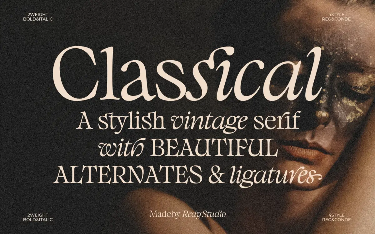
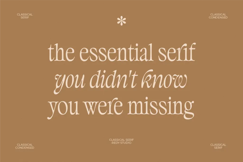
Classical leans into an old-style printing feel by refusing to balance itself the way a normal text serif would. The ascenders, descenders and x-height are drawn unevenly rather than matched to a shared grid, so the type has a slightly off-kilter rhythm on the page. That’s a deliberate choice, and it reads as vintage rather than as a mistake — closer to the irregularity of old letterpress specimens than to a clean revival. The serifs themselves are traditional, bracketed, with enough contrast between thick and thin strokes to give the letters some presence at larger sizes without collapsing into hairlines.
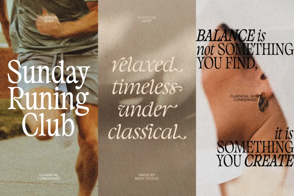
It’s a display-leaning serif dressed as a text face. The character shapes have enough idiosyncrasy — a canted terminal here, a slightly heavier bowl there — that you notice them individually rather than reading them as a neutral block of text. That’s fine for a headline or a short line of copy. It’s more of a liability if you’re expecting it to disappear into a paragraph.
Character set and features
The font includes alternate characters and ligatures accessible through OpenType features, along with multilingual character support. The alternates give you a way to vary repeated letters within a headline or logotype so the unevenness doesn’t feel mechanical — useful if you’re setting a short piece of type and want it to look hand-picked rather than default. The ligatures follow the same vintage logic, joining letter pairs the way old type foundries used to, which is a nice detail if your layout software actually renders them.
Letter spacing is worth watching closely. Because the forms are already irregular, tightening or loosening tracking changes the character of the word more than it would with a more geometric serif — the brief itself points to this, suggesting you adjust spacing to control how
What we liked, and what we didn’t
Strengths
- a
- b
- c
Trade-offs
- a
- b
placeholder

Tmfonts writes independent reviews of typefaces: what each font does well, where it falls short, what it suits, and where it is sold.