
The Romantic Font Free Download
Is The Romantic Font free to download?
The Romantic Font is a commercial font sold on Creative Market, so the full version needs a paid license. Get it from the official listing: The Romantic font download.
Need something free? These handwritten fonts from Google Fonts are free for personal and commercial use:
Design style
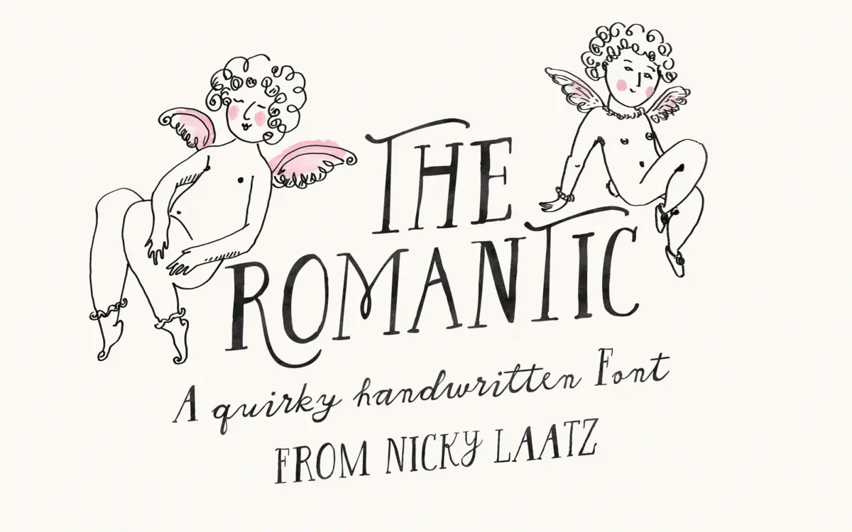
The Romantic Font sits somewhere between a script and a serif, which is exactly the pitch. The lowercase is built from loose, hand-drawn strokes that wobble slightly off the baseline, the kind of imperfection that reads as quilled ink rather than a ruled nib. Uppercase letters are drawn taller and straighter, with small serif-like flicks at the terminals, so a capital doesn’t just start a word but announces it. The contrast between the two registers is the whole design idea: casual, connected lowercase against upright, almost formal capitals.
It leans into the antique lettering reference rather than a clean calligraphic model. Strokes thicken and thin unevenly, curves aren’t perfectly circular, and the baseline drift is deliberate rather than a flaw to be corrected. That’s a specific look, closer to hand lettering pulled from an old invitation than to a modern brush script. If you want smooth, even rhythm, this isn’t it. If you want a face that feels drawn by a person on a given afternoon, it delivers that.
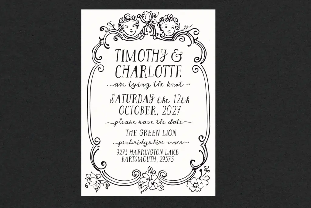
Character set and features
The typeface carries alternates, ligatures and swashes, which is where the
What we liked, and what we didn’t
Strengths
- The tall serif-flavoured capitals against loose lowercase gives it a distinct, recognisable structure
- Alternates and swashes genuinely reduce repetition rather than being decorative filler
- PUA encoding makes the alternate glyphs usable for people working outside full OpenType apps
Trade-offs
- The uneven baseline and stroke contrast make it tiring at small sizes or in long passages
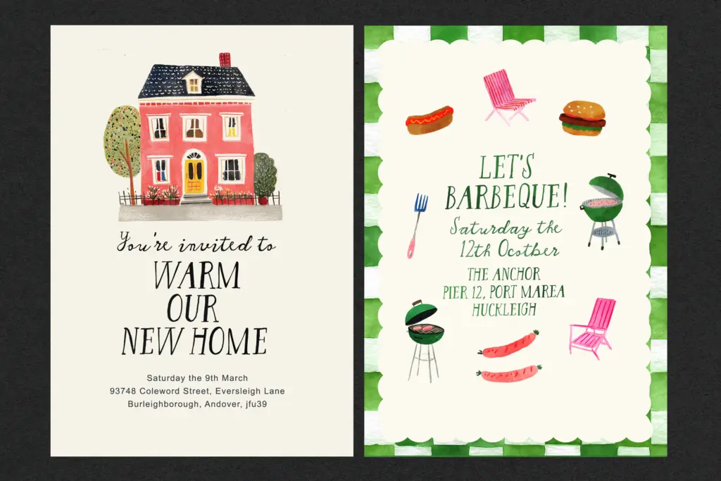
- Its antique, quilled character limits it mostly to warm/romantic contexts rather than broader branding work
A charming, deliberately imperfect script-serif hybrid best kept to short lines and generous sizes. It has real personality but asks for careful setting rather than default paragraph use.

Tmfonts writes independent reviews of typefaces: what each font does well, where it falls short, what it suits, and where it is sold.