
Runholdy Font Free Download
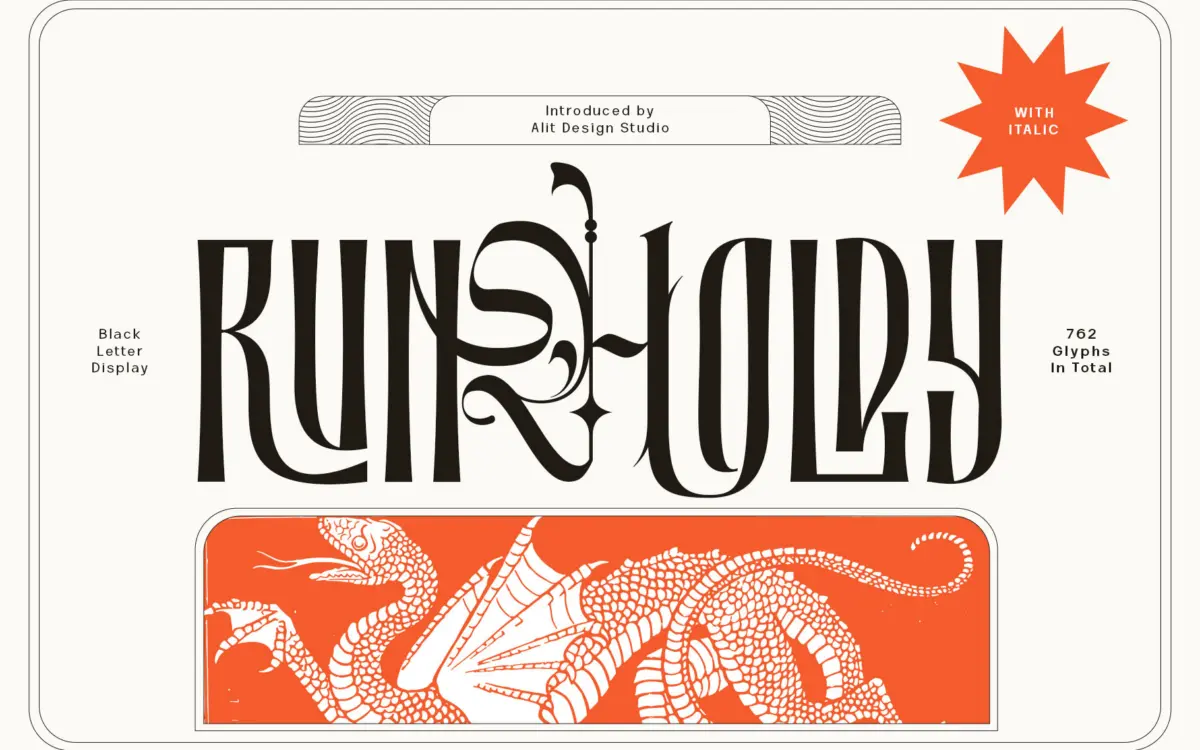
Is Runholdy free to download?
Runholdy is a commercial font sold on Creative Market, so the full version needs a paid license. Get it from the official listing: Runholdy font download.
Need something free? These blackletter fonts from Google Fonts are free for personal and commercial use:
Design style
Runholdy sits at the crossing of two traditions that don’t usually meet. The bones are blackletter — broken, angular strokes with sharp verticals — but the overall texture reads closer to a geometric sans than to a traditional gothic hand. Instead of dense, woven letterforms, the letters here have been opened up and simplified, with straighter stems and cleaner counters than you’d find in a historical blackletter revival.
The result is a face that trades the ceremonial weight of true blackletter for something more graphic and poster-friendly. It won’t be mistaken for a manuscript face, and it isn’t trying to be. The angularity gives it an edge that reads as contemporary and slightly aggressive rather than gothic-solemn, which is presumably the point of calling it “dark beauty, modern style.” It’s a design decision worth naming plainly: purists looking for authentic blackletter structure should look elsewhere, but designers wanting a blackletter-flavoured mark without the medieval baggage will find something usable here.
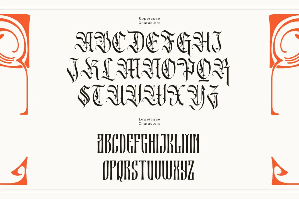
Character set and features
The set is large — 762 glyphs is a lot of raw material, and includes ligatures and swash variants alongside an italic companion. That’s a genuine point in its favour: a lot of blackletter-adjacent display faces ship thin, single-weight, with no alternates to break up repetition. Here you get enough variation to avoid the obvious tell of a display font used at length, where every lowercase ‘a’ looks identical.
Getting to those swashes requires software with OpenType feature support — Illustrator, InDesign, Photoshop CC, CorelDraw — and the seller notes that if your software lacks a glyphs panel, you’ll need to install the swash glyphs as separate font files. That’s a real friction point for anyone working in simpler layout tools or web CSS, where accessing contextual alternates isn’t straightforward. Language coverage extends across Latin, Western, Central and South European sets plus Vietnamese, and PUA Unicode support is included, which is the usual workaround for smuggling in extra glyphs beyond standard code points. Useful, but it means some characters won’t render as expected without the correct font installed on the viewing end.
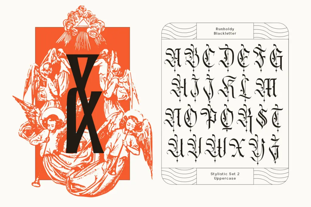
Use cases
This is a display face, full stop — it’s built for headlines, logotypes, badges, and short-form graphic moments, not paragraphs. The angular, semi-blackletter structure works well at large sizes on posters, album art, streetwear labels, and any branding that wants a harder edge than a standard script or serif would give. The italic companion adds some flexibility for secondary lines or subheads without switching families entirely.
At small sizes or in dense settings, the sharper joins and reduced counters will start to clot, so it’s not a candidate for body copy or fine print. Treat it the way you’d treat any bold blackletter-inspired display face: sparingly, at size, with plenty of surrounding space to let the angularity read as intentional rather than cramped.
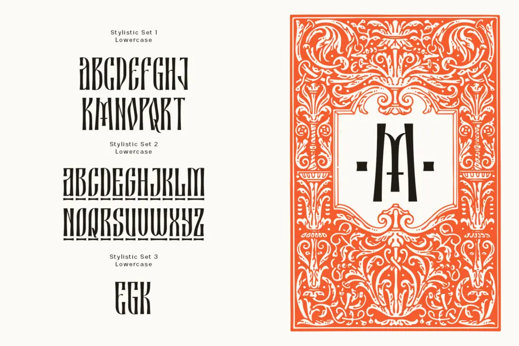
What we liked, and what we didn’t
Strengths
- Large glyph set with ligatures and swashes gives more variation than typical single-weight display fonts
- The blackletter-sans hybrid structure reads as modern and graphic rather than ornamental or dated
- Includes a matching italic, useful for secondary lines without switching families
Trade-offs
- Accessing the swash alternates requires OpenType-aware software, which locks out simpler design tools
- The angular joins and tight counters clot at small sizes, ruling out anything beyond short display text
Runholdy is a competent hybrid that trades authentic blackletter texture for a cleaner, more graphic silhouette suited to modern branding. The large glyph set and included italic add welcome flexibility, but the swash system's software requirements and the face's limited range outside display work keep it from being a universal pick.

Tmfonts writes independent reviews of typefaces: what each font does well, where it falls short, what it suits, and where it is sold.