
Vintage Serif & Calligraphy Script Font Free Download
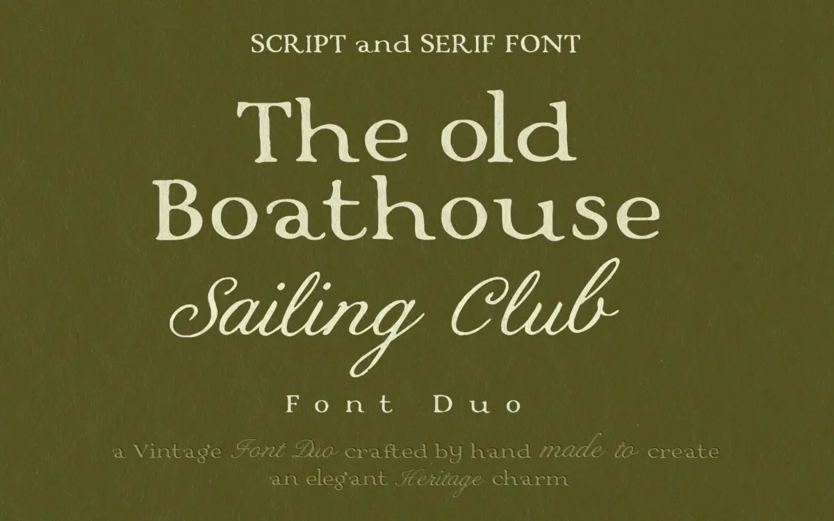
Is Vintage Serif & Calligraphy Script free to download?
Vintage Serif & Calligraphy Script is a commercial font sold on Creative Market, so the full version needs a paid license. Get it from the official listing: Vintage Serif & Calligraphy Script font download.
Need something free? These handwritten fonts from Google Fonts are free for personal and commercial use:
Design style
This is a two-piece set built around a single mood: old money without the shout. The serif half carries slightly softened edges and even proportions, the kind of drawing that reads as handcrafted rather than gridded. Strokes have a light irregularity to them, as if drawn with a broad nib and then cleaned up just enough to hold together as a working font. It doesn’t chase the exaggerated ink traps or distressed texture that a lot of vintage-labelled serifs lean on. Instead it settles for restraint, which is harder to pull off and more useful once you have it.
The companion script is the more expressive of the two. It’s built on calligraphic logic — entry strokes that taper, joins that look pulled rather than pasted, a slant that stays consistent without feeling mechanical. Where the serif is quiet, the script does the talking, and the pairing works because the two don’t compete for the same attention.
Character set and features
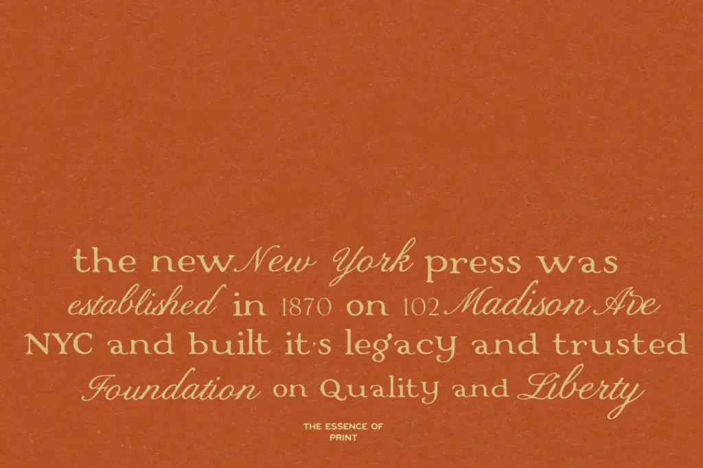
As a duo, the practical value is in how the two typefaces sit next to each other on a page: the serif for structure and small text, the script for the flourish — a monogram, a signature line, a single word of emphasis. Handwritten scripts like this one tend to depend on connecting forms, so expect the usual calligraphy-font caveat: individual letters look better in context than isolated on a swatch, and you’ll want to check how words you actually intend to set behave, rather than trusting the specimen alone.
The serif is the more forgiving of the two at small sizes, since its softened edges are subtle rather than textural — they won’t clog or blur the way a heavily inked vintage face can. It reads as a display serif first, though, not a body-copy workhorse; save it for headlines, labels and short-form copy rather than paragraphs.

Use cases
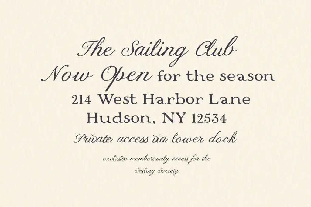
The brief points squarely at the kind of work where restraint reads as expense: membership cards, embossed or letterpress-style stationery, packaging for a heritage or sport-and-leisure brand, wedding invitations that want warmth without kitsch. Coastal and club-adjacent branding is an obvious fit given the pairing’s origin, but the same softened-serif-plus-script formula works just as well for a wine label, a boutique hotel, or an editorial spread going for old-world calm rather than pastiche.
Where it will struggle is anywhere that needs a loud, contemporary voice — tech branding, anything aiming for youthfulness or high energy will find this duo working against the brief rather than for it. It’s also a font for designers comfortable hand-kerning a script; if you need something that sets cleanly straight out of the box at any size, this asks a bit more patience than that.
What we liked, and what we didn’t
Strengths
- Softened serif reads as handcrafted without tipping into heavy vintage texture
- Script and serif are drawn to complement rather than compete, easing pairing decisions
- Restrained character suits quiet-luxury and heritage branding better than most vintage-tagged sets
Trade-offs
- The script demands manual kerning attention to avoid awkward joins in longer words
- Narrow tonal range makes it a poor fit for anything needing energy or contemporary edge
A well-mannered pairing that favours restraint over spectacle, which makes it genuinely useful for heritage and quiet-luxury branding but limited outside that lane. The serif is the sturdier partner; the script needs careful kerning to sing. Worth having if your work leans toward old-world calm rather than contemporary punch.

Tmfonts writes independent reviews of typefaces: what each font does well, where it falls short, what it suits, and where it is sold.