
Valty Font Free Download
Is Valty free to download?
Valty is a commercial font sold on Creative Market, so the full version needs a paid license. Get it from the official listing: Valty font download.
Need something free? These sans serif fonts from Google Fonts are free for personal and commercial use:
Design style
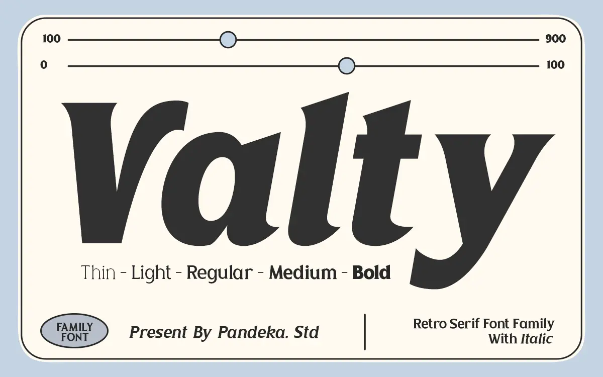
Valty leans into a late-80s, early-90s mood — the kind of bold, slightly rounded letterforms you’d expect on a cassette sleeve or a sportswear logo rather than a body-copy face. The curves are generous and the terminals soft, giving the letters a bouncy, confident stance rather than a restrained one. It reads as a display face first: something built to be set large, not something designed to disappear into a paragraph.
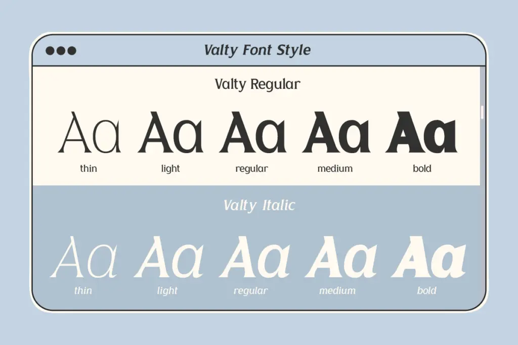
Across its five weights — Thin through Bold — the personality holds steady. The lighter cuts thin out the strokes without losing the playful curve structure, so you get a genuinely usable range rather than five versions of the same idea rendered pointless by extremes. The heavier weights thicken up nicely for poster work and logotypes, where the retro character comes through strongest. It’s not a subtle typeface, and it isn’t trying to be.
Character set and features
Each of the five weights ships with a companion italic, giving ten styles in total, which is a reasonable spread for a display family and enough to build hierarchy within a single piece without reaching for a second typeface. Uppercase and lowercase are both drawn with the same playful curve language, and numerals and punctuation are included, so the set covers the basics you’d need for headline and short-copy work.
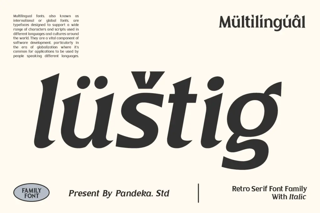
Multilingual support is included, which extends its reach beyond a purely English-language brief, and PUA encoding means the extended glyph set is reachable in apps that don’t handle standard Unicode access well — useful if you’re working in Cricut Design Space or similar. Beyond that, the character set is fairly straightforward: this isn’t a font stuffed with contextual alternates or elaborate ligature sets. It’s a clean, workable core rather than an ornamented one.
Use cases
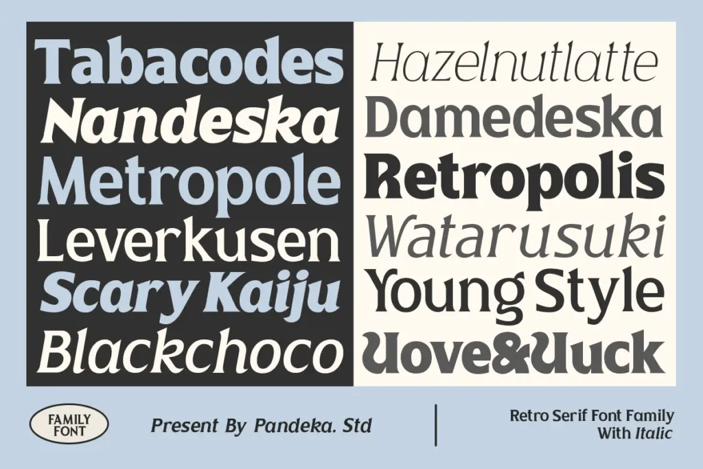
Valty is best suited to headline and logo work: short bursts of text where the retro curve and weight range can do their job at size. Posters, packaging fronts, apparel graphics, and branding marks that want a nostalgic, slightly playful edge are all reasonable fits. The five-weight range means you can pair a Thin headline with a Bold accent word and stay within the same family, which is handy for quick brand systems that don’t want to introduce a second typeface just for contrast.
It’s less suited to long-form or small-size setting — the curves and bounce that make it distinctive at 60pt start to muddy at 10pt, and the character isn’t built for dense paragraphs anyway. Treat it as a display and branding tool, and it earns its keep; ask it to run a page of body text and it will struggle.
What we liked, and what we didn’t
Strengths
- Five weights plus italics give real hierarchy options without switching typefaces.
- The playful curve language stays consistent from Thin to Bold rather than falling apart at the extremes.
- PUA encoding and multilingual support make the extended character set easy to reach across apps.
Trade-offs
- Legibility drops off fast at small sizes, limiting it to display and headline use.
- The character set is fairly basic, with no notable ligatures or alternates to add variety.
Valty is a confident, retro-leaning display face with a genuinely usable five-weight range and matching italics. It's built for headlines, logos and short bursts of branded copy, and it shows its limits quickly once you try to set it small or run it long.

Tmfonts writes independent reviews of typefaces: what each font does well, where it falls short, what it suits, and where it is sold.