
National Forest Font Free Download
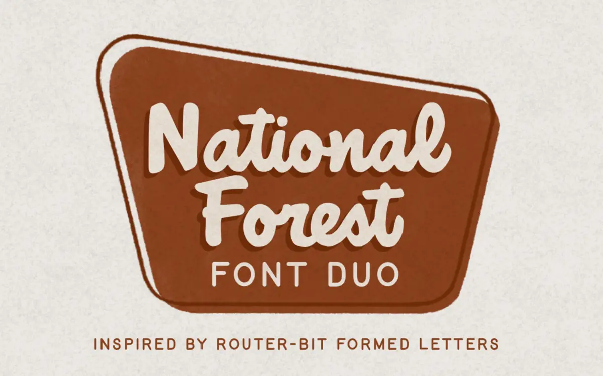
Is National Forest free to download?
National Forest is a commercial font sold on Creative Market, so the full version needs a paid license. Get it from the official listing: National Forest font download.
Need something free? These script fonts from Google Fonts are free for personal and commercial use:
Design style
National Forest takes its cue from the carved wooden signage found at national park entrances and trailheads, the kind cut with a router bit and left slightly uneven at the corners. That source is obvious in the letterforms: strokes taper and swell the way a rotating bit does when it enters and exits wood, rather than the way a pen or brush would. The script half of the duo keeps a loose, almost hand-routed connection between letters, with joins that don’t always sit at the same height, which reads as deliberate rather than sloppy once you see it across a full word. The companion print style is blockier and more upright, echoing the sans-serif lettering used on the same signs for park names and mileage markers.
Neither style is trying to be elegant. The charm here is in the roughness — slightly uneven baselines, corners that don’t quite square off, a general handmade quality that would be sanded out of a more polished script. That’s a specific choice, and it won’t suit every brief, but it’s consistent across both fonts, which is what makes the duo work as a pair rather than two unrelated designs bolted together.
Character set and features
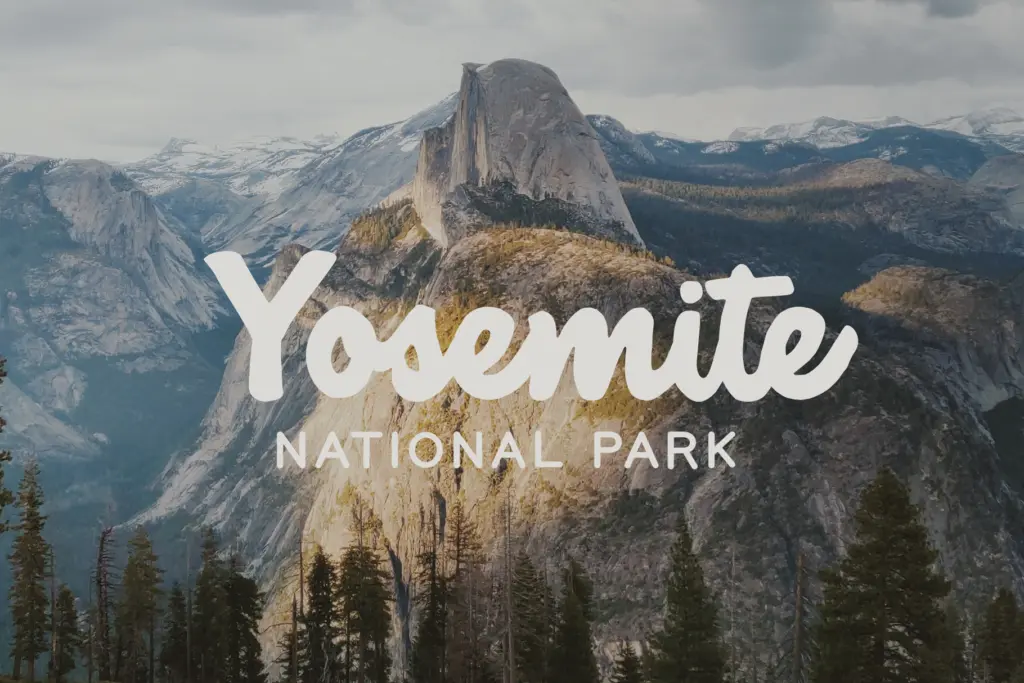
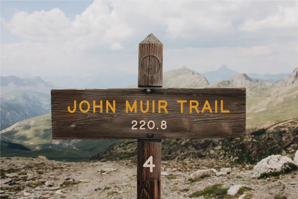
As a duo, the value is in how the script and print styles sit next to each other. The print face is doing the legibility work — it’s the one you’d trust for a line of body text or a product name that needs to be read at a glance — while the script carries the personality, best used for a word or short phrase rather than a paragraph. Because both were drawn with the same routed-groove logic, swapping between them in a lockup doesn’t feel like mixing typefaces from different eras, which is the usual risk with a script-plus-sans pairing.
Given the retro sign inspiration, don’t expect this to behave like a contemporary display script with dozens of alternates and elaborate ligatures — the appeal is the rawness of the mark-making, not technical range. Treat it as a character-driven pair rather than a feature-heavy system, and it delivers on what it promises.
Use cases
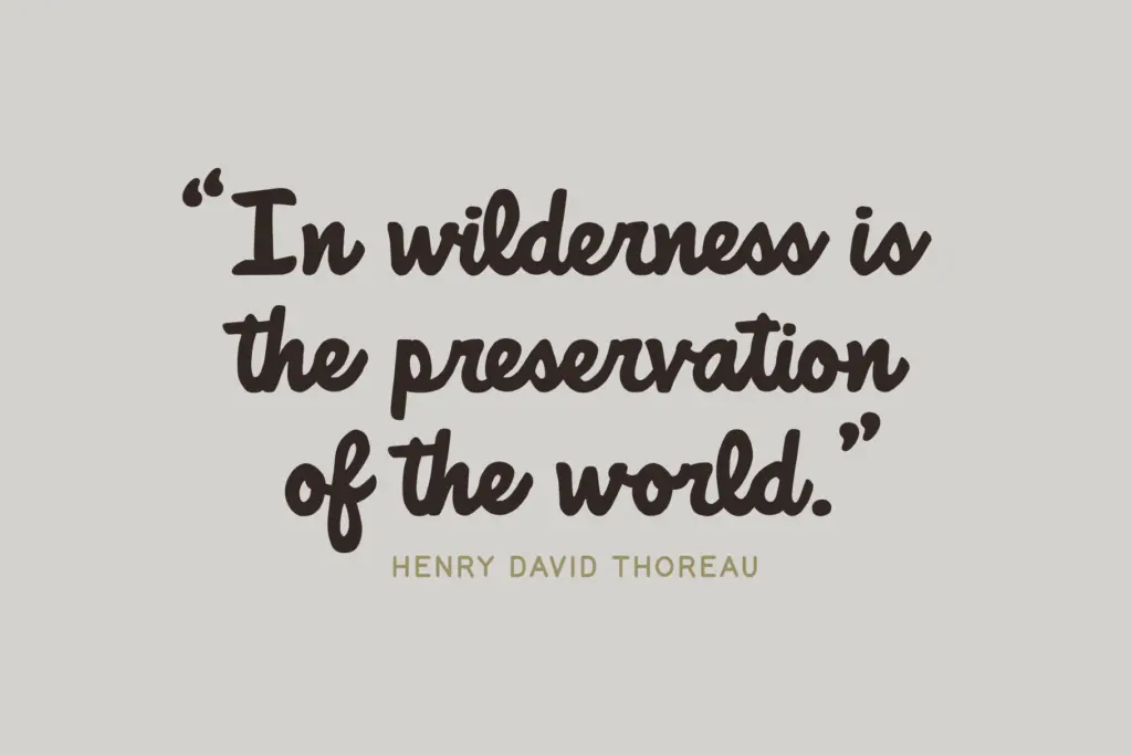
This is a duo built for a fairly narrow but well-served niche: outdoorsy, rustic, Americana-adjacent branding. Think campground and cabin rental logos, craft beer labels, trail merchandise, farmers’ market signage, or a wedding invitation going for a woodsy rather than formal mood. The script works well as a short signature line — a business name, a tagline — set large, where the routed texture actually reads. The print pairs underneath for addresses, dates, or supporting copy.
It’s less suited to anything that needs to look clean or corporate; the intentional imperfection will fight against a brief asking for polish. And because the script is built for short bursts of text rather than long-form reading, it isn’t a fit for body copy of any real length — you’ll want to keep it to headlines, badges, and lockups. Within that lane, though, the two fonts do a genuinely useful job of covering both the decorative and the functional half of a rustic logo without needing a third typeface brought in to bridge them.
What we liked, and what we didn’t
Strengths
- Script and print styles share a consistent routed-groove texture that makes them feel like one family
- The rough, uneven letterforms convincingly evoke carved park signage rather than a generic vintage script
- Print style provides a legible workhorse partner so the duo covers both display and supporting text
Trade-offs
- The script is only practical for short words or phrases, not extended text
- The intentional imperfection limits use to rustic or retro briefs and clashes with cleaner, corporate work
National Forest does one job well: it captures the look of routed park signage in a script and print pairing that hold together as a set. It's a niche tool rather than a flexible workhorse, so it rewards rustic, outdoorsy branding and struggles outside that lane.

Tmfonts writes independent reviews of typefaces: what each font does well, where it falls short, what it suits, and where it is sold.