
Vienna Woodtype Font Free Download
Is Vienna Woodtype free to download?
Vienna Woodtype is a commercial font sold on Creative Market, so the full version needs a paid license. Get it from the official listing: Vienna Woodtype font download.
Need something free? These display fonts from Google Fonts are free for personal and commercial use:
Design style
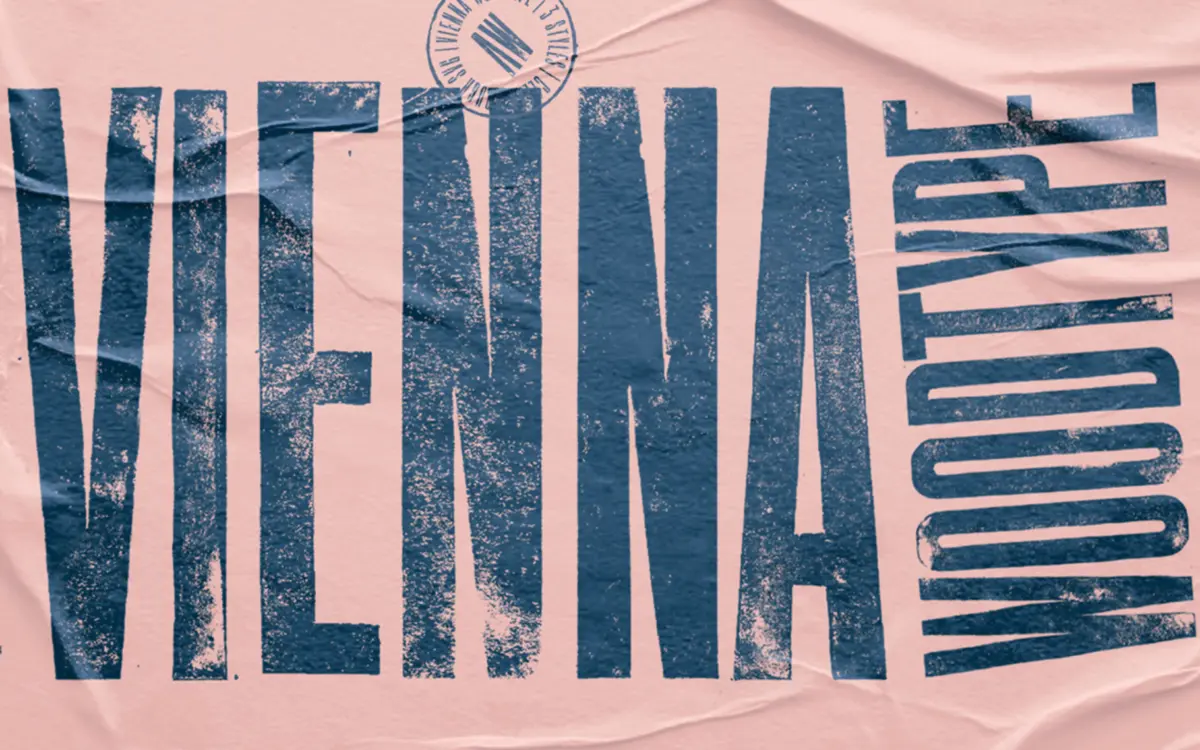
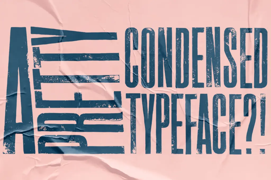
Vienna Woodtype announces its process before you even read a word: these are letterforms carved into linoleum, hand-printed, then scanned into outlines. That origin shows in the way strokes taper unevenly, corners round off slightly where a blade slipped, and edges carry the faint texture of ink pressed into paper rather than vector precision. It’s an ultra-condensed sans, tall and narrow, with a bluntness that reads as woodtype poster lettering rather than anything drawn on a grid. The condensed proportions push letters close together, which suits its intended job — big, loud, single-line headlines rather than anything set in a paragraph.
The character comes from imperfection kept intentionally rather than smoothed away. Strokes vary in weight along their length, terminals are cut rather than rounded, and the whole face has a hand-tool rhythm that a clean digital condensed sans doesn’t have. It won’t be mistaken for a contemporary grotesque.
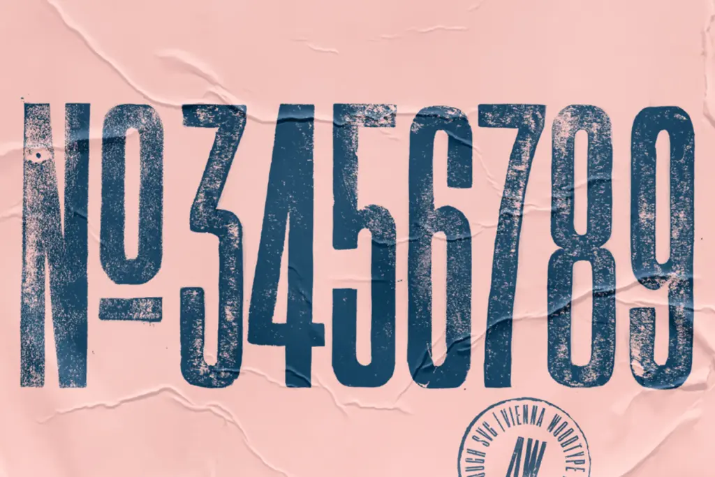
Character set and features
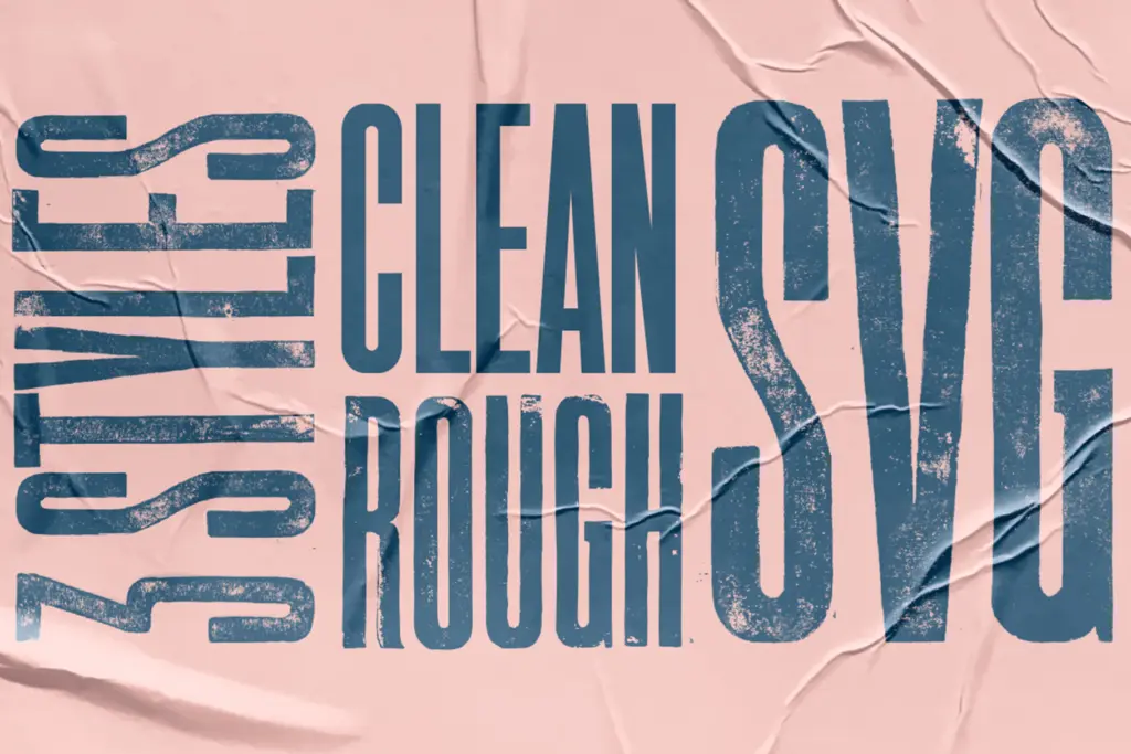
The font ships in three versions: a Clean cut, a Rough cut, and an SVG version. The Clean version keeps the carved character of the letterforms but with tidier edges, useful when you want the woodtype look without visible print noise. The Rough version leans into the linocut texture more heavily — ink pooling, uneven pressure, broken strokes — and reads more like an actual reclaimed print than a font. The SVG version carries full-colour or textured glyphs where supported, which is worth checking against your software since SVG fonts don’t render identically everywhere.
Because this is a display face built around one strong idea, don’t expect an extensive OpenType feature set or multiple weights beyond the cuts described. Nor is it built for body copy: the density of an ultra-condensed letterform at small sizes turns the texture into mush rather than character. It wants space, size, and short words.
Use cases
This is a poster and packaging font first. Think craft beer labels, small-batch food packaging, gig posters, or any project that wants to nod at old print shops without pulling in an actual blackletter or slab serif. The condensed width means it’s efficient for headlines that need to punch above their column width, and the rough version particularly suits anything trying to look aged, distressed, or handmade — vintage branding, artisanal markets, hipster-leaning cafés and record shops.
It is less useful anywhere that calls for restraint or neutrality. A brand wanting a clean, modern voice should look elsewhere; this typeface has an opinion about texture and history that it won’t set aside. Pair it carefully — it wants a plain, quiet body font nearby to offset its noise, and it should almost never appear at paragraph sizes. Used as a single headline word on a poster or label, though, it does exactly what a linocut sign painter would have done by hand, and does it with some conviction.
What we liked, and what we didn’t
Strengths
- Genuine linocut texture that reads as hand-carved rather than filtered
- Three cuts (Clean, Rough, SVG) give some flexibility in how much grit shows
- Condensed proportions make it efficient for punchy poster and label headlines
Trade-offs
- Ultra-condensed width and print texture make it unreadable below display sizes
- Limited to one strong mood, so it won't suit brands wanting a neutral or modern voice
Vienna Woodtype does one job — loud, textured, hand-carved headlines — and does it with real conviction thanks to its linocut origins. It's not built for reading, only for shouting a few words with some grit, and buyers should know its ultra-condensed proportions and rough texture limit it strictly to display use.

Tmfonts writes independent reviews of typefaces: what each font does well, where it falls short, what it suits, and where it is sold.