
Modulus Pro Font Free Download
Is Modulus Pro free to download?
Modulus Pro is a commercial font sold on Creative Market, so the full version needs a paid license. Get it from the official listing: Modulus Pro font download.
Need something free? These sans serif fonts from Google Fonts are free for personal and commercial use:
Design style
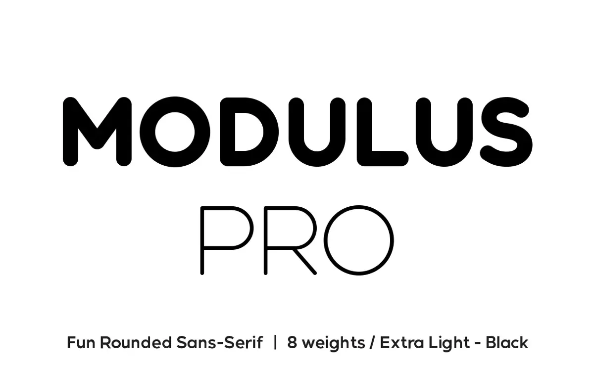
Modulus Pro is a rounded sans that trades softness for something firmer than the usual friendly-rounded template. The curves are there — terminals close off gently rather than snapping to a hard edge — but the proportions are tighter and the stroke contrast is more deliberate than most fonts in this genre allow themselves. That gives it an edge that keeps it from reading as generic app-icon rounded sans. It sits closer to a geometric sans with the corners eased off than to the bouncy, toy-like rounded faces that dominate this category.
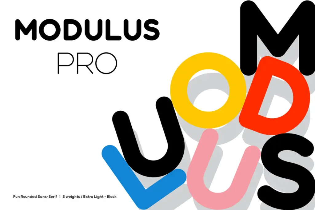
Across eight weights, from Extra-Light to Black, the rounding stays consistent, which matters more than it sounds. A lot of rounded families only really commit to the concept in the middle weights and go soft or overly blunt at the extremes. Here the Extra-Light keeps its structure instead of dissolving into hairlines, and the Black holds its curves without turning into a blob. That range is the real achievement of the update — it’s what makes the family usable as a system rather than a single mood.
Character set and features
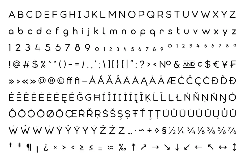
The glyph set has been expanded with multilingual support, which widens the field considerably beyond a display-only release. More relevant to how most people will actually use this font is the stylistic alternate set. There’s a generous number of alternate characters built to be swapped in for logotype work — different terminal treatments, altered bowls, a few characters with genuinely different structure rather than just a serif flourish added on. Ligatures are included too, though as with most alternate-heavy display fonts, they’re best used selectively rather than turned on wholesale, since a paragraph built entirely from alternates starts to look restless.
The upshot is that this isn’t a font you install and use straight out of the box for a wordmark — the interesting work happens once you start picking through the alternates and building a custom combination for a specific name or headline. That’s a feature for anyone doing bespoke logotype work, and a bit of a chore for anyone who wanted something that looks finished on the first try.
Use cases
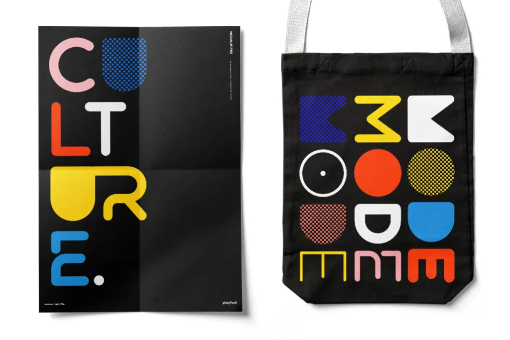
This is a branding and display font first. The alternate set and the weight range both point toward logotypes, wordmarks, and packaging lockups where a designer is going to spend time customising individual letterforms rather than setting continuous copy. It also works well for poster headlines and editorial display type, where the rounded-but-firm character gives a headline some presence without tipping into cute.
It’s not built for body text, and the family doesn’t try to pretend otherwise — there’s no attempt at an italic system or the kind of spacing refinement that long-form reading needs. Treat it as a display and identity tool: strong at large sizes, in short lines, in the hands of someone willing to dig into the alternates rather than accept the defaults.
What we liked, and what we didn’t
Strengths
- Rounding stays structurally consistent from Extra-Light through Black rather than collapsing at the extremes.
- Deep stylistic alternate set genuinely useful for custom logotype and wordmark construction.
- Firmer, more geometric character than typical rounded sans faces, avoiding the generic app-icon look.
Trade-offs
- Requires manual selection among alternates to look finished — no strong out-of-the-box default identity.
- Not suited to body copy or long-form setting; purely a display and branding tool.
Modulus Pro is a rounded sans with enough structural firmness to avoid the genre's usual softness, and the alternate-heavy glyph set makes it a genuinely useful tool for bespoke logotype work. It asks for time and editing rather than handing over a finished look, and it has no ambitions as a text face. For branding and display work built letter by letter, it earns its place.

Tmfonts writes independent reviews of typefaces: what each font does well, where it falls short, what it suits, and where it is sold.