
Fitzgerald Font Free Download
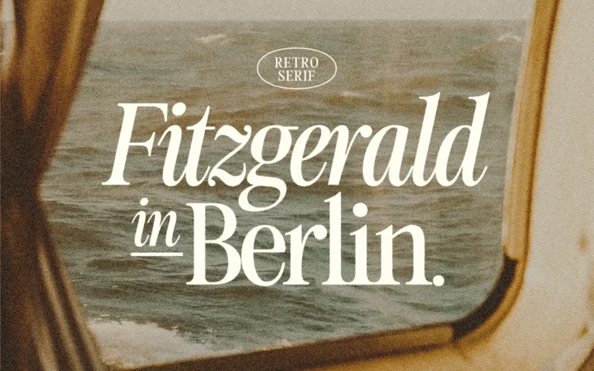
Is Fitzgerald free to download?
Fitzgerald is a commercial font sold on Creative Market, so the full version needs a paid license. Get it from the official listing: Fitzgerald font download.
Need something free? These serif fonts from Google Fonts are free for personal and commercial use:
Design style
Fitzgerald sits in that familiar corner of type design where nineteenth-century didone proportions get sanded down for present-day use. The contrast between thick and thin strokes is present but not severe, and the serifs are bracketed rather than hairline, which keeps the whole face from feeling too brittle. The result reads as retro without tipping into pastiche: you get the nostalgic cues, but the letterforms are cleaner and more even than the transitional serifs they’re borrowing from.
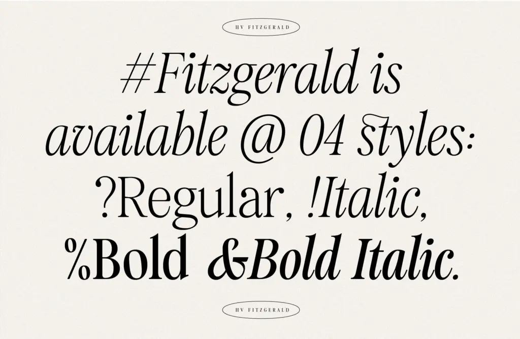
The four styles cover Regular, Italic, Bold and Bold Italic. The italic leans cursive in places rather than simply sloping the roman, which gives it some warmth, though it also means the italic reads a touch more decorative than a plain oblique would. The bold weight is a moderate step up in stroke width, not a maximalist black, so it works for emphasis without becoming its own display face.
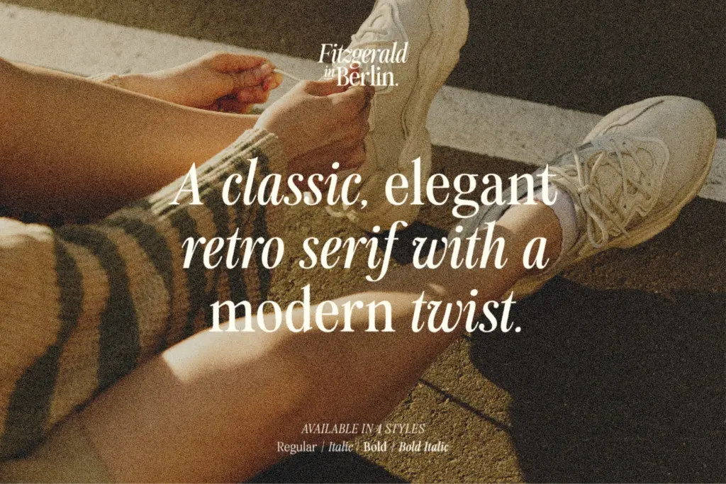
Character set and features
Coverage is aimed at European languages plus Vietnamese, so diacritic support is a genuine consideration here rather than an afterthought — useful if your work spans more than English-language copy. The seller notes standard ligatures, described as connected-letter forms, which are accessed through OpenType features; in practice that means you’ll want software with a Glyphs panel, such as Illustrator, to reach the fuller set rather than relying on automatic substitution in every app. That’s a minor friction point worth knowing before you commit a layout to them.
Beyond that, the set is fairly conventional: no listed small caps, alternates, or swash extras beyond the ligatures. This is a font built to do one job — a well-mannered retro serif — rather than a sprawling family with a dozen contextual tricks.
Use cases
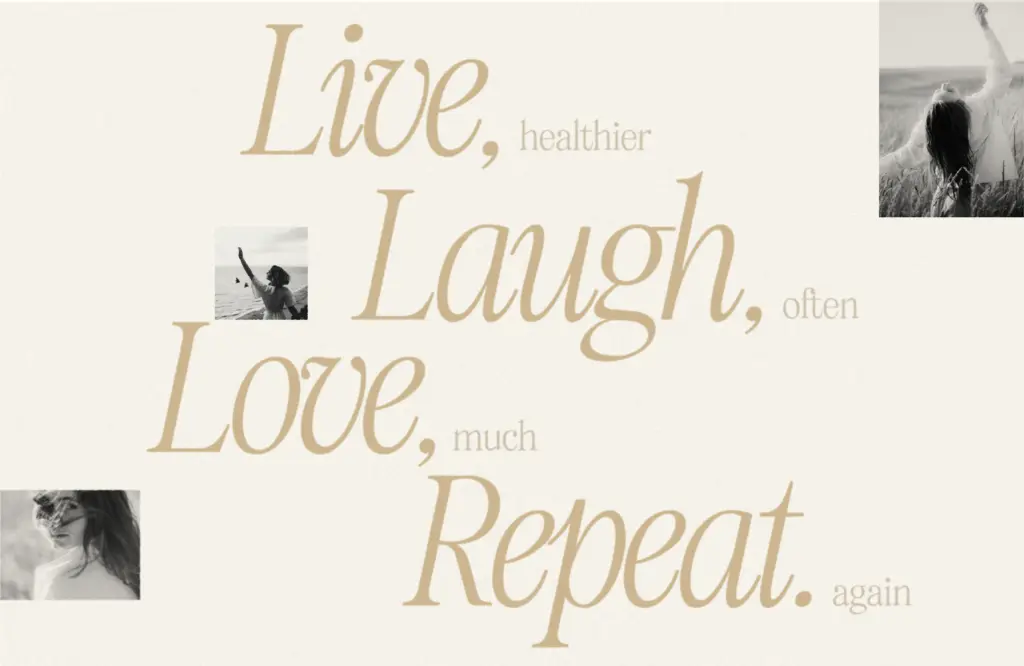
The seller pitches Fitzgerald for both display and body text, and that claim needs some scepticism. At headline and subhead sizes — logos, packaging front panels, editorial mastheads, Instagram graphics — the contrast and serif detail read clearly and give the retro mood the format wants. At long-form body copy sizes, the contrast starts to work against it: thin strokes that look crisp at 60px can thin out and lose density in a paragraph of 10px text, especially on screen. Treat it as a strong display and short-copy serif with body-text capability reserved for print runs at generous point sizes, not as a workhorse text face for dense web copy.
Where it earns its keep is branding work with a vintage or Americana lean — wedding stationery, café and bakery packaging, editorial pull quotes, logotypes that want warmth without looking handwritten. Pair the Regular for setting and the Bold for emphasis, and keep line lengths short if you push it into paragraph use. It’s a font with a clear lane; the trick is staying inside it.
What we liked, and what we didn’t
Strengths
- Contrast is restrained enough to avoid looking like pastiche didone revival.
- Bold weight is genuinely useful for emphasis rather than purely decorative.
- Diacritic coverage for European languages and Vietnamese broadens its practical reach.
Trade-offs
- Body-text legibility suffers at small sizes due to stroke contrast thinning out.
- Full ligature access requires OpenType-aware software with a glyphs panel, not universal in lighter apps.
Fitzgerald is a competent, well-drawn retro serif that earns its keep in logos, packaging and short display copy. It's less convincing as a body-text face, despite the seller's claims, since the contrast thins out at small sizes. A solid pick for vintage-leaning branding work, not a do-everything family.

Tmfonts writes independent reviews of typefaces: what each font does well, where it falls short, what it suits, and where it is sold.