
Oranges & Lemons Font Duo Free Download
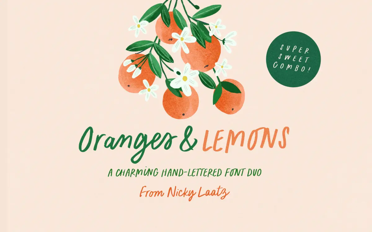
Is Oranges & Lemons Font Duo free to download?
Oranges & Lemons Font Duo is a commercial font sold on Creative Market, so the full version needs a paid license. Get it from the official listing: Oranges & Lemons Font Duo download.
Need something free? These script fonts from Google Fonts are free for personal and commercial use:
Design style
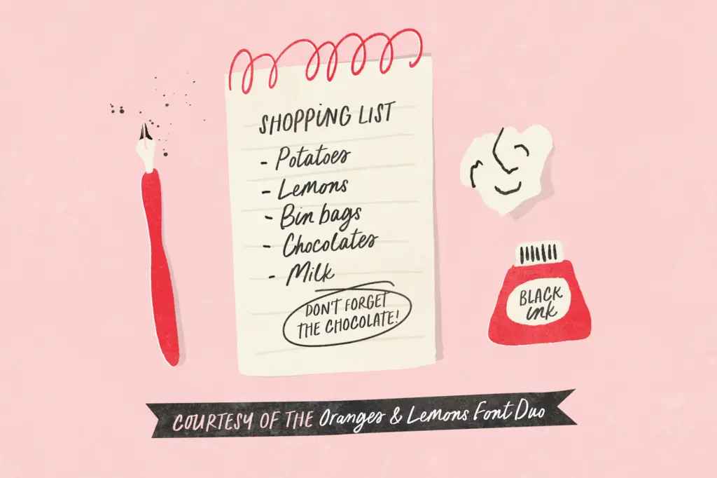
Oranges & Lemons is a two-piece set built around a single idea: informal, marker-drawn lettering that reads as if it were written quickly with a felt-tip pen rather than plotted in a vector program. The script half carries the loose, slightly wobbly connection you get from real handwriting, with joins that don’t try to hide their inconsistency. The all-caps companion is blunter and squarer, styled like the marker lettering you’d see on a hand-drawn sign or the cover of a picture book, and it’s built to sit alongside the script rather than stand on its own.
Neither style aims for polish. The strokes have visible texture at the terminals, and the baseline drifts a little from letter to letter, which is the point — this is a duo built to look drawn, not typeset. That approach works well for the tone it’s going after: warm, unfussy, a bit playful. It won’t suit anything that needs to look considered or expensive.
Character set and features
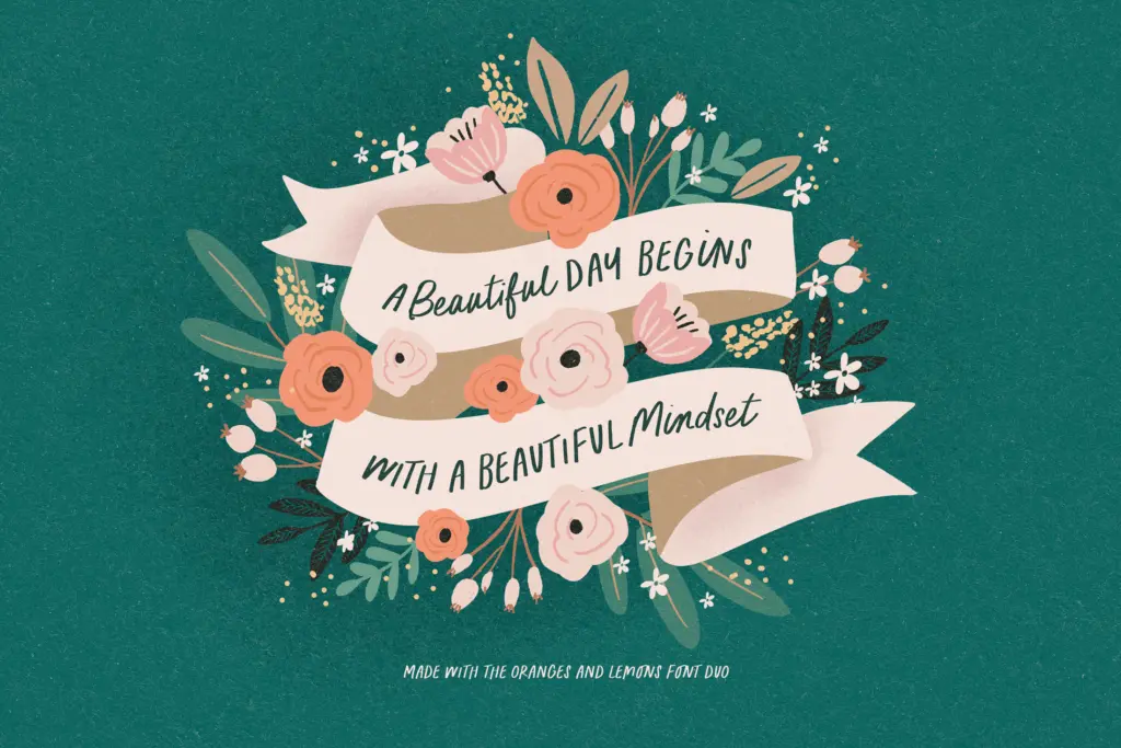
Both fonts include OpenType ligatures, and they matter more here than in most script faces — the seller is upfront that you need to switch ligatures on to see the intended letter connections, and without them the script loses a good deal of its charm and starts to look like disconnected pieces rather than handwriting. Any workflow that strips OpenType features (some web builders and older layout tools do) will flatten the effect, so it’s worth checking before committing to a layout.
Language support extends across a decent spread of European languages, including several with accented characters, so the duo should hold up for projects outside straightforward English-language use. There’s no indication of extended weight options or a variable axis — this is a fixed-style pairing, not a family with a range of gradations.
Use cases
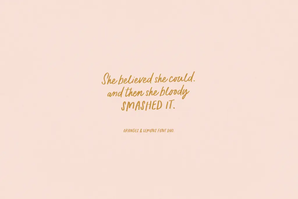
This is a font for warmth over authority. Greeting cards are the obvious home, and the duo does that job well — the script for a sentiment, the marker caps for a short header or a name. Children’s book covers and interior titling suit it too, as does packaging that wants to read as handmade or small-batch rather than manufactured. Illustrated quotes, recipe cards, plant labels, and similar nature- or kitchen-adjacent ephemera are all reasonable fits given the tone.
It’s less suited to formal branding, editorial body text, or anything that needs to project restraint. The looseness that makes it charming at small, casual applications becomes a liability at large display sizes or in contexts where consistency matters — a logo built from this script will carry its handwritten wobble into every reproduction, which is fine for a bakery and wrong for a law firm. Pairing the script with the marker caps gives you a built-in contrast for headline-plus-accent layouts, which is useful, but don’t expect either style to double as a workhorse text face. Use it where a hand-drawn feeling is the actual brief, not a background texture.
What we liked, and what we didn’t
Strengths
- Marker-cap and script pairing gives a ready-made contrast for header-plus-accent layouts
- Ligature-driven joins give the script a genuinely handwritten feel when features are enabled
- Broad European language support beyond basic English
Trade-offs
- Ligatures are essential to the design, so it loses its character in tools that strip OpenType features
- Too loose and inconsistent for formal branding or any use requiring a controlled, tidy look
Oranges & Lemons does one job convincingly: warm, handmade-looking lettering for casual, personal-facing work. It leans heavily on OpenType ligatures to deliver its charm, and it has no ambitions beyond the tone it's built for, which is fine as long as buyers know that going in.

Tmfonts writes independent reviews of typefaces: what each font does well, where it falls short, what it suits, and where it is sold.