
Royale Couture Font Free Download
Is Royale Couture free to download?
Royale Couture is a commercial font sold on Creative Market, so the full version needs a paid license. Get it from the official listing: Royale Couture font download.
Need something free? These serif fonts from Google Fonts are free for personal and commercial use:
Design style
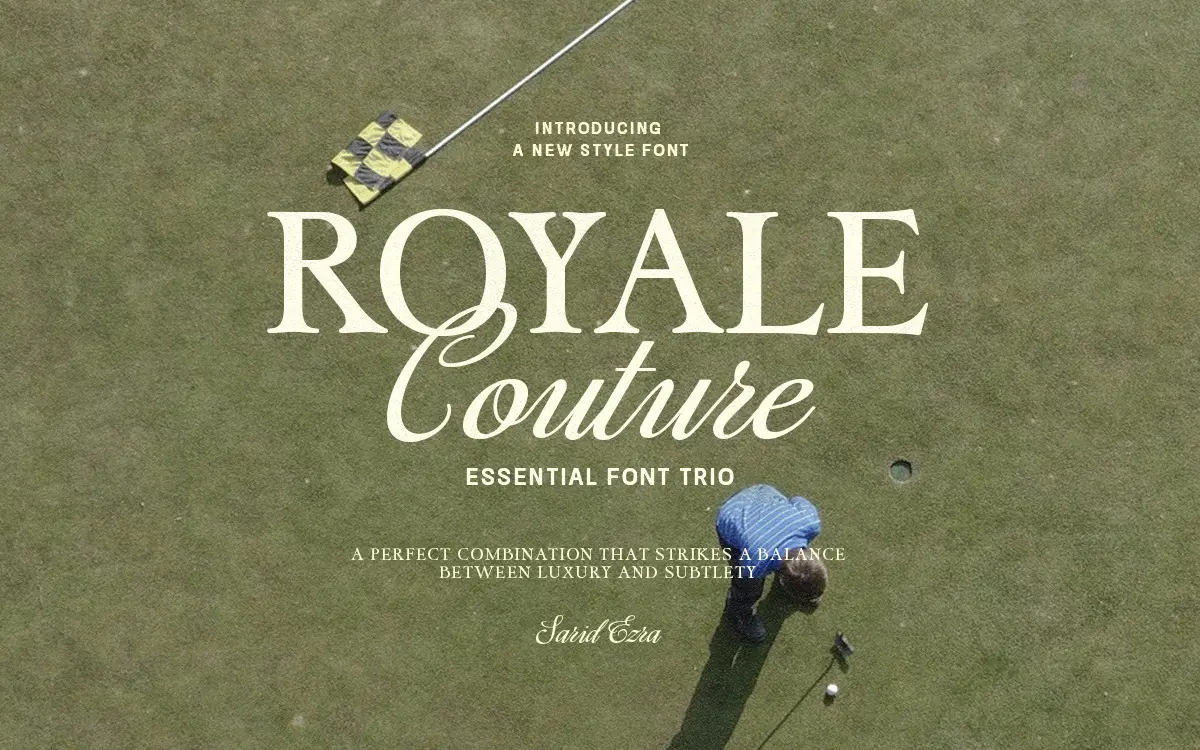
Royale Couture is built as a set from the start rather than three fonts stitched together after the fact, and that shows in how the pieces relate. The bold serif carries the weight: thick vertical stems, tapered serifs, and enough contrast to read as confident rather than heavy. The classic sans strips that same skeleton down to bare structure, keeping proportions consistent with the serif so the two can sit on the same page without a visible seam. The script is the flourish piece, looping and connected, clearly meant for accents rather than paragraphs. None of the three is doing anything radical on its own. The value is in how deliberately they’ve been drawn to the same underlying grid, so swapping between them doesn’t jolt the eye.
Character set and features
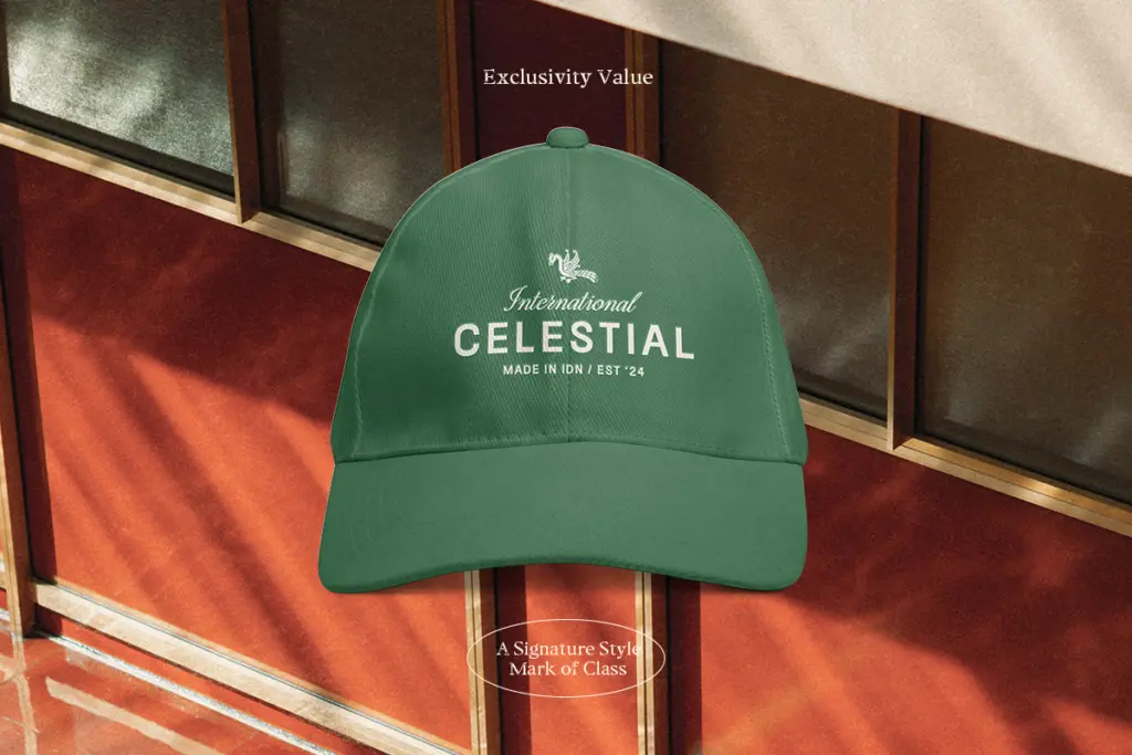
All three styles cover numerals and basic symbols, and the trio is positioned as multilingual, which matters if you’re producing packaging or branding for markets beyond a single language. The script leans on connecting strokes and alternate forms to avoid the flat, robotic look that plagues a lot of script fonts built without enough ligature work — though without a full glyph chart in hand, it’s worth checking how deep that alternate set actually goes before committing a full logotype to it. The serif and sans are more straightforward: clean, dependable letterforms without much personality of their own, which is exactly the point when they’re meant to support a flashier script rather than compete with it.
Use cases
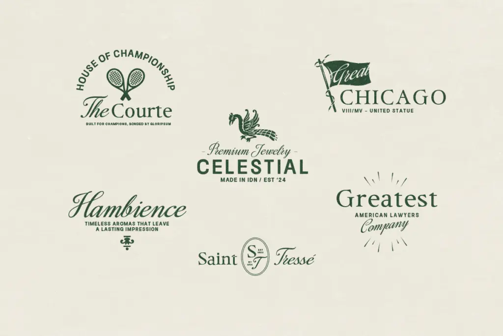
This is a branding kit, not a text-setting typeface, and it should be used that way. The serif works for a logotype or a short headline where you want some weight and formality — think a boutique name plate or a product label. The sans is the workhorse: body copy on packaging, secondary lines under a logo, anywhere you need something quiet and legible. The script is the one doing the emotional labour, best kept to short phrases, monograms, or a single accent line on an invitation rather than anything long-form, since connected scripts lose clarity fast once you’re setting more than a few words. Put together, the trio suits fashion labels, beauty brands, wedding stationery, and Instagram-native branding where a

What we liked, and what we didn’t
Strengths
- The three styles share consistent proportions, so pairing them is genuinely low-effort.
- The bold serif has enough contrast to hold up as a standalone logotype face.
- Multilingual and numeral support extends its use beyond simple English wordmarks.
Trade-offs
- The serif and sans are safe rather than distinctive, so the kit leans heavily on the script for personality.
- Long-form script setting quickly loses legibility, limiting it to short phrases and accents.
Royale Couture does what a branding trio is supposed to do: give you a serif, a sans and a script that were clearly drawn to sit together, saving the pairing headache. Individually the serif and sans are competent but unremarkable, and the script needs restraint to avoid looking generic at length. It's a solid pick for fashion and lifestyle branding rather than a typeface you'll reach for on a text-heavy project.

Tmfonts writes independent reviews of typefaces: what each font does well, where it falls short, what it suits, and where it is sold.