
Honeymoon Hand Script & Doodles Font Free Download
Is Honeymoon Hand Script & Doodles free to download?
Honeymoon Hand Script & Doodles is a commercial font sold on Creative Market, so the full version needs a paid license. Get it from the official listing: Honeymoon Hand Script & Doodles font download.
Need something free? These script fonts from Google Fonts are free for personal and commercial use:
Design style
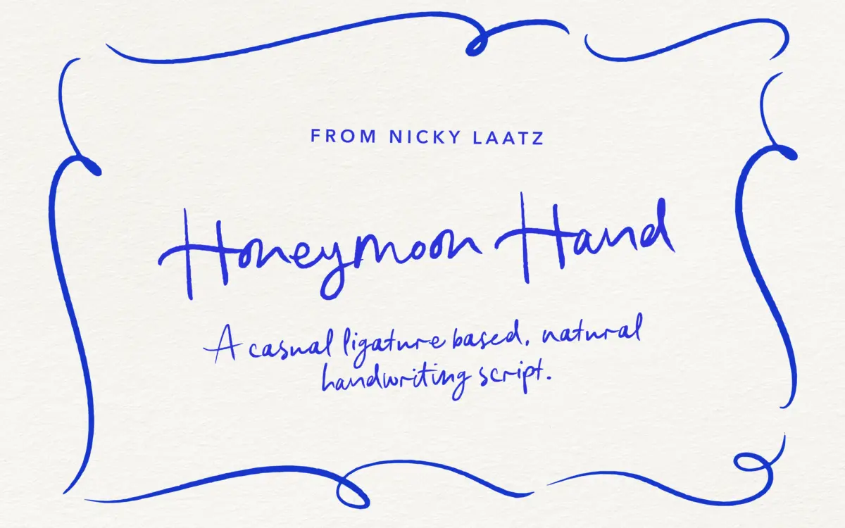
Honeymoon Hand Script is built around the pretence of a fast, unselfconscious hand rather than a formal calligraphic model. Strokes wobble slightly, baselines drift, and joins between letters look tugged rather than engineered. That looseness is the entire design argument: it wants to read as a note scrawled by someone in a good mood, not as a font chosen from a catalogue.
The letterforms lean casual over elegant. Ascenders and descenders swing out with some flourish, but nowhere near the theatrical loops of a formal script. Nib pressure is implied rather than drawn with real contrast, so the stroke weight stays fairly even throughout a word, which helps the wobble read as charm rather than clumsiness. It’s a script pitched at warmth over precision, and it delivers that consistently.
Character set and features
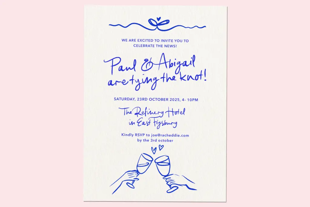
The OpenType ligature set is doing real work here. Handwritten scripts live or die on whether repeated letter pairs and awkward junctions look natural, and this one leans on automatic substitutions to smooth those spots out rather than leaving the burden on the user to manually swap glyphs. In a supporting font application, that matters — set a word without the ligatures active and you’ll see the seams the feature was built to hide.
Language support extends beyond English to French, Spanish, Irish, Low German, the Norwegian variants, Portuguese, and Swiss German, so accented setting in European wedding markets is covered rather than left to guesswork. The bundled doodles — vector illustrations plus transparent PNGs — are a genuine bonus rather than filler. Think small floral sprigs, hearts, arrows, the kind of embellishment that pairs naturally with a script this informal, and having them as both editable vectors and drop-in PNGs saves a production step for anyone building invitation suites or social graphics.
Use cases
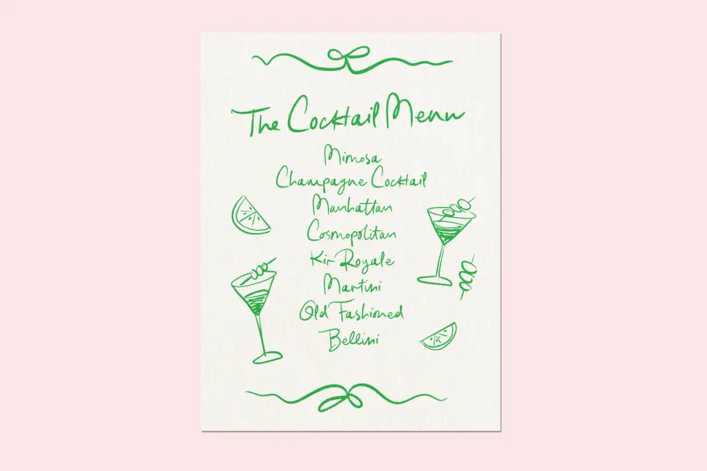
This is a font for occasions, not for body copy. Wedding invitations and save-the-dates are the obvious home, and the script’s informality suits couples steering away from anything that reads as stiff or traditional. It also works for greeting cards, gift tags, and short social captions where a handwritten voice adds warmth — logos for small, friendly brands (bakeries, florists, lifestyle accounts) can borrow the same tone.
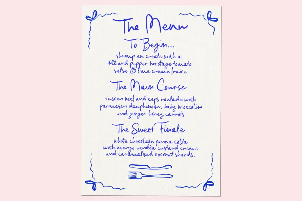
Keep it short. A signature line, a name, a short greeting all sit comfortably; a paragraph of it will fatigue the eye fast, since the irregularity that reads as charming at large sizes becomes noise once you’re asking readers to parse sentences. Pair it with a plain sans or a quiet serif for any supporting text — dates, addresses, RSVP details — so the script stays the accent rather than the whole voice. Set it big, let the doodles do some of the lifting, and it earns its keep.
What we liked, and what we didn’t
Strengths
- Ligature set smooths natural-feeling letter joins that most casual scripts fumble
- Bundled vector and PNG doodles save a production step for invitation and card layouts
- Broad European language support beyond the usual English-only script
Trade-offs
- Legibility drops quickly past a line or two of running text
- The even stroke weight makes it read more casual-cute than genuinely calligraphic
Honeymoon Hand Script does one job well: a casual, romantic handwritten voice for short wedding-related copy, backed by a ligature set that earns its keep. It's not built for long-form setting and shouldn't be asked to do more than a line or two at a time, but within that narrow brief it's genuinely useful, especially with the doodle pack thrown in.

Tmfonts writes independent reviews of typefaces: what each font does well, where it falls short, what it suits, and where it is sold.