
Postcards From Portugal Font Free Download
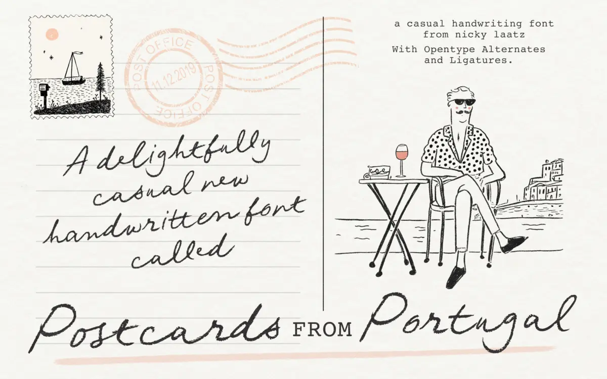
Is Postcards From Portugal free to download?
Postcards From Portugal is a commercial font sold on Creative Market, so the full version needs a paid license. Get it from the official listing: Postcards From Portugal font download.
Need something free? These script fonts from Google Fonts are free for personal and commercial use:
Design style
Postcards From Portugal is a penned script built on an unsteady, deliberately imperfect baseline. The strokes carry the texture of a felt-tip or rollerball dragged quickly across paper — you can see where the ink thickens at the start of a letter and thins as the pen lifts. It doesn’t try to fake the polish of a calligraphy nib. The joins are loose, the loops are a bit lopsided, and that looseness is the whole point: this is a script styled after a hand-written note dashed off on a sunny terrace, not a formal invitation hand.
Where it earns its “touch of elegance” claim is in the letter proportions. Ascenders and descenders swing out with enough length to give the words some air, and the x-height sits low enough that words read as a continuous, flowing line rather than a stack of separate letters. It sits somewhere between a casual marker script and a more considered brush script, and that middle ground is where most of its character lives.
Character set and features
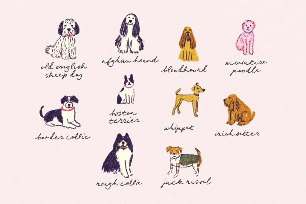
The family isn’t a single static script — it comes with a lighter weight, a narrower/compact cut, and oblique versions of each, which gives you more room to manoeuvre than a typical single-style handwritten font. The narrower cut in particular is worth trying for tighter spaces like labels or narrow packaging panels, where a full-width script would otherwise wrap awkwardly.
OpenType alternates and ligatures are built in, and they matter more here than in most scripts because the letterforms are irregular by design — repeated letters or common pairs can start to look mechanically repetitive if alternates aren’t switched on. In a design app that supports OpenType features (turning on stylistic alternates and standard ligatures), the font varies its letter shapes enough to hold the illusion of a handwritten note rather than a typed-out font pretending to be one. Skip that step and you lose a good part of what makes the design work — this is not a font to set-and-forget in a plain text box.
Use cases
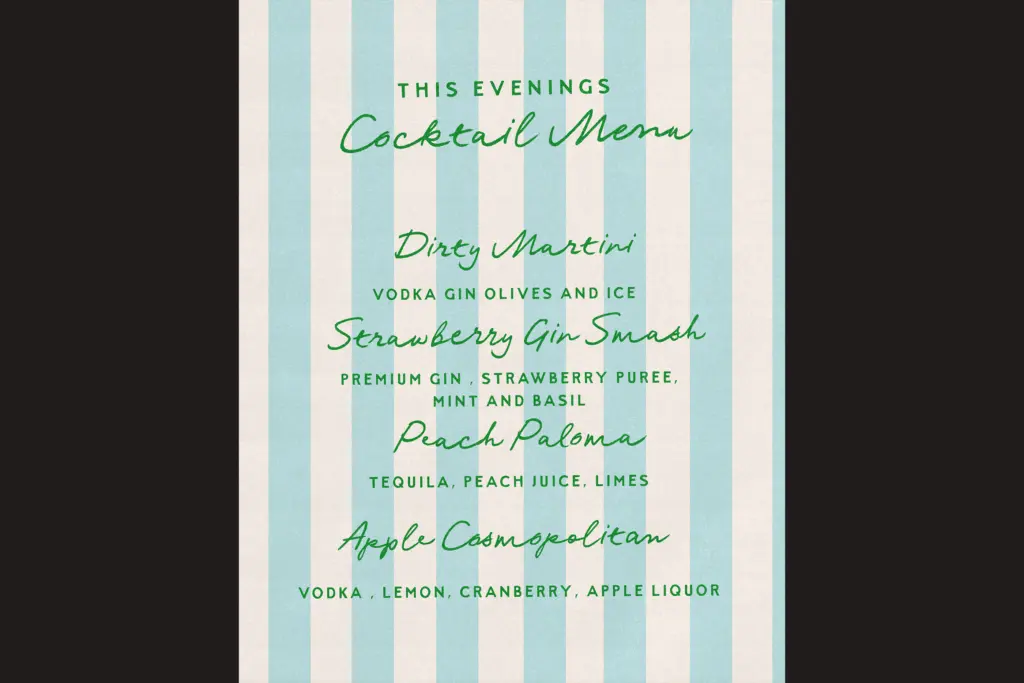
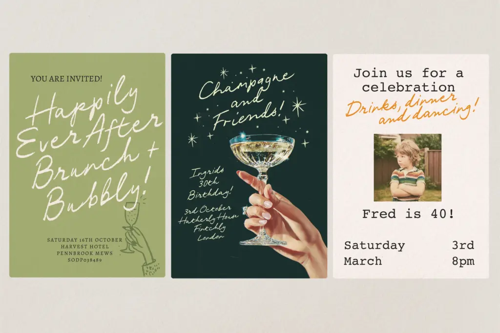
This is a font for short bursts of text, not paragraphs. It’s suited to postcards, packaging call-outs, greeting card messages, logotypes for travel or lifestyle brands, and the kind of quote graphic that gets shared on social media. The rough, sun-bleached feel works well anywhere a brand wants to signal informality — beach towns, coffee packaging, boutique hospitality — but it will fight against anything that wants to read as serious or corporate.
At smaller sizes the irregular baseline and thin ink traces start to lose definition, so it’s better reserved for headline-scale use: a product name on a label, a short phrase on an invitation, a wordmark. For body copy or dense settings, pair it with a plain sans or serif and let this font do the talking in short doses only.
What we liked, and what we didn’t
Strengths
- Multiple weights and a narrow cut give more flexibility than a single-style script
- Alternates and ligatures genuinely vary the letterforms when switched on
- Irregular pen-drawn texture reads as authentically casual rather than templated
Trade-offs
- Legibility drops quickly at small sizes due to the loose baseline and thin strokes
- Without OpenType features enabled the repetition becomes obvious and the illusion breaks
Postcards From Portugal is a well-drawn casual script that leans hard on its OpenType alternates to avoid looking repetitive. It's built for short, sun-drenched branding moments rather than long text, and it delivers well within that lane.

Tmfonts writes independent reviews of typefaces: what each font does well, where it falls short, what it suits, and where it is sold.