
Castrell Font Free Download
Is Castrell free to download?
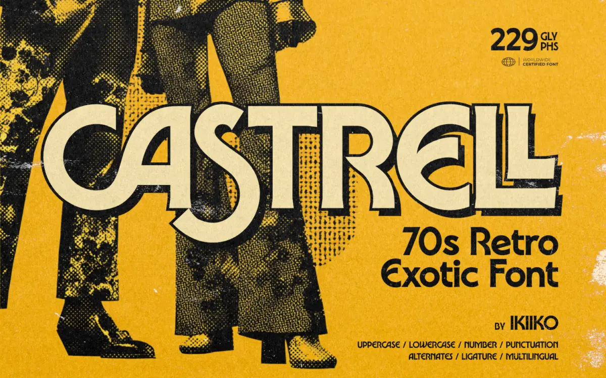
Castrell is a commercial font sold on Creative Market, so the full version needs a paid license. Get it from the official listing: Castrell font download.
Need something free? These display fonts from Google Fonts are free for personal and commercial use:
Design style
Castrell sits in that overworked-but-still-fun lane of 70s revival lettering, the kind of face built to look like it was airbrushed onto a van or printed on a Blaxploitation one-sheet. The letterforms are thick, rounded and confident, with bowls that bulge slightly past where a conventional sans would stop them. Terminals are soft rather than sharp, giving the whole alphabet a rubbery, inflated quality that reads as friendly rather than aggressive.
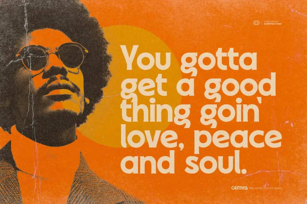
What makes it read as “exotic” rather than generic retro is the treatment of curves on letters like S, G and the lowercase a and g — they swing wider than expected, with a bit of extra flourish at the joins. It’s a display face with a clear point of view, not a warmed-over geometric sans with rounded corners bolted on. The design commits to its era rather than gesturing at it.
Weight is consistently heavy throughout, which is right for the genre but means there’s no lighter companion cut here to fall back on when a project needs restraint.
Character set and features
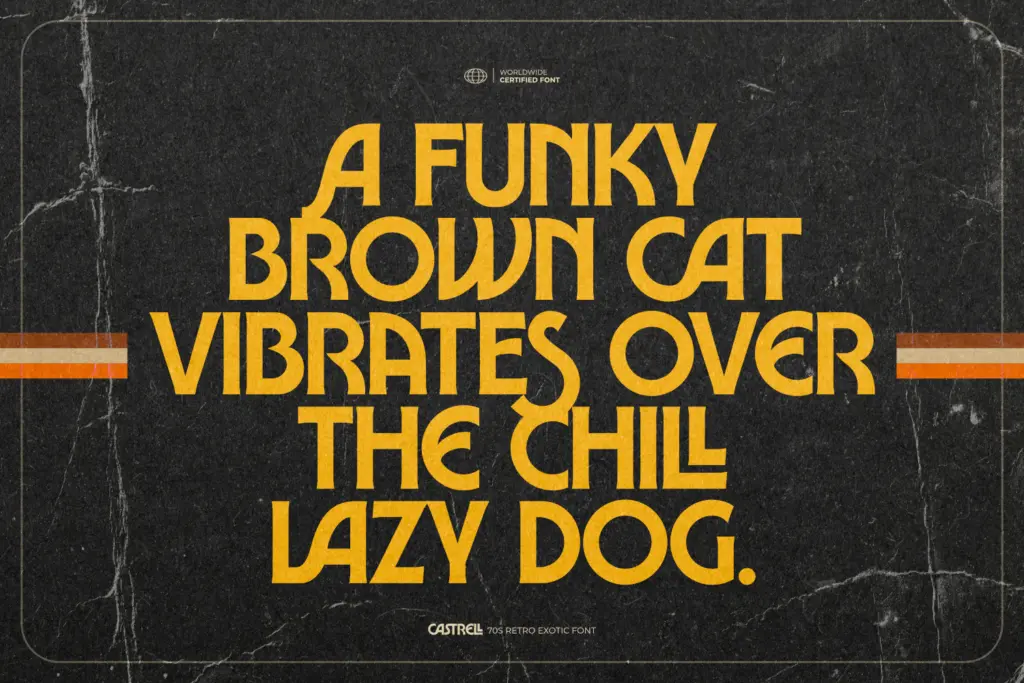
The set covers uppercase and lowercase, numerals and punctuation, with alternates and ligatures included for some letter pairs — useful for breaking up repeated letterforms in short headline-length settings, which is really the only length this font is built for. Multilingual support is mentioned, though the practical value of that will depend on how far the diacritic coverage actually extends; treat it as a bonus rather than a reason to buy.
Because the letterforms are so rounded and wide, spacing needs attention at small sizes — pairs like the lowercase r and n can start to merge visually if tracking is left too tight. This isn’t a flaw so much as a reminder that display faces like this are drawn for word-scale impact, not paragraph-scale reading. At three or four words set large, the rhythm the designer built in really does carry the piece.
Use cases
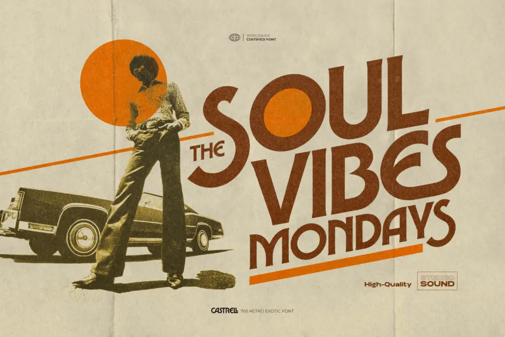
This is a poster and title font first. Think vintage movie titles, funk and soul album art, retro logo marks, and packaging that wants to nod at 70s design without going full parody. It has enough personality to anchor a brand mark on its own — a short word set in Castrell doesn’t need much else around it.
It’s less suited to anything that needs a body copy partner in the same voice, or to contexts where restraint matters — a law firm rebrand or a minimalist product label will find Castrell far too loud. It also won’t do well shrunk into UI text or small print; the curves that make it distinctive at large sizes just muddy at 10px.
For apparel graphics, festival posters, and any project deliberately chasing a funk or disco-era mood, it does the job with conviction and without much hand-holding needed from the designer using it.
What we liked, and what we didn’t
Strengths
- Distinctive rounded curves give it real period character rather than a generic retro look
- Alternates and ligatures help break up repetition in short headline settings
- Heavy, consistent weight makes it read confidently at poster scale
Trade-offs
- No lighter weight companion, so it can't flex into lower-impact uses
- Rounded letterforms crowd together at small sizes and need careful spacing
Castrell commits fully to its 70s funk brief with rounded, swaggering letterforms that work well as short-form display type. It's not built for reading at length or for quiet contexts, but for posters, logos and title cards chasing a disco-era mood, it delivers convincingly.

Tmfonts writes independent reviews of typefaces: what each font does well, where it falls short, what it suits, and where it is sold.