
Pomp & Circumstance Font Free Download
Is Pomp & Circumstance free to download?
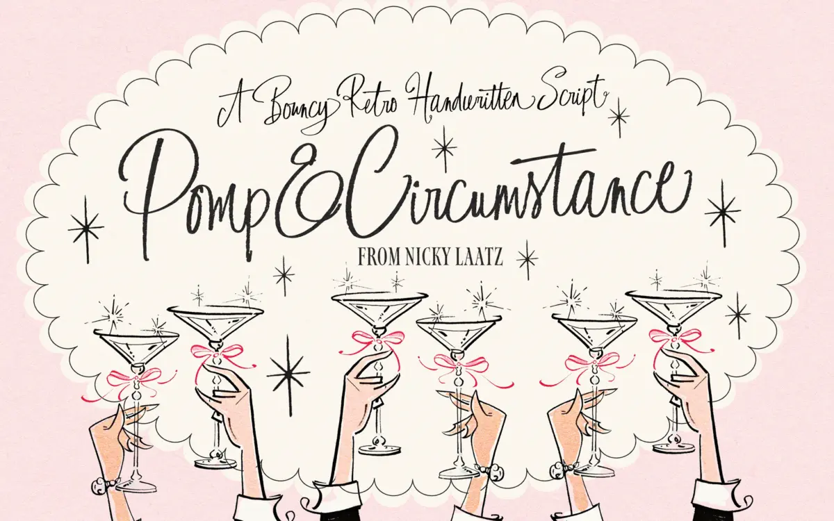
Pomp & Circumstance is a commercial font sold on Creative Market, so the full version needs a paid license. Get it from the official listing: Pomp & Circumstance font download.
Need something free? These script fonts from Google Fonts are free for personal and commercial use:
Design style
Pomp & Circumstance is a handwritten script built around irregularity rather than flow. The strokes have a deliberate wobble to them, as if drawn with a dry brush or a chunky marker, and that texture is the point: this is not a font chasing elegance or continuous calligraphic movement. Letters bounce up and down off an uneven baseline, and the joins between characters look hand-placed rather than mechanically connected. It reads as a nod to 1950s hand-lettering — the kind you’d see on a diner sign or a greeting card from that era — filtered through a modern, slightly cartoonish sensibility.
The weight is fairly heavy and consistent through most strokes, with only mild contrast, which suits the textured, almost woodblock feel of the letterforms. Nothing about it is trying to look refined. It’s cheerful and a little rough at the edges, and that roughness is baked into the drawing rather than applied as an effect.
Character set and features
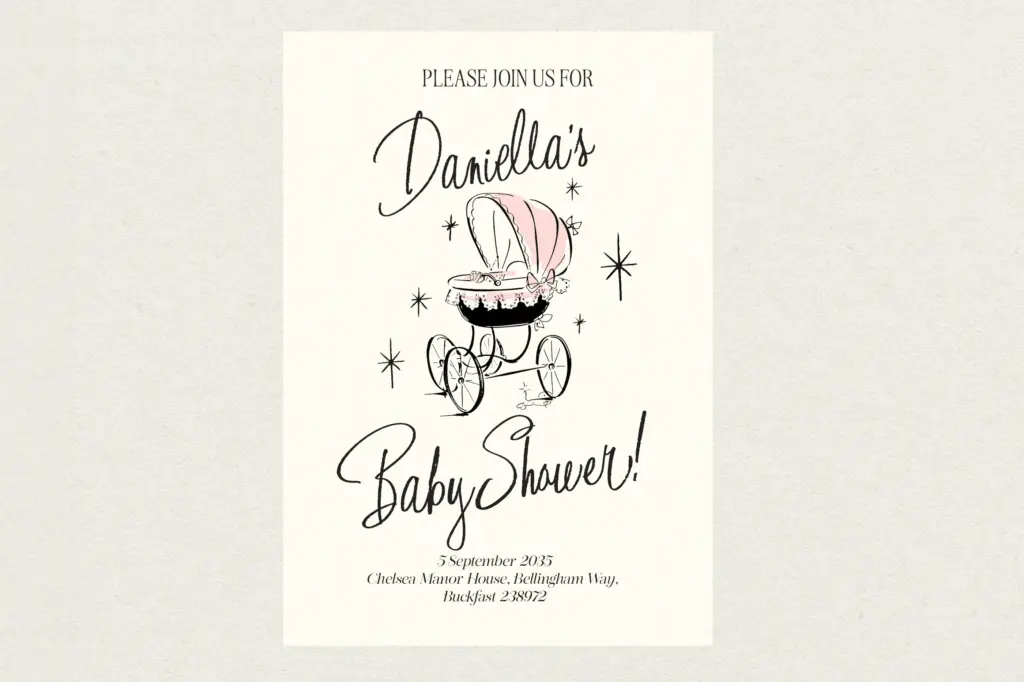
The font comes loaded with OpenType alternates and ligatures, which matters more here than in most scripts because the base letterforms are so idiosyncratic — swapping in alternates is how you avoid obvious repetition when the same letter shows up twice in a word. Accessing them properly requires OpenType-aware software; the seller has also PUA-encoded the glyphs so they can be reached through Font Book or Character Map and pasted in, which is a reasonable workaround for people working in apps without full OpenType support, though it’s a slower, more manual process than clicking a stylistic-alternates panel.
Given the handwritten, alternate-heavy construction, this is not a font to set on autopilot. Getting a natural-looking result means going letter by letter, swapping in alternates where a word starts to look too uniform or where letters collide awkwardly. That’s typical of scripts in this genre, but worth flagging for anyone expecting to type a sentence and have it look finished immediately.
Use cases
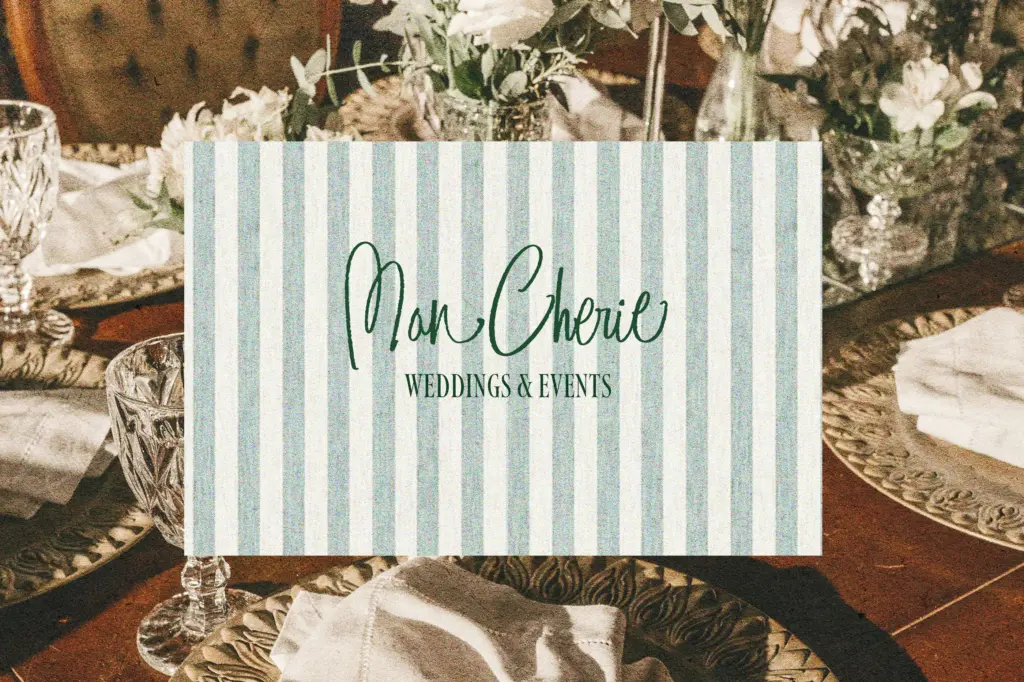
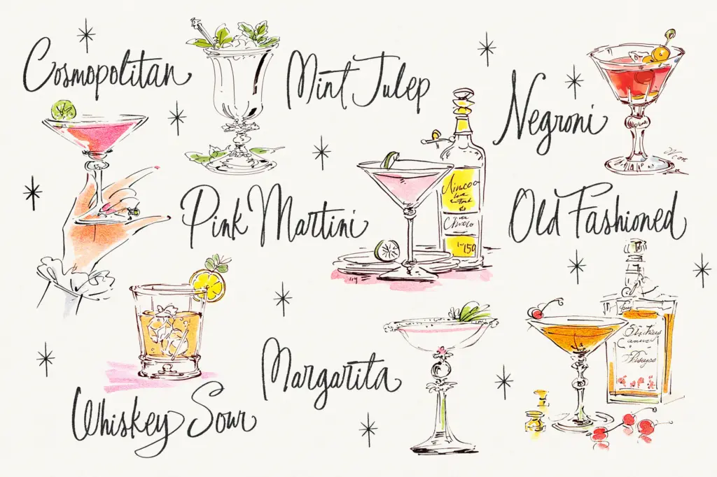
This suits short bursts of text where personality matters more than information density: a greeting on a card, a name on an invitation, a headline on packaging aimed at a younger or more casual audience, a logotype for a brand that wants warmth over polish. Its retro, hand-drawn texture works well for baby announcements, birthday designs, and branding that’s leaning into nostalgia without going fully vintage-formal.
It is less suited to anything requiring restraint or long-form reading. The bounce and texture that make it charming at display sizes will work against legibility the moment you drop it below headline size or try to set more than a few words. It also won’t suit a wedding aiming for a traditional, elegant tone — the deliberate roughness reads as playful rather than romantic, so it’s a poor fit for formal invitations even though the seller lists weddings among its uses. For quirky, fun-first branding and greeting-card work, though, it does the job it sets out to do.
What we liked, and what we didn’t
Strengths
- Distinctive dry-brush texture gives it a genuine hand-lettered feel rather than a generic script look.
- Generous alternates and ligatures let you break up repetition across a word.
- PUA encoding means the extras are reachable even without full OpenType support.
Trade-offs
- Legibility drops fast below display sizes, so it's unsuitable for body text or dense layouts.
- Getting natural-looking results requires manually swapping alternates rather than typing and forgetting.
Pomp & Circumstance is a characterful, deliberately rough script that nails a specific retro, hand-lettered mood. It needs manual attention to alternates to look its best and is a poor fit outside short, playful display use.

Tmfonts writes independent reviews of typefaces: what each font does well, where it falls short, what it suits, and where it is sold.