
Modernline Font Free Download
Is Modernline free to download?
Modernline is a commercial font sold on Creative Market, so the full version needs a paid license. Get it from the official listing: Modernline font download.
Need something free? These script fonts from Google Fonts are free for personal and commercial use:
Design style
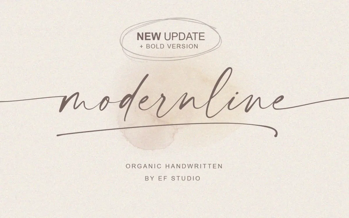
Modernline sits in the casual-signature end of the script spectrum: a single-line, monoline-leaning handwritten face that reads as if someone wrote it quickly with a felt brush and didn’t fuss over it afterward. The stroke has some contrast, but it’s subtle rather than the deep thick-thin swing of a formal calligraphic script. Letters lean forward slightly and connect with loose, uneven joins that feel like genuine handwriting rather than a vectorised approximation of it.
The ‘organic’ label the brief uses is fair. Baselines drift a little, x-heights aren’t rigidly uniform, and the ascenders and descenders loop with some variation from letter to letter. That’s the point of a font like this — it’s meant to avoid the stamped-out look that plagues a lot of script releases. The trade-off is that it won’t sit as cleanly in a strict grid as a more geometric script would; you’re buying informality, and informality has a ceiling on how tidy it can look.
The addition of a bold weight is the more useful update here. It doesn’t just thicken the stroke uniformly — it gives the face enough presence to hold its own as a headline rather than only working as an accent word beneath a sans serif.
Character set and features
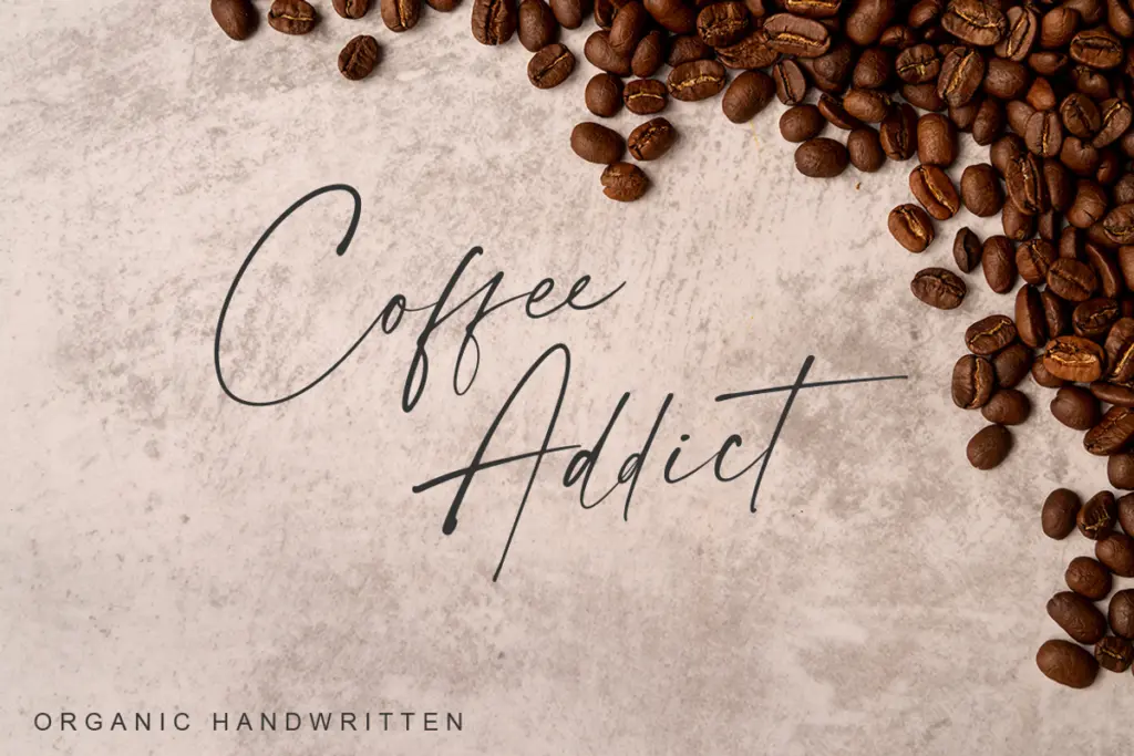
Full upper and lowercase, numerals, punctuation, and multilingual character support cover the basics without complaint. The more interesting part is the ligature and swash set: beginning and ending swashes on the lowercase, plus extra swash variants, give you room to dress up a word without switching typefaces. The ‘tail’ variant included alongside the main font and its bold counterpart is effectively a second flavour of the same script — useful when you want a more expressive terminal on a final letter without hand-kerning it yourself.
Because it’s a connecting script, spacing needs attention. Letters are designed to flow into one another, so setting it in all caps or forcing unusual letter-spacing will break the illusion of handwriting fairly quickly. This is a font that rewards word-by-word typesetting, not paragraph setting — it isn’t built for body copy and shouldn’t be asked to do that job.
Use cases
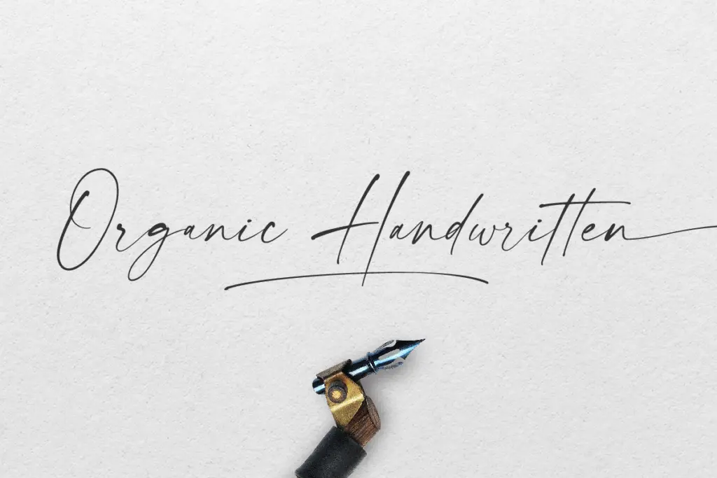
Modernline’s natural home is short-form: a signature-style logotype, a name on a wedding invitation, a single line on packaging, a sign-off on a poster. The looseness that makes it feel handwritten also makes it unsuitable for anything that needs to be read in volume or at small sizes — swashes and thin joins lose definition once you’re below the size a real signature would appear at. Used at display size, where the connections and variation can be seen properly, it reads as intended.
Pairing it with a plain, restrained sans or serif for supporting text is the standard approach with a script like this, and it will need that support — Modernline is not a font family that wants to carry an entire piece of design on its own.

What we liked, and what we didn’t
Strengths
- Loose, uneven joins genuinely read as handwriting rather than a templated script
- New bold weight gives it enough weight to work as a standalone headline
- Swash and ligature set lets you vary single words without extra typefaces
Trade-offs
- Needs generous size to hold its thin connecting strokes and swashes legibly
- Not suited to setting in caps or with adjusted letter-spacing without breaking the flow
Modernline is a competent, unfussy handwritten script that does the signature-and-invitation job well, especially now that a bold weight gives it some headline presence. It's not a font for body copy or tight grids, and the looseness that gives it character also limits how small it can go. A solid, narrow-purpose tool rather than a versatile workhorse.

Tmfonts writes independent reviews of typefaces: what each font does well, where it falls short, what it suits, and where it is sold.