
Classy Marisa Font Free Download
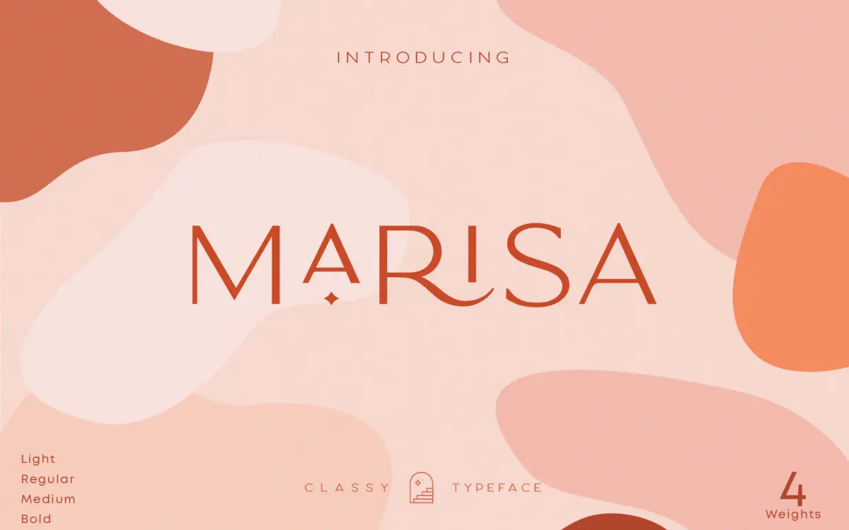
People searching for a Classy Marisa free download usually have a logo, a shop sign or a product label in mind and want to test these wide, light capitals before paying for them. There is no official free version. Kaligra.co sells Classy Marisa only under paid licences, and neither its own shop nor its Creative Market listing offers a demo or personal-use file.
Classy Marisa free download: is there a legal free copy?
No. The product page on Kaligra.co has a Buy Now button and four licence choices, Desktop, E-pub, App and Webfont, with nothing to download for free. The Creative Market listing works the same way. When we checked in October 2026, Creative Market listed the Desktop licence at $35 per seat, Webfont at $49, E-pub at $75 and App at $332. Prices and discounts change, so confirm them on the listing before you buy.
A licence gets you the whole family: Light, Regular, Medium and Bold, plus the alternates and ligatures. Kaligra says the download includes TTF, OTF and web files. Copies passed around as a Classy Marisa free download on font-sharing sites were not distributed by Kaligra, and they come with no licence you could rely on for a client’s logo or a product you sell.
Get Classy Marisa — official listing
Classy Marisa specimen and verified specs
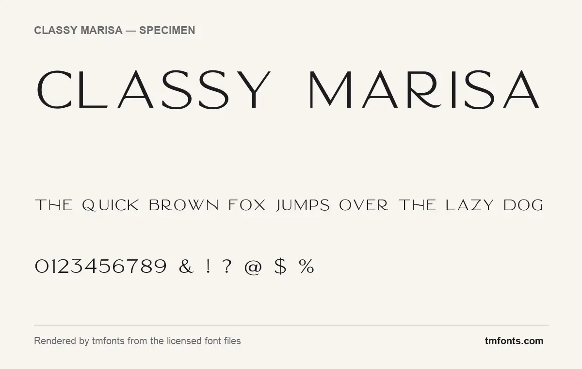
- Styles: 4 (Bold, Light, Medium, Regular)
- File formats: OTF
- Glyphs: 217
- Language support: Basic Latin (English), Western European
- OpenType features: discretionary ligatures, kerning
- PUA-encoded extras: 77 glyphs (usable in Canva and Cricut)
- Case: All caps (lowercase keys type capitals)
Checked by tmfonts from the licensed font files.
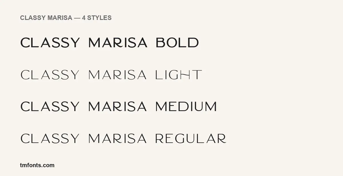
How Classy Marisa is drawn
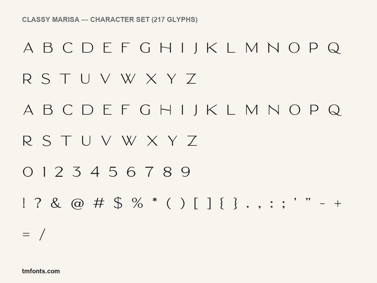
Classy Marisa is a capitals-only display face. In the character set rendered from the licensed files, the lowercase keys hold a second set of capitals, the same height as the uppercase but with small differences in letters such as H and R, so anything you type, including sentence case, comes out in caps.
Set a word and the first thing you notice is air. Round letters take up nearly a full square, and the font’s built-in spacing leaves a wide gap between characters, so a word like MARISA already looks letterspaced before you touch the tracking. Strokes are thin with a slight swell and taper, closer to a flared or engraved letter than to a strict geometric sans. The listing files it under sans-serif, but Kaligra itself calls it “a Minimalist Modern Elegant vintage font”.
Most of the alphabet is plain, which makes the odd ones stand out. Look at the character set and the H is the giveaway: its bar is a hooked line that climbs from left to right instead of sitting level. Diagonals in the N and Z bend gently rather than running straight, the J hangs below the line, and the W is two Vs that overlap in the middle. The Q’s tail runs flat along the baseline, far enough to sit under a following letter. The numerals share the same light, open drawing, with a flat-topped 3 and a round 0. In the four-weight image, Light is close to a hairline, while Bold keeps the same skeleton with enough weight to read from a distance.
Files, weights and glyphs in the licence
- Four weights: Light, Regular, Medium and Bold.
- Formats: OTF in the files we rendered; Kaligra lists TTF, OTF and web files.
- Glyphs: 217 in the Regular.
- Family name in your font menu: “Marisa”, not “Classy Marisa”.
- Extras: Kaligra’s description mentions ornaments as well as alternates and ligatures.
Accents, ligatures and reaching the alternates
The files cover Basic Latin and the Western European accented set, which handles English plus languages such as French, German, Spanish, Italian and Portuguese. Two OpenType features are built in:
- Kerning tightens or loosens specific letter pairs, for example A next to V. It works on its own in nearly every app.
- Discretionary ligatures are optional joined letter pairs. They stay off until you enable them in the OpenType panel of Illustrator or InDesign, or in Photoshop’s Character panel menu.
The more decorative glyphs are reachable another way: 77 of them are mapped to the Private Use Area (PUA), a block of Unicode code points that fonts use for extras. That matters in Canva and Cricut Design Space, which have no glyphs panel. On Windows, open Character Map, choose Marisa, copy the glyph and paste it into your text box; on a Mac, use Font Book or the Character Viewer. The pasted glyph only displays correctly while the text is set in Classy Marisa. Kaligra’s product page also links a video playlist on accessing glyphs in Canva and other apps.
Where Classy Marisa works, and what to pair it with
Kaligra pitches the font at branding, logos, clothing labels, packaging, magazine headers and text laid over photos. The specimens back that up: it looks best as one to four words with plenty of space around them, such as a boutique name, a perfume label or a cover line. Without a true lowercase it is the wrong choice for paragraphs, captions or anything someone has to read at length.
- Lora for body copy on menus, packaging backs and websites; its soft serifs suit Marisa’s tapered strokes.
- Libre Caslon Text when the brand should feel more bookish and traditional.
- Karla for small practical text such as prices, ingredients and contact details.
Personal and commercial licensing
Kaligra offers no free tier, and a Classy Marisa free download from a third-party site carries no licence at all, so a personal project needs the same paid licence as a commercial one. On Creative Market, the Desktop licence is sold per seat and covers making artwork on your computer, such as logos, print, merchandise and images for the web and social media. Embedding the font on a website calls for the Webfont licence, e-books for E-pub and apps for App. Kaligra’s own shop sells the same four types and invites enterprise buyers to ask about custom terms. This is a general summary, not legal advice; the licence file in your download sets the actual limits.
Installing the font files
Windows: unzip the download, select the four OTF files, right-click and choose Install (or Install for all users). Mac: unzip, double-click each file and click Install Font, or drag the files into Font Book. Restart your design apps afterwards. If you can’t find it, type “Marisa” in the font menu. For Canva, upload the files to Brand Kit, which needs a paid Canva plan.
DM Sans, Manrope and Raleway as free stand-ins
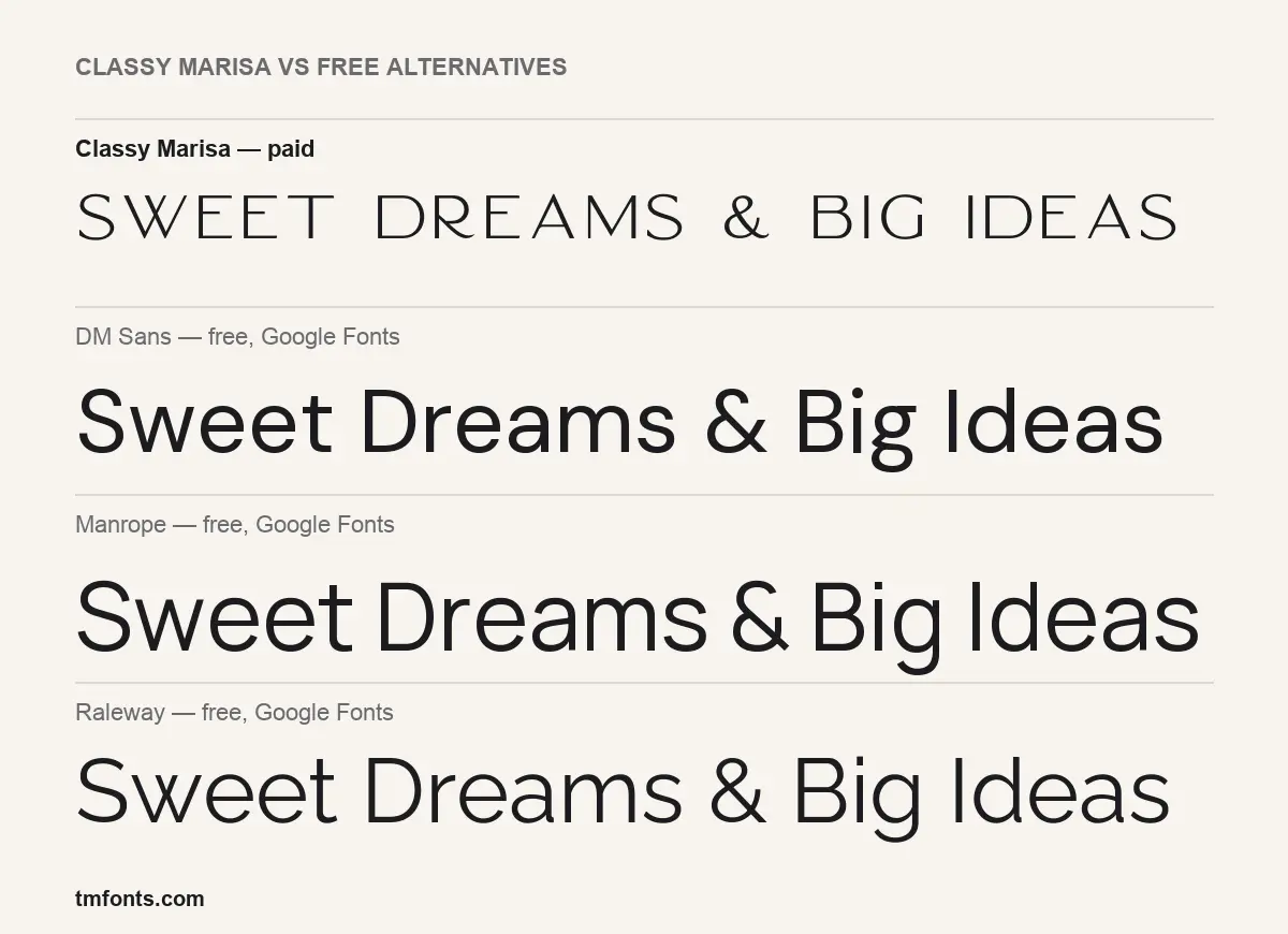
If the budget is zero, these three Google Fonts are free for commercial use under the SIL Open Font License. Our comparison sets the same phrase in each: all three are everyday sans families with a full lowercase, heavier and more compact than Classy Marisa at the same size.
- DM Sans is a low-contrast geometric sans with a round, friendly feel. Set in capitals with wide tracking it gets the airy look, but none of the curved details.
- Manrope is a modern grotesque with squarer curves and a technical tone. It is the most neutral of the three and the furthest from Marisa’s vintage mood.
- Raleway is the closest match. It has elegant, wide capitals, a thin weight, and a w with crossed middle strokes, which echoes Classy Marisa’s overlapping W.
Classy Marisa questions answered
Can I try Classy Marisa before buying it?
Not with an official demo. The specimens on this page, rendered from the licensed files, are the best free preview, and Kaligra’s product page has more sample images.
Why does my lowercase text come out in capitals?
That is how the font is built. The lowercase keys hold alternate capital forms, so every setting is all caps, and you can mix the two sets for variety.
Which weight should I use for small print?
Medium or Bold. The Light weight is close to a hairline and is best kept large.
Who publishes Classy Marisa?
Kaligra.co, also known as Kaligra Studio on Creative Market. The font files do not name an individual designer.

Tmfonts writes independent reviews of typefaces: what each font does well, where it falls short, what it suits, and where it is sold.