
Ranch Water Display Type Font Free Download
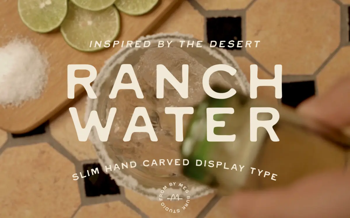
Is Ranch Water Display Type free to download?
Ranch Water Display Type is a commercial font sold on Creative Market, so the full version needs a paid license. Get it from the official listing: Ranch Water Display Type font download.
Need something free? These sans serif fonts from Google Fonts are free for personal and commercial use:
Design style
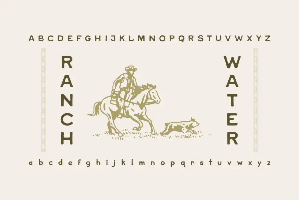
Ranch Water belongs to a familiar lineage of western display sans faces — the kind that reads like it’s been branded into wood rather than drawn on a screen. It’s pitched as a refined follow-up to the designer’s earlier Cowboy font, and the lineage shows: same rugged spirit, tightened up and given a lowercase. The letterforms lean slab-adjacent, with squared terminals and a slight taper on the strokes that suggests hand-carving without tipping into full-on distressed texture. There’s no grunge overlay here, no worn edges — the character comes from the shapes themselves, not from added wear.
The proportions are wide and confident, built for a headline rather than a paragraph. Strokes carry a modest contrast, thick enough to hold ink or paint texture in a branding mockup, thin enough to keep the letters from feeling clunky. It sits in that overlapping territory between rustic slab and western sans, and reads immediately as regional — Texas roadhouse, ranch supply, small-batch spirits — rather than generic vintage.
Character set and features
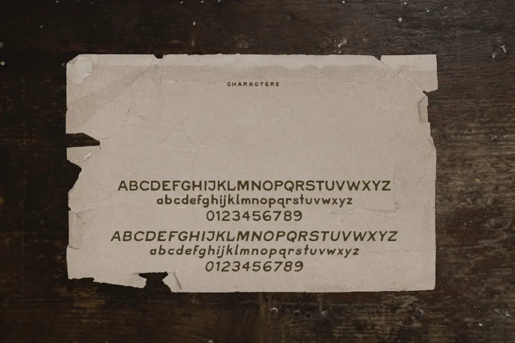
The addition of a lowercase is the meaningful upgrade over its predecessor, and it’s what makes Ranch Water usable beyond a single word in all caps. The lowercase keeps the same carved personality as the capitals but with shorter, sturdier ascenders and descenders, which helps it hold together at smaller display sizes without the letters feeling mismatched in weight.
Language support extends to English, Spanish, French, and German, so accented characters are covered if a label or menu needs them — useful for food and drink branding that often has to handle a few diacritics without switching typefaces mid-design. There’s no mention of an extended stylistic set, ligature package, or alternate characters, so treat this as a solid, single-style display font rather than one built for elaborate lettering compositions. It does what it does — a confident western display face — without trying to be a full family.
Use cases
This is a logo and packaging font first. It’s suited to short bursts of text: a brand name on a bottle label, a wordmark for a roadhouse or ranch-adjacent business, a headline on a menu or product tag. The carved, chunky character works well against leather, wood-grain, or matte paper stock backgrounds — anything that wants to feel handmade rather than digital. Given the western framing, it also suits event branding with a rustic or countryside theme, including invitations for a barn wedding or a rodeo-adjacent celebration, though it’s not an elegant script and shouldn’t be mistaken for one.
It’s not built for body copy or long-form setting — the wide proportions and heavy strokes get tiring fast at paragraph sizes, and the lack of a true text-weight companion means it needs to be paired with something else for supporting copy. Used as intended, in short display bursts, it does its job cleanly: warm, sturdy, and legible at a glance without needing texture effects to sell the mood.
What we liked, and what we didn’t
Strengths
- The carved, squared terminals give it a handmade feel without any added grunge texture.
- The new lowercase makes it far more flexible than an all-caps-only western font.
- Multilingual accent support means it can handle Spanish, French, and German branding without substitution.
Trade-offs
- No extended weight or text-friendly companion, so it can't handle body copy or long labels.
- Limited to one style with no visible alternates or ligatures, so compositional variety is minimal.
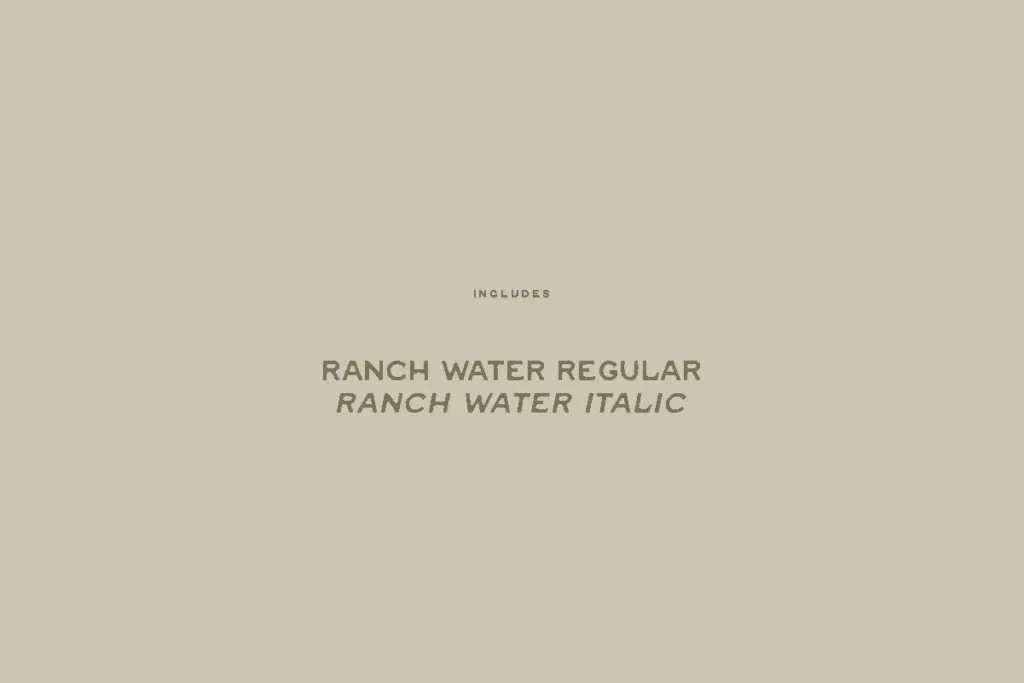
Ranch Water is a competent, single-purpose western display face that does exactly what it promises: short bursts of rustic, carved-looking branding text. It's not versatile enough to carry a whole project alone, but for a wordmark or label headline in that regional, handmade register, it delivers cleanly without leaning on distressed textures to fake authenticity.

Tmfonts writes independent reviews of typefaces: what each font does well, where it falls short, what it suits, and where it is sold.