
Mozart Script II Font Free Download
Is Mozart Script II free to download?
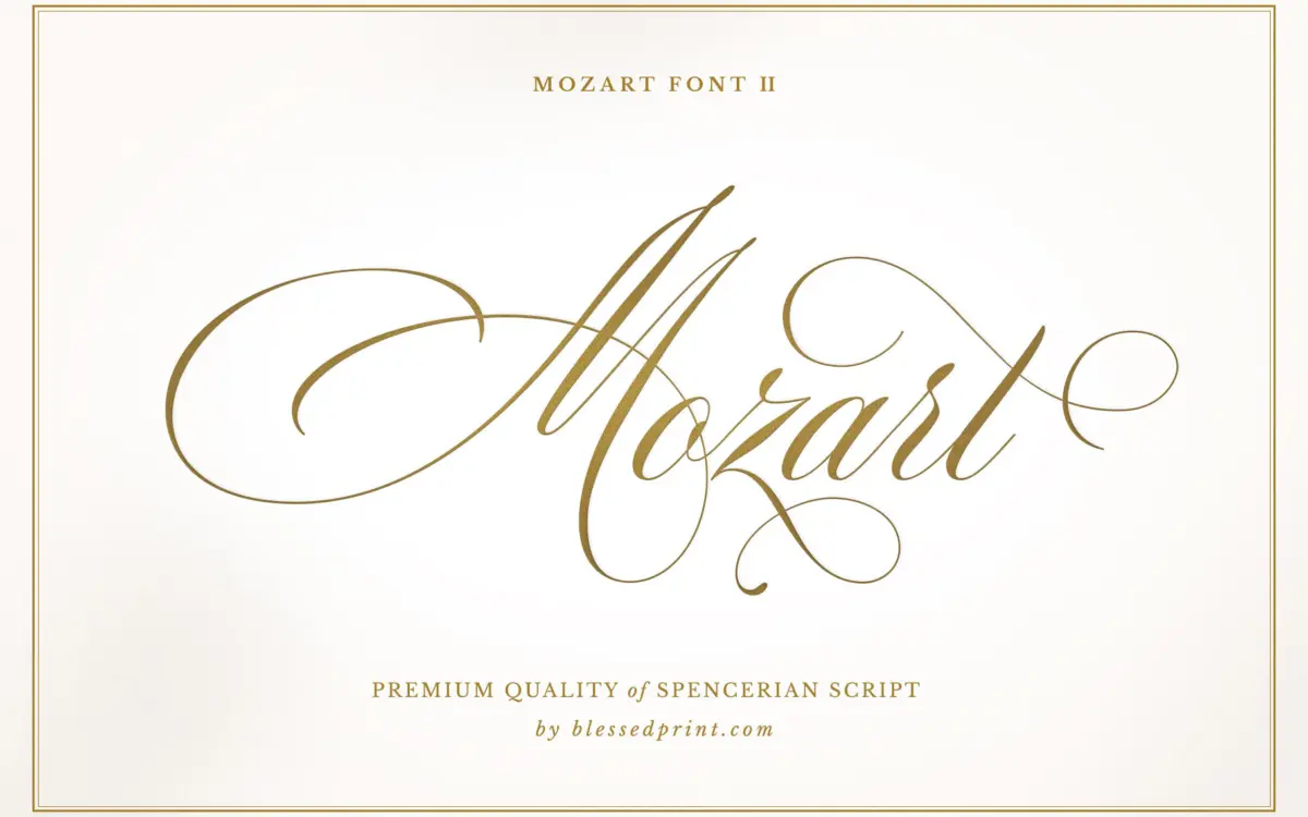
Mozart Script II is a commercial font sold on Creative Market, so the full version needs a paid license. Get it from the official listing: Mozart Script II font download.
Need something free? These script fonts from Google Fonts are free for personal and commercial use:
Design style
Mozart Script II Basic sits in the lineage of Spencerian penmanship crossed with copperplate discipline. The lowercase carries the springy, forward-leaning rhythm of Spencerian hands, while the joins and stroke contrast lean toward copperplate’s tighter control. That combination is common in wedding-market scripts, but this one avoids the over-decorated look that a lot of them fall into. The letters feel like they were built for legible flow first, ornament second.
Stroke contrast is present but not extreme — thin entry and exit strokes, thicker downstrokes, without the hairline fragility that makes some copperplate-style fonts unreliable at small sizes or in foil stamping. The uppercase, especially in its more restrained set, has enough formality for monograms without tipping into the illegible flourish territory that swash-heavy scripts often invite.
What’s worth noting is restraint. This is the Basic version of a two-tier release, and it reads that way: the drawing is confident but the feature set is deliberately narrower than what the foundry sells elsewhere. That’s fine on its own terms, but it does mean the typeface’s ambition is capped by design, not by the letterforms themselves.
Character set and features
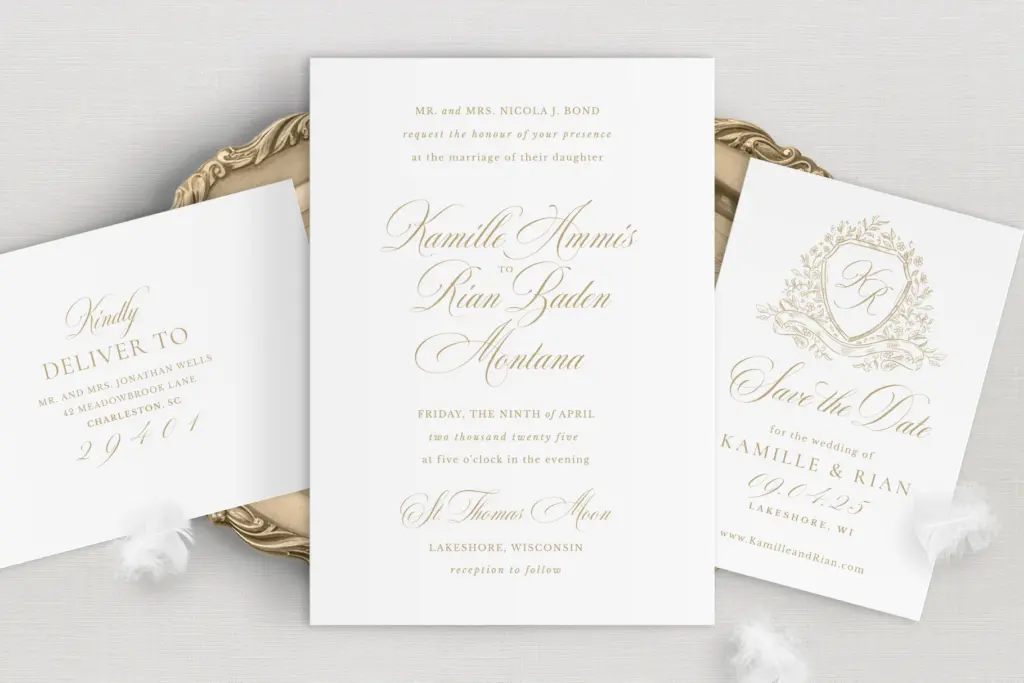
Basic ships with two uppercase sets, giving you a choice between a more formal capital and a slightly looser alternative for the same letter — useful for varying monograms or repeated initials in a layout without the alphabet looking mechanical. The lowercase has been refined from the original release, which should mean smoother joins and fewer awkward collisions between adjacent letters, though as with any connecting script, some letter pairs will need manual kerning attention in tight-tracked headlines.
Ligatures are included to handle common letter combinations that would otherwise fight each other, and there’s a standard set of swashes for word-initial and word-final flourishes. Multilingual support is mentioned, which matters for anyone setting names or vows in languages beyond English — always worth testing your specific accented characters before committing to a final layout, since script fonts vary widely in how gracefully they handle diacritics.
Symbols round out the set, presumably ampersands and the small decorative marks scripts of this kind typically include for spacing between words on invitations. Compared to the Pro version, this one has fewer alternates and no Roman numerals, so if a project needs extensive contextual variation across a long paragraph of running script, this tier will show its limits faster.
Use cases
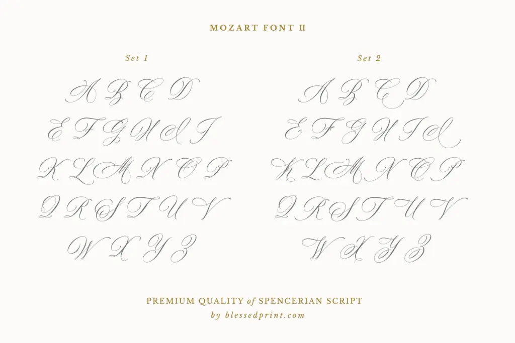
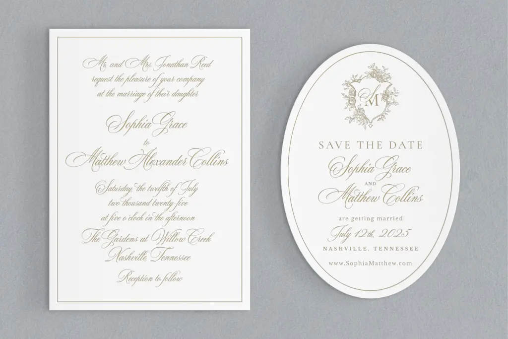
This is squarely a wedding-stationery font: save-the-dates, invitation suites, envelope addressing, place cards, and monogram work are where the letterforms are drawn to perform. The moderate contrast and clean joins mean it should hold up reasonably well in foil stamping and letterpress, where hairline strokes can drop out or blob under pressure — though testing a proof at your actual print size and process is still the only way to be sure.
For logo or signature-style branding work outside weddings, the script’s formality translates well enough, provided the brand voice wants warmth and tradition rather than a contemporary edge. It’s less suited to long-form text or body copy — connecting scripts rarely are — and less suited to anyone who needs the depth of alternates that heavy hand-lettering or crest-and-monogram specialists require, since that’s reserved for the Pro tier.
What we liked, and what we didn’t
Strengths
- Two uppercase sets give monograms and repeated initials real variety without extra typefaces.
- Moderate stroke contrast holds up better in foil stamping and letterpress than hairline-heavy scripts.
- Spencerian rhythm feels natural and flowing rather than forced or overly ornamental.
Trade-offs
- Fewer alternates and no Roman numerals compared to the Pro version limits its use in longer decorative layouts.
- Connecting script letterforms will still need manual kerning attention in tightly set headline work.
Mozart Script II Basic is a well-drawn, moderate-contrast script that does classic wedding stationery convincingly without overreaching. It's a sound choice for DIY invitation work and monogramming, but its narrower feature set compared to the Pro edition will frustrate anyone who needs deep alternates or extensive swash variation.

Tmfonts writes independent reviews of typefaces: what each font does well, where it falls short, what it suits, and where it is sold.