
Fifty Fifty Serif Regular Italic Font Free Download
Is Fifty Fifty Serif Regular Italic free to download?
Fifty Fifty Serif Regular Italic is a commercial font sold on Creative Market, so the full version needs a paid license. Get it from the official listing: Fifty Fifty Serif Regular Italic font download.
Need something free? These serif fonts from Google Fonts are free for personal and commercial use:
Design style
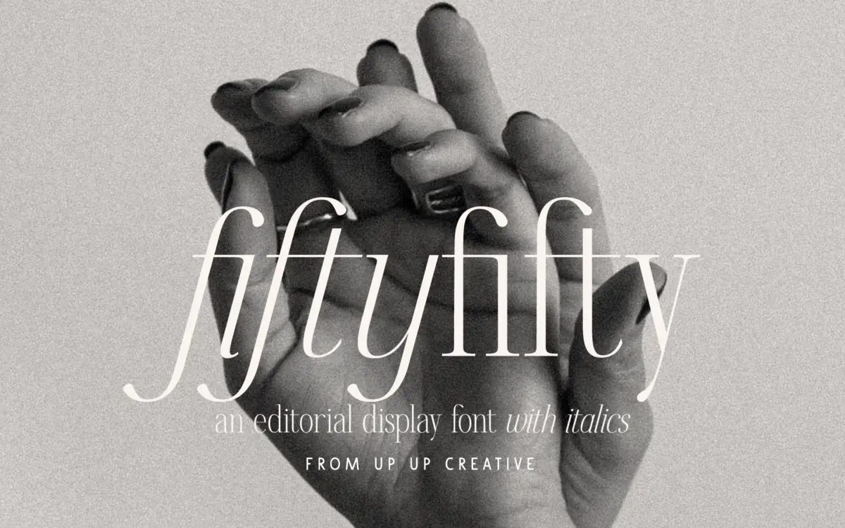
Fifty Fifty sits in that editorial-serif territory that’s become a staple of branding kits over the past few years: moderate contrast, a slightly compressed feel in the caps, and curves that avoid the brittle sharpness you get in more classical revivals. The regular weight reads as confident but not heavy — it’s built for the kind of headline that needs to carry a page without shouting. Terminals are rounded rather than pointed, which softens the overall tone and pushes it toward warmth rather than austerity.
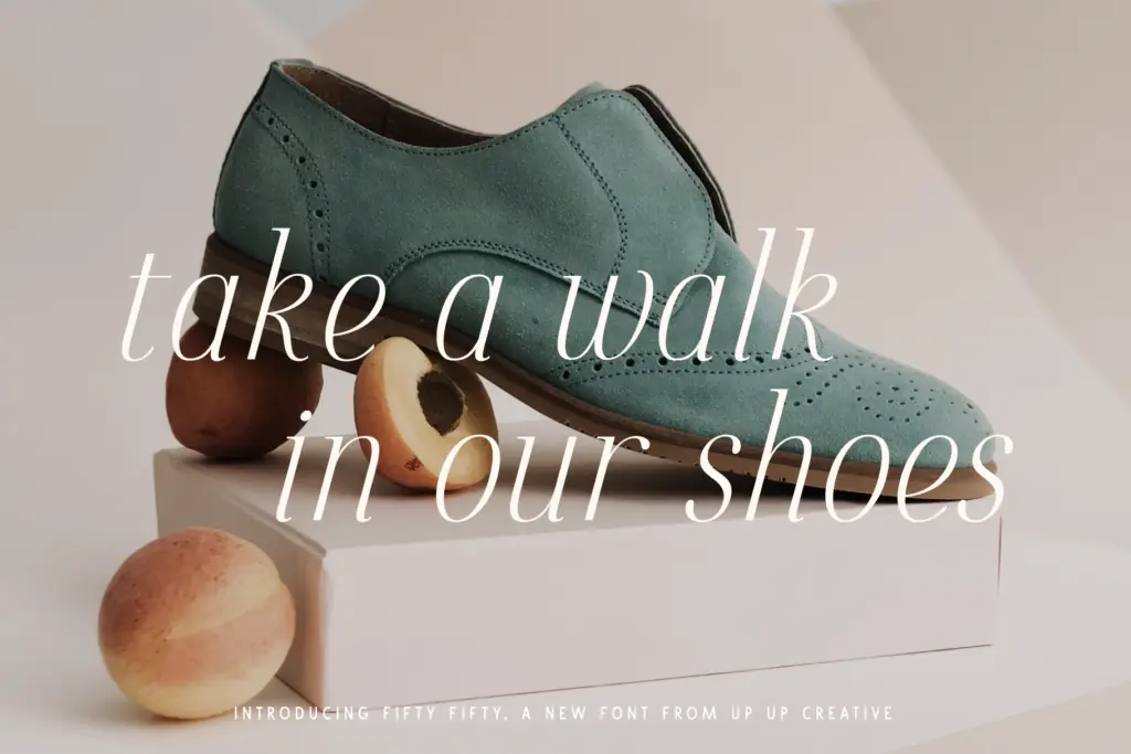
The italic is where the personality actually lives. It leans further into calligraphic gesture than the roman does, with entry strokes and swash-adjacent details that make it feel closer to a companion script than a simple oblique cut of the regular. That’s a deliberate choice and it works, provided you’re using the italic for what it’s built for — short emphasis, a subhead, a name lockup — rather than long-form reading, where its added flourish starts to slow the eye down.
Character set and features
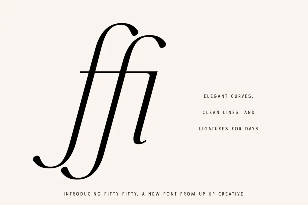
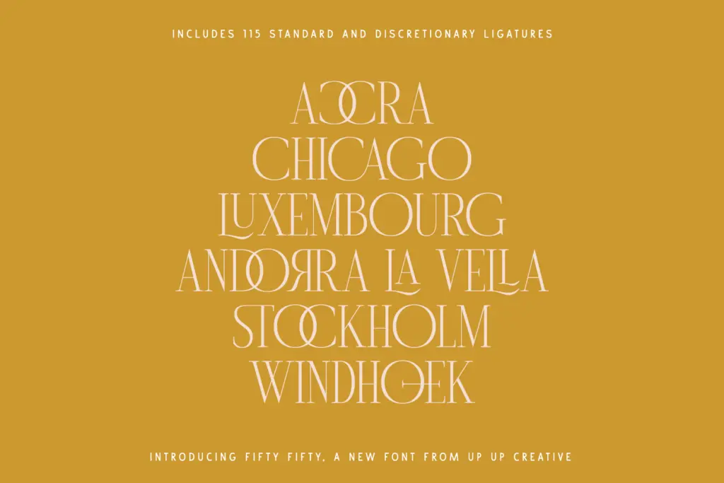
The glyph count here — around 700 — is doing real work. Over 100 standard and discretionary ligatures give the italic in particular a handmade quality when common letter pairs are set: the ligatures fuse rather than just kern, so words like connecting fl or ct combinations stop looking like two separate letterforms bolted together. Stylistic sets and character variants extend this further, letting you swap terminal treatments or alternate lowercase forms without touching a different font file.
Multilingual support and currency symbols are included, which matters if this is going into packaging or price-facing layouts across markets, though the font’s real strength is still in its display behaviour rather than its coverage breadth. Access to the ligature set and stylistic alternates depends on the software doing the setting — Illustrator and InDesign handle OpenType features natively, but getting the same result in Word takes manual digging through the advanced font panel, which is worth knowing before you commit a layout workflow to it.
Use cases
This is a headline and branding font first. It’s suited to editorial mastheads, logotypes, monogram marks, and packaging lockups where a handful of large-set words need to feel considered rather than just correct. The caps are genuinely strong — clean enough to stand alone in a wordmark — and the lowercase holds up better than most editorial serifs do at similar sizes, so you’re not restricted to all-caps treatments if the brand voice calls for something quieter.
Where it’s less suited is body copy. At paragraph sizes the ligatures and italic flourish that make it distinctive at large sizes start working against comfortable reading, and this listing only includes the regular weight and its italic, so there’s no bold or light to build a full text hierarchy from within the family as sold here. For a poster, a menu, a logo, or an editorial title, it does its job cleanly. For anything beyond a few lines of continuous text, it needs a second typeface doing the heavy lifting alongside it.
What we liked, and what we didn’t
Strengths
- Ligature set of over 100 glyphs gives the italic genuine handmade texture in common letter pairs
- Caps are strong enough to stand alone in a wordmark or monogram
- Multilingual support and currency symbols make it usable beyond English-only branding work
Trade-offs
- Only regular and italic are included here, so there's no built-in weight range for hierarchy
- The italic's flourish slows reading at body-copy sizes
Fifty Fifty is a capable headline serif with an italic that carries real character, thanks to a generous ligature set. It's not a text font and this listing only gives you two styles, so plan on pairing it rather than building a whole system from it.

Tmfonts writes independent reviews of typefaces: what each font does well, where it falls short, what it suits, and where it is sold.