
French Aperitif Font Free Download
Is French Aperitif free to download?
French Aperitif is a commercial font sold on Creative Market, so the full version needs a paid license. Get it from the official listing: French Aperitif font download.
Need something free? These handwritten fonts from Google Fonts are free for personal and commercial use:
Design style
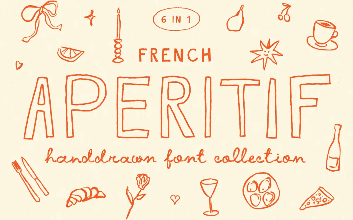
French Aperitif reads as a set of felt-tip or pencil sketches rather than a formal script. The strokes wobble slightly, the baselines drift, and the joins between letters look deliberately unresolved — this is the point of the design, not a flaw to be smoothed over. It sits in that loose, bistro-chalkboard territory: think hand-lettered specials boards and zine covers rather than anything that wants to look considered or precise.
The family gives you six cuts built around this idea. There’s a script, a regular, and a bold, each also available as an outline version (bold, regular and thin). That’s a reasonable spread for a face this informal — the outline variants in particular are useful, since they let you layer a filled word over an outlined one for the kind of doodled poster effect the seller is clearly chasing. The drawing itself is consistent across weights, which matters more than it sounds: a lot of hand-drawn families lose their character once you move from script to a supposedly ‘regular’ companion, but here the same nervous, slightly messy hand carries through.
Character set and features
Alternate letterforms are the family’s main working tool. With this many variants per letter, you can break up repeated characters in a headline so the hand-drawn illusion holds — nothing kills a faux-handwritten look faster than seeing the same exact ‘a’ three times in one word. Whether you access these through OpenType features or by swapping glyphs manually will depend on your software, so check before you commit to a layout that depends on it.
The family also ships with a set of hand-drawn bonus elements — small doodles and marks in PNG and SVG — which read as a practical addition rather than filler. They’re clearly drawn in the same hand as the type, so you’re not stitching together mismatched decorative assets from elsewhere.
Don’t expect this to behave like a text face. The looseness that makes it charming at large sizes is exactly what will make it collapse at small ones — tight tracking or a paragraph of body copy will just look muddy. This is a headline and accent typeface, not a reading one, and it should be treated that way from the start.
Use cases
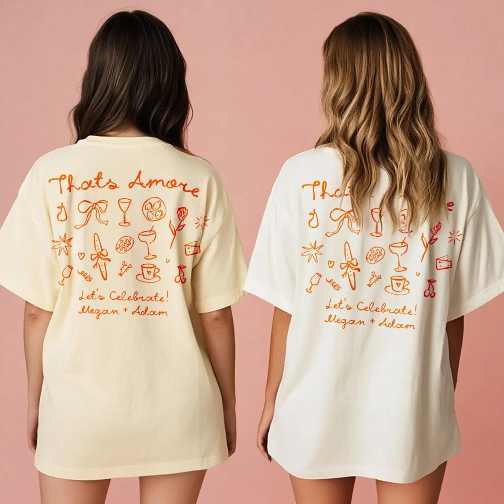
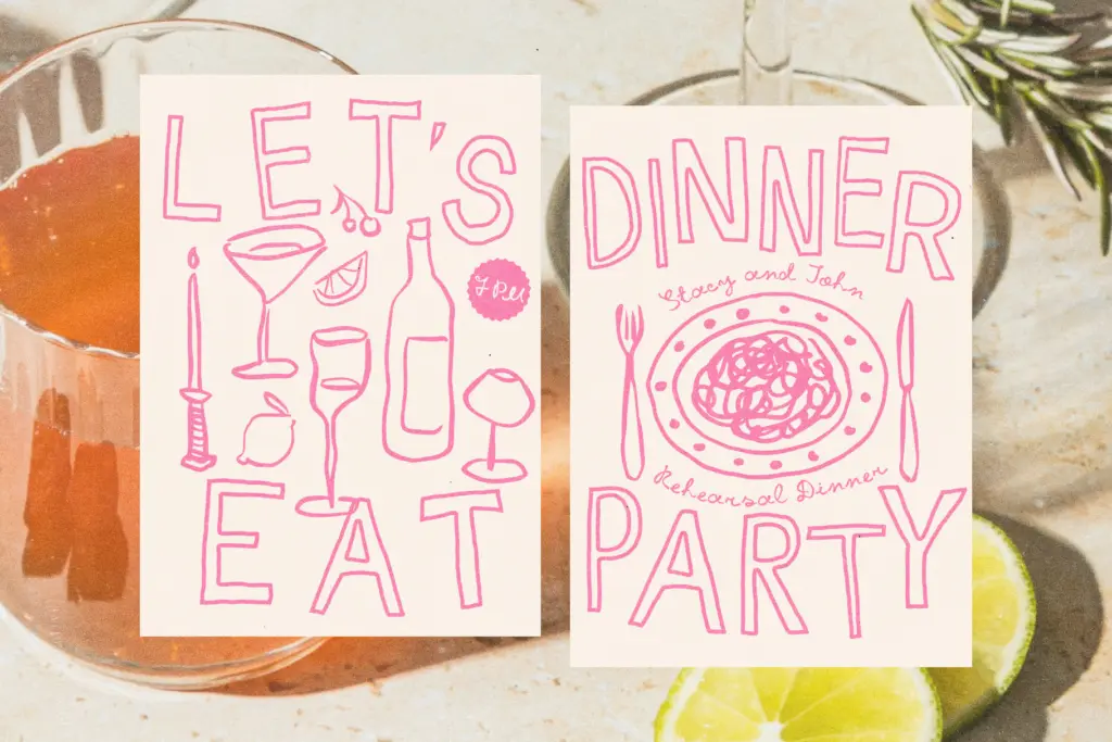
French Aperitif is built for the kind of work where a bit of visible hand is the whole appeal: bar and restaurant menus, event posters, social media graphics, and wedding stationery that’s aiming for relaxed rather than formal. Content creators wanting thumbnail or title text with a scrappy, personal feel are squarely in its target audience — the name and the outline variants both suggest that use directly.
It’s less suited to anything that needs to look neutral or professional at scale — corporate decks, signage meant to be read at distance, or long-form copy of any kind. And because the wobble is baked into every glyph, it won’t suit a brand that wants to age into something more polished later; this is a font for a specific mood, not a flexible base to build a system on.
What we liked, and what we didn’t
Strengths
- Six coordinated weights, including three outline cuts, give real layering options for posters and titles
- Alternate letterforms genuinely help disguise repetition in short hand-lettered phrases
- Bonus hand-drawn elements match the type's hand and add practical decorative value
Trade-offs
- The intentional wobble makes it unsuitable for body text or small sizes
- Its specific scrappy mood limits use in anything aiming for a polished or neutral brand voice
French Aperitif does one job well: scrappy, hand-drawn headline type with enough alternates and outline variants to keep posters and menus feeling loose and personal. It's not built for reading at length or for brands that need to look composed, and buyers should go in expecting a mood-specific display face rather than a flexible workhorse.

Tmfonts writes independent reviews of typefaces: what each font does well, where it falls short, what it suits, and where it is sold.