
Keel Font Free Download
Is Keel free to download?
Keel is a commercial font sold on Creative Market, so the full version needs a paid license. Get it from the official listing: Keel font download.
Need something free? These serif fonts from Google Fonts are free for personal and commercial use:
Design style
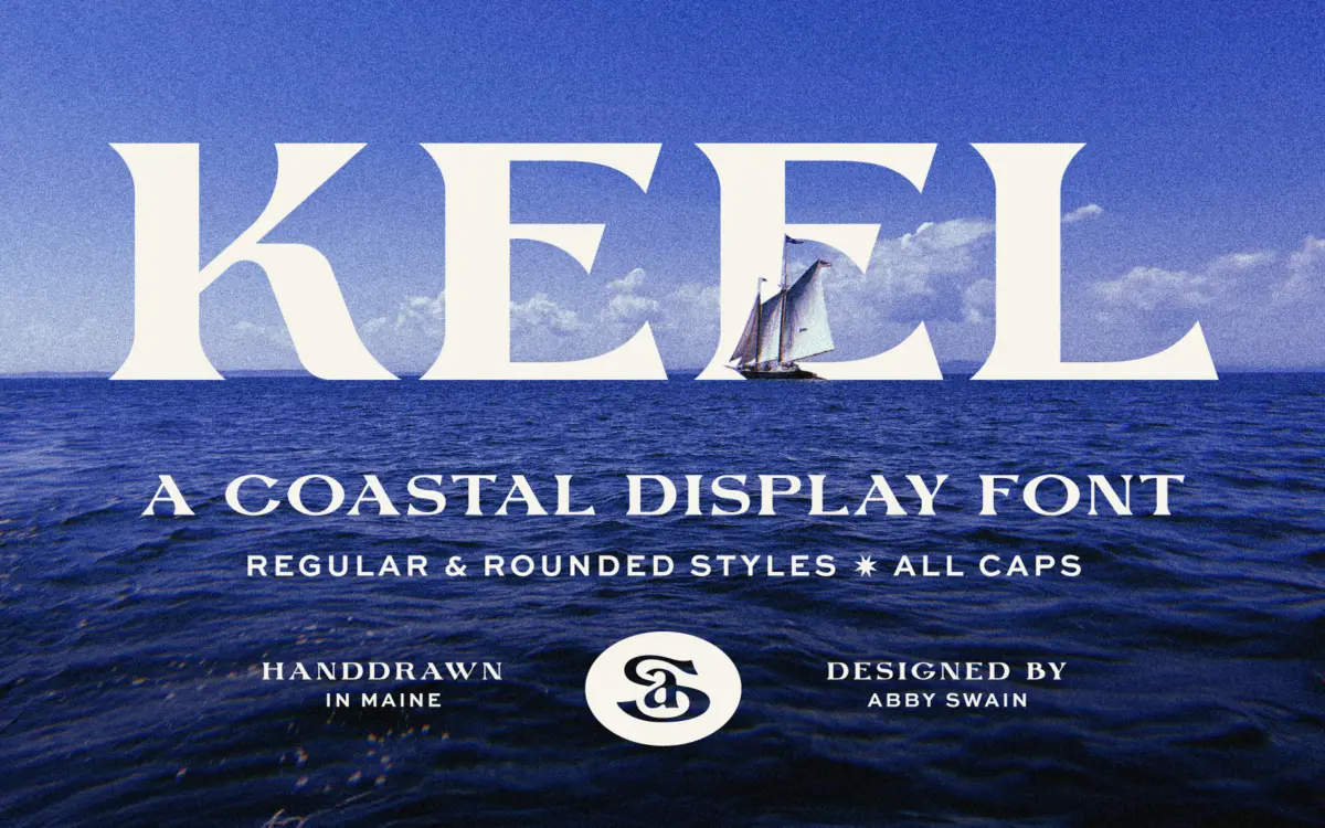
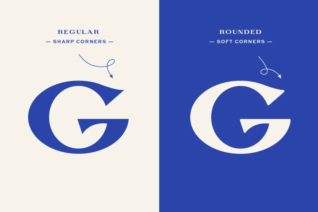
Keel is a display serif built on the kind of irregularity that only comes from drawing letters by hand and keeping the wobble in. The strokes carry visible variation in weight and width from letter to letter, and the serifs are stubby, slightly uneven wedges rather than precise, ruled forms. There’s a carved, weathered quality to it — you can imagine it routed into a plank of wood and bolted to a shopfront. It comes in two versions, a regular cut and a rounded one, and the difference matters more than it sounds. The regular style has sharper terminals and reads a bit more like old dock signage; the rounded style softens those same terminals into blunt, friendly ends that suit anything aimed at families or children. Both share the same underlying skeleton, so switching between them doesn’t change the voice of a piece, just its temperature.
This is not a font built for restraint or neutrality. It has a strong point of view — worn-in, nautical, a little folksy — and it commits to that fully rather than trying to be flexible enough for a law firm’s letterhead. That’s a fair trade for what it is.
Character set and features
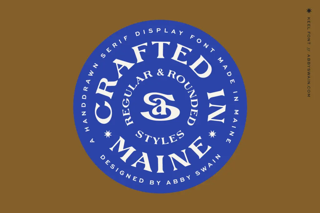
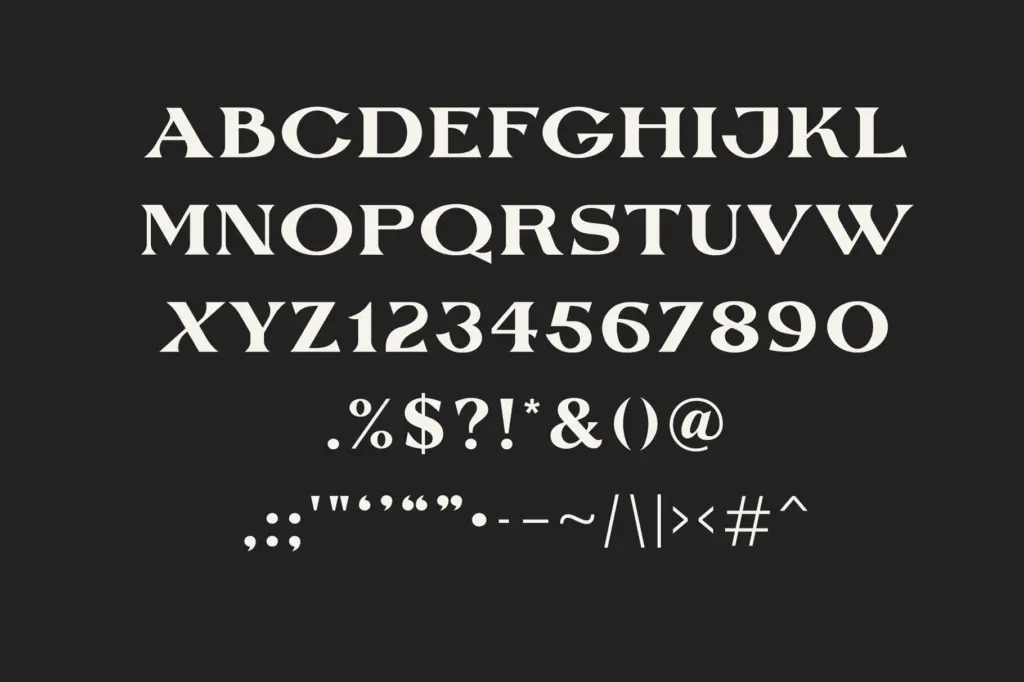
The letterforms are irregular by design, which means consistency isn’t the goal here — texture is. Curves in letters like S and G have a hand-cut looseness, and the counters are generally open enough to avoid clogging at small sizes, though this is still very much a display face rather than a text face. The rounded companion style is a genuine second option rather than a token alternate; it’s built out fully enough to use on its own for a whole project if the carved look feels too rough for the brief. Given its handmade origins, expect the font to reward being set large — a word or two, a name, a short phrase — rather than being asked to carry paragraphs.
Use cases
Keel does exactly the job its name suggests. It sits comfortably on packaging for seafood, coastal food and drink brands, and marina or boatyard signage, where the carved unevenness reads as authenticity rather than sloppiness. Wedding invitations for a beach or lakeside venue are a natural fit too, especially paired with a plainer serif or sans for body copy, since Keel itself isn’t meant to set the fine print. The rounded cut opens the door to children’s book covers and titling — pirate stories, tide-pool adventures, anything that wants warmth over polish.
Where it struggles is anywhere that needs neutrality or a wide range of tones. It’s a one-mood font: coastal, handmade, nostalgic. Push it into a tech startup’s logo or a formal corporate report and the charm reads as mismatched rather than deliberate. It also won’t hold up as a body text option — the irregularity that gives it character at large sizes turns into visual noise once you shrink it down to paragraph scale. Used within its actual lane — signage, packaging, branding for coastal or lifestyle businesses, invitations with a relaxed tone — it does a specific job well and doesn’t pretend otherwise.
What we liked, and what we didn’t
Strengths
- The hand-drawn irregularity gives it a genuinely carved, weathered feel rather than a generic 'rustic' filter.
- The rounded companion style extends its range into softer, family-friendly applications without breaking the voice.
- Open counters keep it legible at the large sizes it's actually meant for.
Trade-offs
- The strong coastal, handmade mood limits it to a narrow set of industries and tones.
- Not suited to body copy or any setting smaller than a few words at a time.
Keel is a well-drawn, character-heavy display serif that knows exactly what it's for: coastal branding, carved-look signage, and packaging with a handmade feel. It won't flex into neutral or corporate territory, and it's not built for body text, but within its lane it delivers a consistent, believable mood.

Tmfonts writes independent reviews of typefaces: what each font does well, where it falls short, what it suits, and where it is sold.