
Supa Mega Fantastic Font Duo Free Download
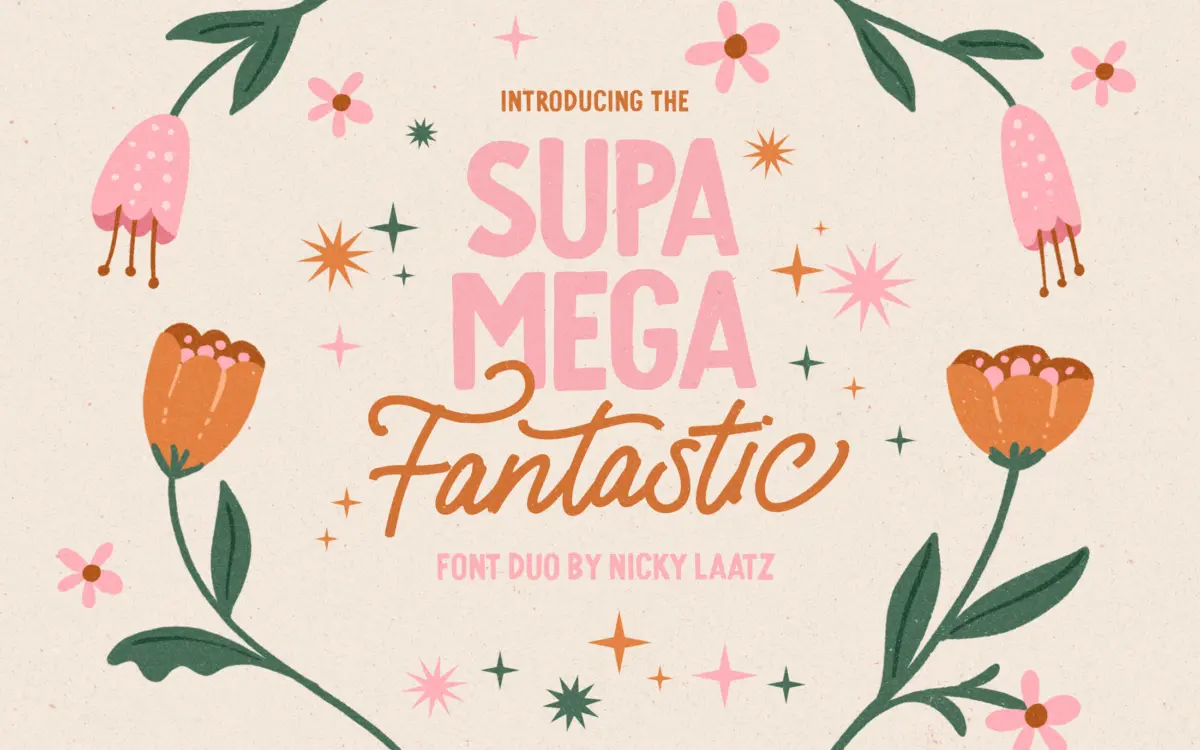
Is Supa Mega Fantastic Font Duo free to download?
Supa Mega Fantastic Font Duo is a commercial font sold on Creative Market, so the full version needs a paid license. Get it from the official listing: Supa Mega Fantastic Font Duo download.
Need something free? These script fonts from Google Fonts are free for personal and commercial use:
Design style
Supa Mega Fantastic Font Duo pairs a monoline script with a chunky all-caps sans, both drawn in the loose, uneven manner of hand-painted signage rather than the smoother, more formal end of the script market. The script has a bounce to it: baselines drift slightly, joins are relaxed rather than mechanically consistent, and letters lean into their curves instead of tightening them. This is a font built to look drawn, not built to look engineered, and it succeeds at that brief. The companion sans is the workhorse of the pair — bold, slab-footed, upright — and it exists mainly to give the script something sturdy to stand next to. On its own the sans is plain, but that plainness is the point; it’s not competing for attention.
Character set and features
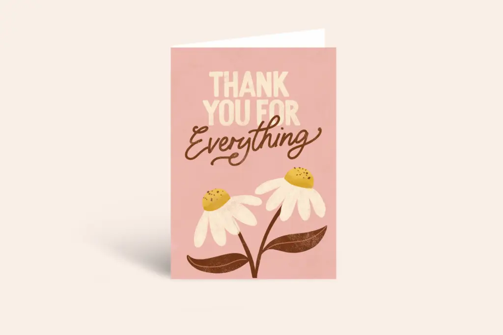
The script comes in two weights, Regular and a slightly thinner cut, and the seller’s advice on which to use where is sound: the lighter weight holds up better reversed out on dark backgrounds, the heavier one wants a light background under dark type. The real depth here is in the OpenType alternates. Every uppercase letter has a fancier alternate form, and lowercase letters carry a run of variants apiece, so a word set twice rarely looks identical. That’s a genuine strength for a script at this price point in the market, but it comes with a caveat worth stating plainly: none of it works without an application that reads OpenType stylistic sets and contextual alternates properly. Drop this into a tool that doesn’t support those features and you’re left with the plain default forms only, which is a noticeably flatter experience than what’s being sold. Language support covers several Northern European sets — Danish, Finnish, French, German, Norwegian, Spanish, Swedish, Swiss German — which is a reasonable spread for greeting card and quote work aimed at a European audience, though it’s not a multilingual claim that stretches to non-Latin scripts.
Use cases
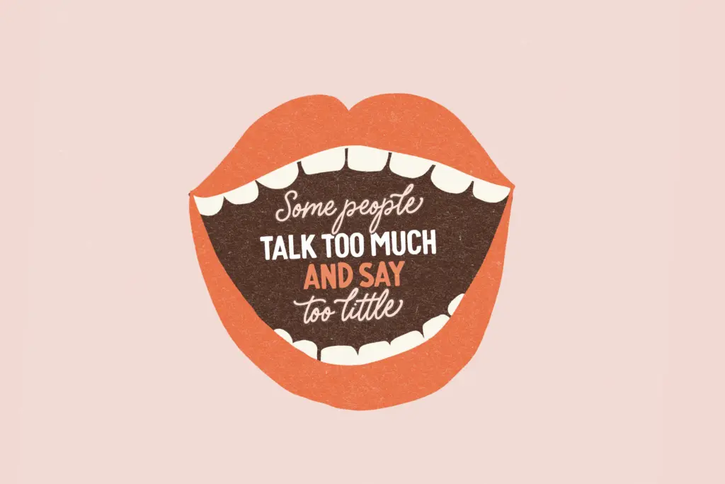
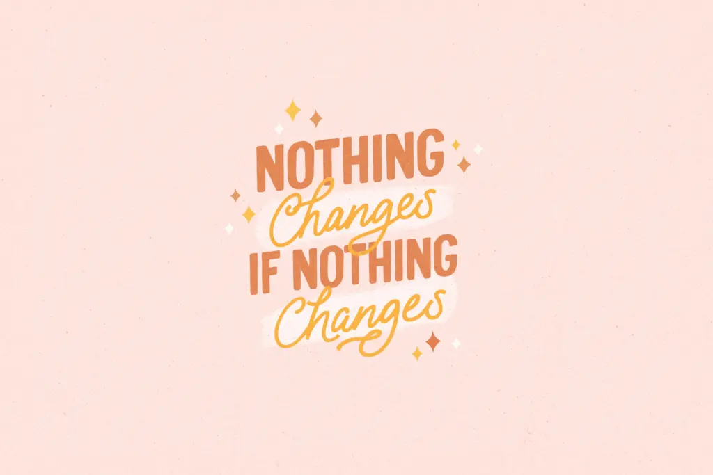
This duo is built for short bursts of type rather than paragraphs: a name on a card, a line of a quote, a word or two on packaging, a poster headline. The script’s irregularity that makes it charming at display size would become fatiguing across a full sentence of body copy, so keep it to headlines, monograms, and short greetings. The sans partner is the better choice when you need a few words to actually read cleanly — a subhead, a tagline, a supporting line under the script’s flourish. Together they suit playful, informal branding: a bakery, a kids’ product line, a wedding invite that wants warmth over polish, a greeting card range. It’s less suited to anything that needs to read as premium or restrained; the hand-drawn wobble reads as friendly, not upscale. Designers doing quote graphics or social templates will get good mileage from the alternate set, provided their toolchain supports it — check that before committing a layout to it.
What we liked, and what we didn’t
Strengths
- Extensive alternate set on both cases gives real variation across repeated letters
- The two script weights are sensibly differentiated for light-on-dark versus dark-on-light use
- The companion sans provides a steady, legible counterpoint without competing for attention
Trade-offs
- Alternates and ligatures are invisible in apps lacking OpenType feature support, flattening the design considerably
- The irregular baseline and loose joins make it unsuitable for anything beyond short lines of text
A charming, informally drawn script-and-sans duo that earns its playful reputation through a genuinely deep alternate set. It's built for short bursts of display type, not for reading at length, and its best features only show up in apps that support OpenType properly.

Tmfonts writes independent reviews of typefaces: what each font does well, where it falls short, what it suits, and where it is sold.