
Tokyo Dreams Font Free Download
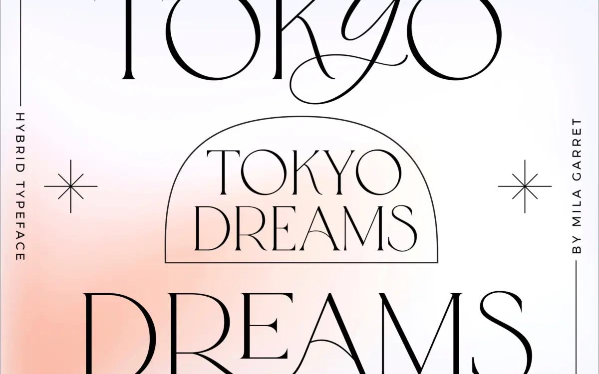
Is Tokyo Dreams free to download?
Tokyo Dreams is a commercial font sold on Creative Market, so the full version needs a paid license. Get it from the official listing: Tokyo Dreams font download.
Need something free? These serif fonts from Google Fonts are free for personal and commercial use:
Design style
Tokyo Dreams is built around one central idea: a plain serif skeleton that can be dressed up or down depending on the job. The base version is a restrained, minimal serif with modest contrast and calm proportions — nothing showy, just a clean structural framework. Layered on top of that are the ligature and hybrid versions, which swap in script-style connecting strokes and swashy alternates that can be dropped into a word wherever a designer wants a flourish.
The concept works because the plain serif is genuinely quiet. It doesn’t try to compete with the ornamentation, so when a script letter gets inserted mid-word it reads as a deliberate accent rather than a clash. That’s a harder balance to strike than it sounds — a lot of serif-script hybrids end up looking like two typefaces fighting for attention. Here the transitions are handled with enough restraint that the eye accepts them as one voice.
Character set and features
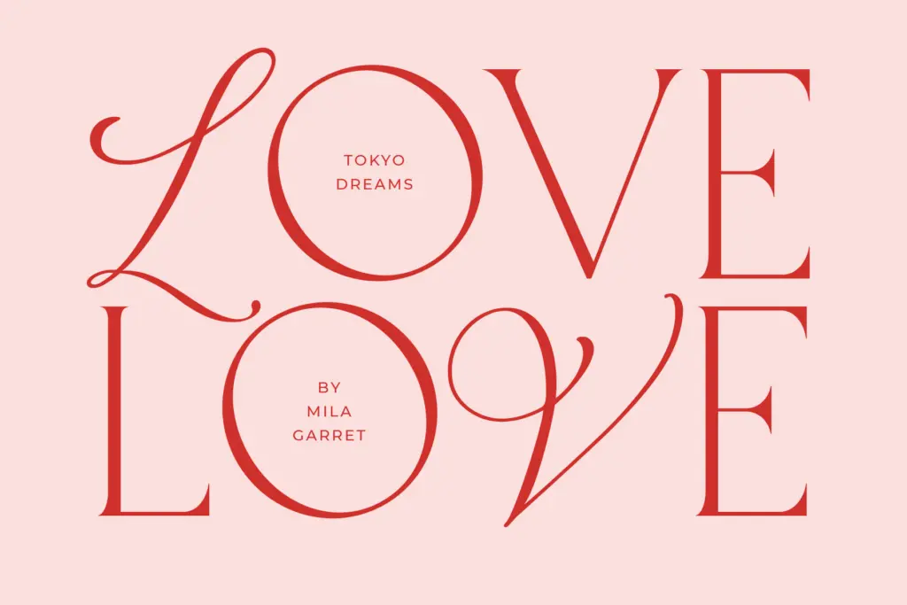
The headline feature is the ligature set — 99 of them, according to the brief, which is a substantial number for a display face. These aren’t just the standard fi/fl pairs; they’re custom joins built to let specific letter combinations flow into a single connected form, useful for building the kind of one-off wordmarks that used to require a hand-lettering job. The hybrid version pushes further, letting script letters be swapped in via uppercase input or accessed as stylistic alternates, so a single word can mix serif and script characters within itself.
This is not a typeface you type and forget. Getting the best results means going through the alternates, testing which ligatures trigger on which letter pairs, and manually kerning where the automated joins don’t quite land. The seller’s own instruction to type in lowercase to see the ligature behaviour is a fair warning — this is a face that rewards fiddling, not one you drop into a paragraph and walk away from. Anyone expecting full-sentence legibility out of the box will be disappointed; this is a short-word, short-phrase instrument.
Use cases
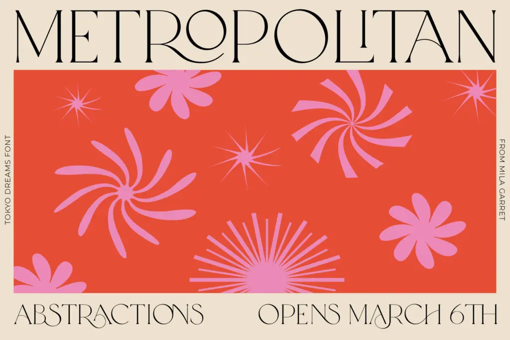
Tokyo Dreams is aimed squarely at logotypes, wordmarks, and short editorial moments — a magazine cover line, a quote graphic, a wedding monogram, a product label. The ligature and script insertions give it a bespoke, hand-finished feel that’s genuinely useful when a brand wants to look custom-lettered without commissioning custom lettering. The plain serif on its own is serviceable for slightly longer headline use, though it’s not distinctive enough to be a first choice for that role alone — its interest lives in the extras.
Where it won’t help: body copy, UI text, anything that needs to be set fast without review, or any context where a designer can’t spend time auditing which alternates actually fire correctly. It’s a specialist tool for a specific kind of decorative wordmark work, and it does that job with more craft than the average ligature pack.
What we liked, and what we didn’t
Strengths
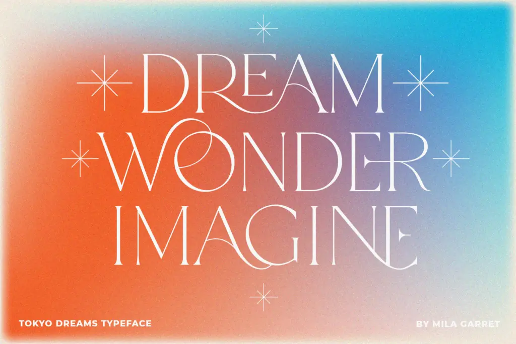
- The plain serif base is restrained enough that the script ligatures read as intentional accents, not clutter.
- 99 custom ligatures give real range for building unique wordmarks rather than generic script joins.
- Script letters can be inserted mid-word via alternates, allowing genuinely custom-looking logotypes.
Trade-offs
- Not built for sentence-length or body text — legibility drops fast beyond short phrases.
- Getting clean results requires manual testing of alternates and ligature triggers rather than typing and going.
Tokyo Dreams pairs a quiet, well-mannered serif with an unusually deep ligature and script-alternate system, making it a strong pick for one-off wordmarks and logo work. It's not a general-purpose text face, and getting the best results requires manual attention to which alternates trigger where. Buy it for the flourishes, not for paragraphs.

Tmfonts writes independent reviews of typefaces: what each font does well, where it falls short, what it suits, and where it is sold.