
TBJ Orcherum Font Free Download
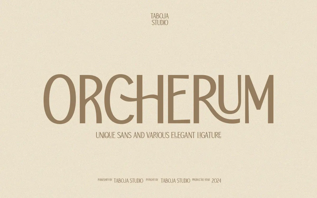
Is TBJ Orcherum free to download?
TBJ Orcherum is a commercial font sold on Creative Market, so the full version needs a paid license. Get it from the official listing: TBJ Orcherum font download.
Need something free? These sans serif fonts from Google Fonts are free for personal and commercial use:
Design style
TBJ Orcherum is a single-weight sans serif designed as a display face first and a text face never. The skeleton is fairly conventional geometric sans construction, but the letterforms have been narrowed and tensioned slightly, giving the uppercase a compressed, upright posture that reads as a little more formal than the average branding sans. It’s the sort of thing you’d expect on a matte black business card rather than an app icon.
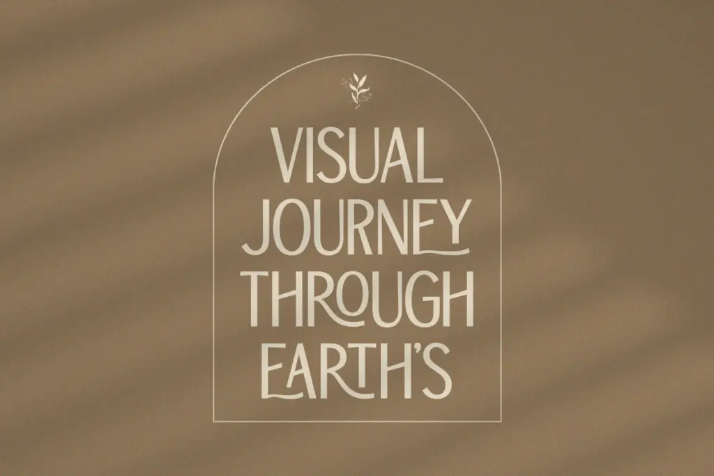
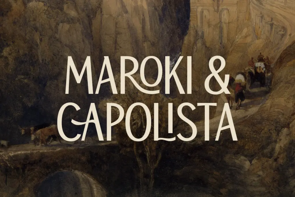
The real design decision here isn’t the base alphabet, though — it’s the ligature set. Orcherum leans hard into fused character pairs and swash connections, the kind of thing that turns a plain word into something closer to a monogram. Used sparingly, this gives the font a handmade, almost hand-lettered warmth that a pure geometric sans doesn’t have. Used across a whole paragraph, it would collapse into noise, but that’s clearly not the intended use.
Character set and features
The family covers uppercase and lowercase, numerals and punctuation, and a set of accented characters aimed at broader European language support. Alternates and ligatures are accessed through OpenType features, and the font is also PUA-encoded, which matters practically: it means the ligatures and alternates are reachable even in apps that don’t fully support OpenType feature panels, such as basic word processors, at the cost of needing a glyph map or panel to find them.
That’s really the operating instruction for this font. Open it in Illustrator, InDesign or CorelDraw with the glyphs panel visible, and there’s a genuine trove of alternate forms to swap letter by letter. Open it in PowerPoint and you’ll get the base alphabet and none of the character — the ligatures are the product, and they’re inert until you go looking for them. This is a one-weight release, so there’s no light or bold to fall back on for hierarchy; contrast in a layout has to come from size, colour or spacing instead.
Use cases
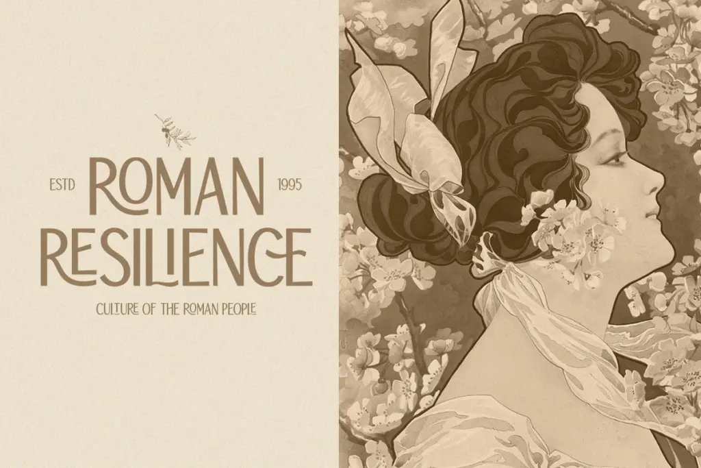
This is a logotype and short-copy font, not a paragraph font. It’s built for the situations where a handful of words carry the whole design: a wordmark, a book cover title, a poster headline, a product label. The ligatures give a single word — a brand name, a monogrammed initial pair — a distinct, custom-lettered look without hiring a letterer, which is exactly the gap this kind of font fills for small studios and solo designers.
It’s less suited to editorial headlines that run long, or any interface where the type needs to sit quietly and do a job without being noticed — the ligatures actively fight that. Anyone using it should also budget real time to sit in the glyphs panel; buying the font and typing normally will get you a serviceable but unremarkable sans, missing the entire reason to choose it in the first place.
What we liked, and what we didn’t
Strengths
- The ligature and alternate set gives short words a custom-lettered, monogram-like quality.
- PUA encoding means the special characters remain accessible even outside full OpenType support.
- Clean, upright geometric base letterforms work well for formal branding contexts.
Trade-offs
- Single weight only, so there's no built-in way to build hierarchy without changing size or colour.
- The font's main feature is invisible unless you actively access alternates through a glyphs panel.
TBJ Orcherum is a display sans whose whole value proposition sits in its glyphs panel, not its default typing behaviour. It's a capable, slightly formal geometric sans with a genuinely distinctive ligature set for anyone willing to hand-set short pieces of type. It's a poor fit for anything beyond a few words at a time.

Tmfonts writes independent reviews of typefaces: what each font does well, where it falls short, what it suits, and where it is sold.