
Notemaker’s Mark Font Free Download
Is Notemaker's Mark free to download?
Notemaker's Mark is a commercial font sold on Creative Market, so the full version needs a paid license. Get it from the official listing: Notemaker's Mark font download.
Need something free? These handwritten fonts from Google Fonts are free for personal and commercial use:
Design style
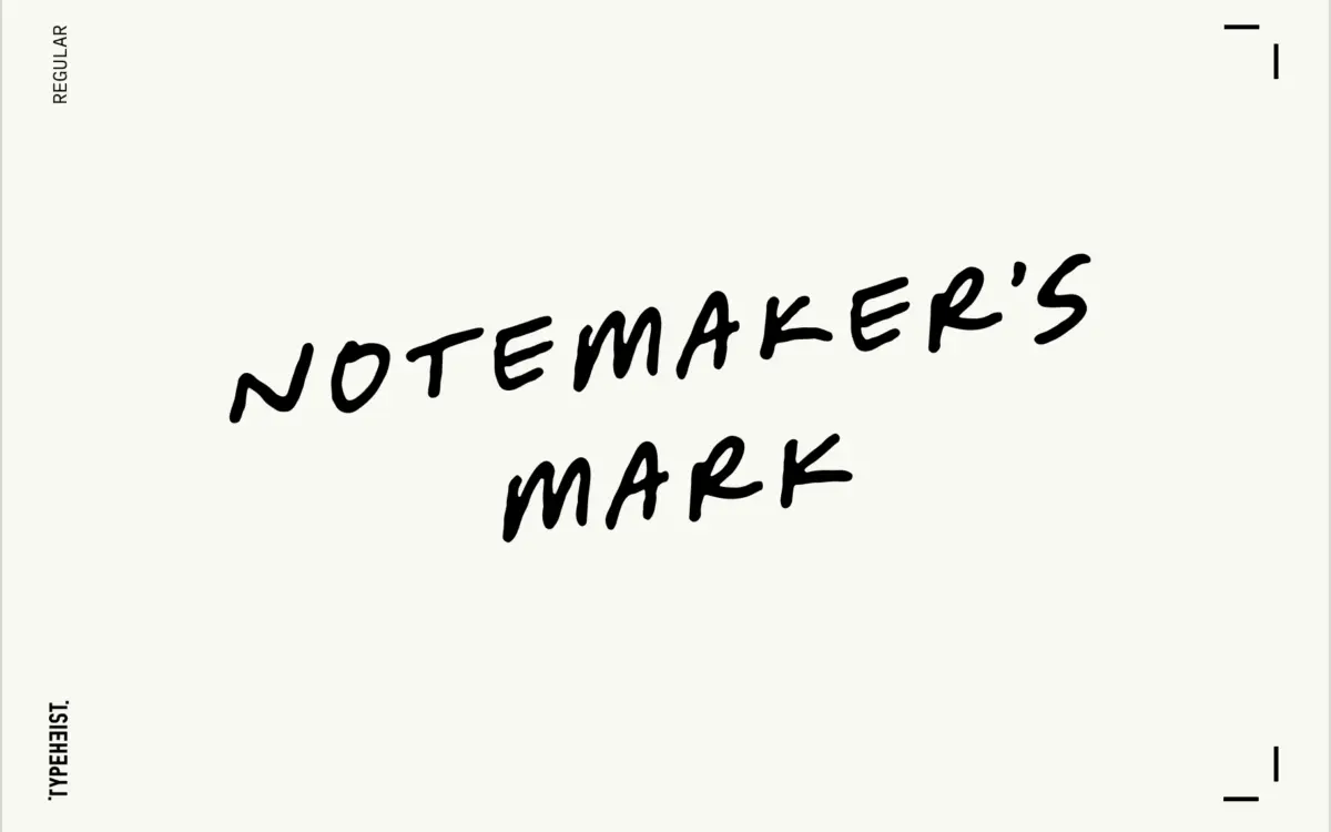
Notemaker’s Mark reads like something jotted down mid-thought rather than penned with any ceremony. The letters lean forward at a consistent forward slant that gives the whole face a sense of momentum, as if the hand writing it was in a hurry to get the idea down before it disappeared. Strokes are monoline-ish but not mechanically so — you can see slight pressure changes at stroke ends, the kind of variation you get from a felt-tip or a rollerball rather than a brush.
What separates this from a lot of handwriting fonts is restraint. It would have been easy to push the looseness further into illegibility or novelty, but the baseline stays reasonably steady and the letter proportions don’t wander much from one character to the next. The result sits somewhere between a genuine handwriting sample and a designed script — loose enough to feel human, controlled enough to sit inside a layout without a fight.
Character set and features
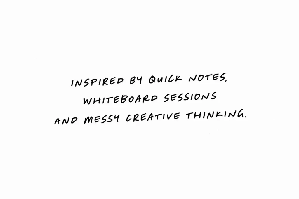
The lowercase carries most of the personality: entry strokes are short and abrupt, exits often trail off rather than closing neatly, and joins between letters look improvised rather than templated. Ascenders and descenders have a bit of extra swing to them, which helps break up what could otherwise be a fairly flat rhythm at word level. Uppercase letters are simpler and more upright by comparison, functioning more as anchors for sentence starts than as decorative capitals — sensible, since overworked caps in a script this casual would clash with the tone.
Spacing is generous enough that words don’t clot together at small sizes, though the forward lean means tight tracking will start to crowd descenders into the next line if you’re not careful with leading. There’s no mention of an extended ligature set or alternate glyphs here, so this isn’t a font built around swapping in dramatic swashes — it’s doing one job, a consistent scrawl, and doing it without much fuss.
Use cases
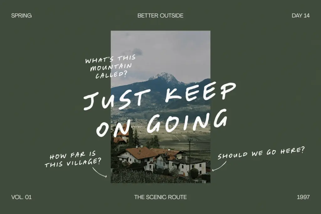
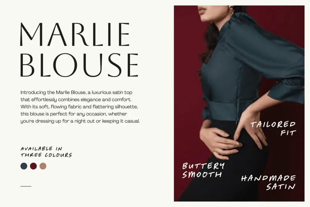
This is a font for the moments in a layout where you want something to feel unfinished on purpose — a sticky-note aside on a packaging insert, a handwritten-style callout in an editorial spread, a caption scribbled across a social graphic. It works well as a secondary voice next to a cleaner sans or serif, standing in for a marker or pen annotation rather than carrying body copy.
At larger sizes — headlines, hero text on packaging, single words on a moodboard — the forward lean and loose baseline read clearly as intentional style. Push it down into paragraph-length use and the informality starts to work against comprehension; scripts like this are built for short bursts, not long reading. It’s also worth testing at the specific size you’ll actually use before committing a whole layout to it, since handwriting fonts like this tend to have a narrow sweet spot between where they feel authentic and where they start to look sloppy.
For lifestyle branding, packaging accents, social captions and the odd annotated diagram, it does exactly what it promises — a scribble, not a signature.
What we liked, and what we didn’t
Strengths
- Consistent forward lean gives it a real sense of momentum and energy
- Restrained enough to stay legible without losing its handwritten character
- Works well as a secondary voice alongside cleaner sans or serif typefaces
Trade-offs
- No apparent ligatures or alternates to vary repeated letter combinations
- Not suited to long-form reading; effect breaks down below headline or caption length
Notemaker's Mark does one thing convincingly: a fast, forward-leaning scrawl that reads as genuine handwriting rather than a designed script pretending to be one. It's best used sparingly, as an accent voice, not a body-text solution. Test your exact size before committing, since the loose baseline has a narrow window between authentic and messy.

Tmfonts writes independent reviews of typefaces: what each font does well, where it falls short, what it suits, and where it is sold.