
Tomato Ketchup Font Free Download
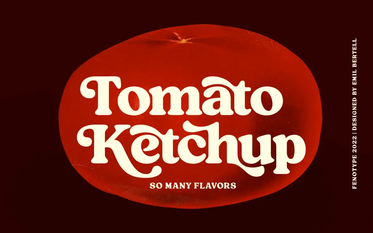
Is Tomato Ketchup free to download?
Tomato Ketchup is a commercial font sold on Creative Market, so the full version needs a paid license. Get it from the official listing: Tomato Ketchup font download.
Need something free? These serif fonts from Google Fonts are free for personal and commercial use:
Design style
Tomato Ketchup is a heavyweight vintage serif with the kind of stocky, confident stroke you’d expect from a label or a hand-painted sign. The contrast is low, the serifs are blunt rather than bracketed, and the overall texture reads dense and a little worn — not distressed exactly, but drawn with enough irregularity in the curves that it avoids feeling like a straight geometric revival. There’s a nonchalance to the letterfit, slightly loose in places, which contributes to that hand-set, mid-century feel rather than a clean digital one.
It sits comfortably in the same territory as diner menus, soda labels and old grocery packaging — sturdy, warm, a bit stubborn. It’s not an elegant serif in the bookish sense; it’s a display serif that wants to be big and doesn’t apologise for it.
Character set and features
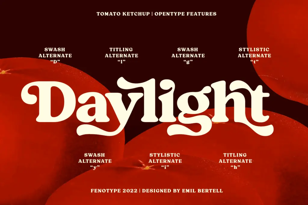
The face comes loaded with contextual, swash, stylistic and titling alternates, along with discretionary ligatures, and the extra glyphs are accessible either through OpenType controls or directly via the Glyphs/Character panel since the font is PUA encoded. That second route matters in practice — a lot of buyers of display faces like this don’t work in software with full OpenType feature support, so being able to reach the alternates manually is a real usability point rather than a footnote.
Contextual alternates are switched on by default and handle small adjustments to stop repeated letters or awkward pairs from colliding, which is a sensible default for a font this chunky — collisions would be more visible here than in a lighter serif. The other alternate sets are optional, aimed at pushing the retro character further for headline-scale work rather than subtle refinement. Worth noting: there’s no stated broader language support here, so treat multilingual use as untested until you check the glyph list yourself.
Use cases
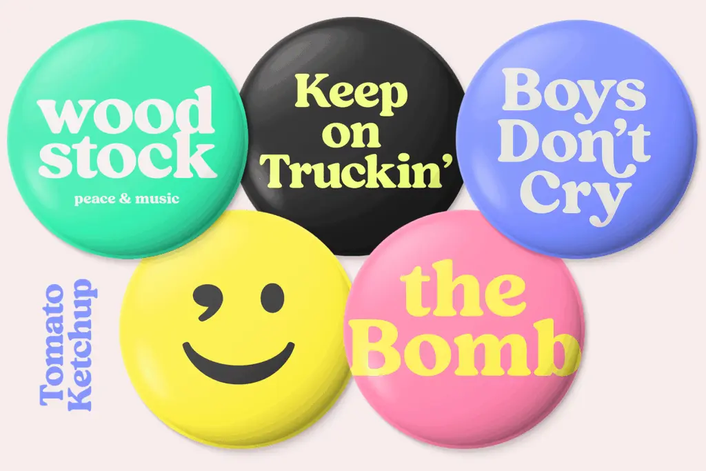
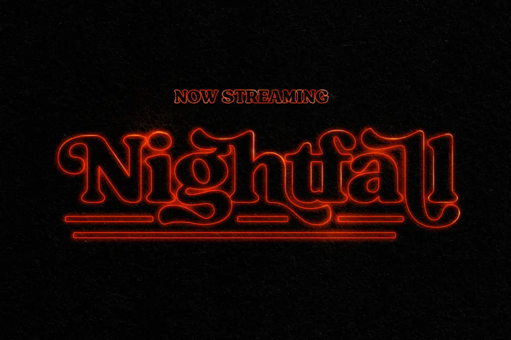
This is a font for short bursts of text, not paragraphs. Logotypes, packaging call-outs, restaurant signage, badge-style lockups, headline treatments on posters or menus — anywhere you need three or four words to carry weight and personality. The seller’s own suggestion to tighten tracking for a denser word-shape and loosen it at small sizes is sound advice; the letterforms are built for that kind of manual tuning rather than for locked-in default settings.
It will struggle in body copy or anywhere legibility at small sizes actually matters — the low contrast and heavy strokes clot together below headline size, and the vintage roughness that reads as charm at 60pt just reads as mud at 10pt. It’s also a font with a strong, specific mood; it won’t quietly recede into a layout, so it’s not the choice if you need something adaptable across a wide brand system. Use it where the nostalgia is the point, not where it’s incidental.
What we liked, and what we didn’t
Strengths
- Alternates are reachable manually via PUA encoding, not just through OpenType-aware apps
- Contextual alternates handle collisions automatically, useful given the heavy stroke weight
- Strong, specific vintage mood suited to packaging and signage-style logotypes
Trade-offs
- Low contrast and heavy strokes make it unreliable below headline sizes
- Its distinct retro character limits versatility across varied brand applications
Tomato Ketchup delivers a specific, well-executed vintage mood with a genuinely useful alternate set, provided you keep it to headline and logo work. It's not built for small sizes or long text, and its strong personality limits how far it stretches across a brand system.

Tmfonts writes independent reviews of typefaces: what each font does well, where it falls short, what it suits, and where it is sold.