
Poina Font Free Download
Is Poina free to download?
Poina is a commercial font sold on Creative Market, so the full version needs a paid license. Get it from the official listing: Poina font download.
Need something free? These sans serif fonts from Google Fonts are free for personal and commercial use:
Design style
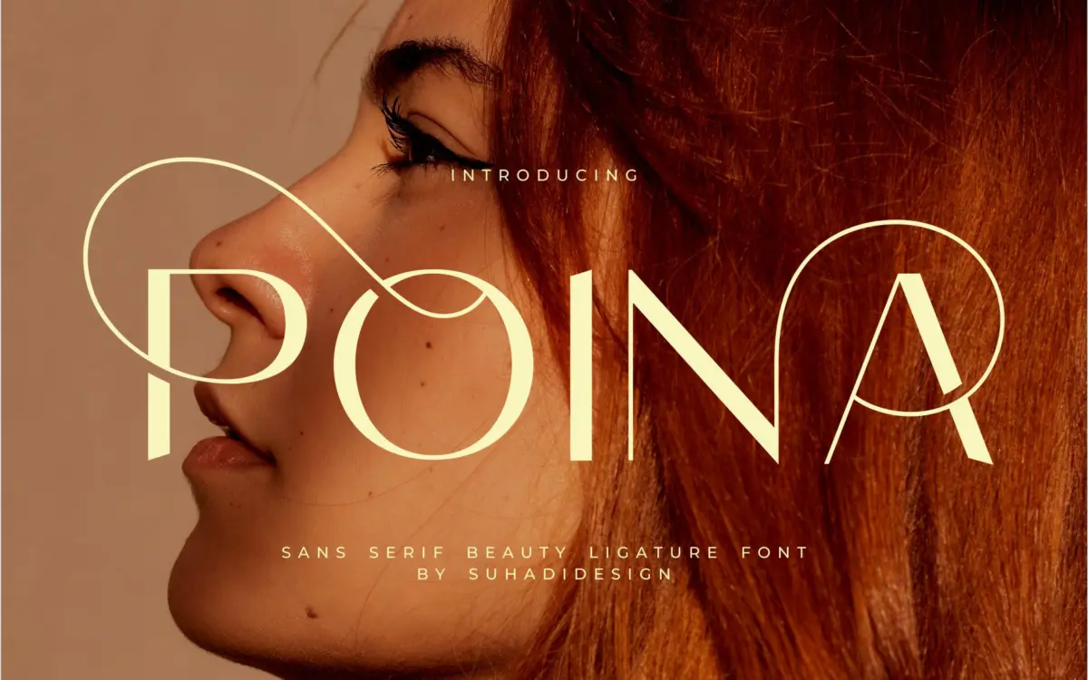
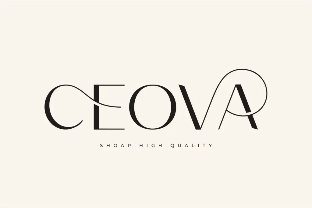
Poina is an uppercase-only sans serif built around ligatures rather than a full running text system. The letters are narrow, upright, and drawn with a light touch — thin strokes, tight apertures, and a general lack of contrast that puts it closer to a monoline sans than anything geometric or grotesque. What separates it from a plain caps set is the ligature work: certain letter pairs link, overlap, or trade terminals so that short words read as a single connected mark rather than a row of separate letters. That’s the whole pitch of the font, and it delivers on it reasonably well within its own scale — a name, a word, a short phrase.
It’s worth being clear about the category placement. This isn’t a workhorse sans in the Helvetica or Inter sense. It behaves more like a display face that happens to use sans-serif letterforms, tuned for the kind of two-to-six-letter compositions you’d put on a lipstick tube or a logo lockup, not for setting sentences.
Character set and features
Poina is capitals-only, with numerals and punctuation rounding out the set. There’s no lowercase, which matters — if your project needs mixed-case body copy or even a subhead in sentence case, this font simply won’t produce it, and you’ll need to pair it with something else for anything longer than a word or two. The ligatures are the real feature here, and they’re clearly the part the designer spent the most time on: specific letter combinations fuse into custom shapes rather than just kerning tighter. Multilingual support is listed among the features, though the brief doesn’t specify which scripts or diacritics are covered, so test your specific language needs before committing to it for anything beyond Latin basics.
Because it’s all caps with ligatures doing double duty, spacing needs attention. Some of the linked pairs sit closer together than a designer might expect from the base letterforms, and getting a wordmark to look intentional rather than accidental means checking every ligature trigger in your actual copy, not just trusting the default settings.
Use cases
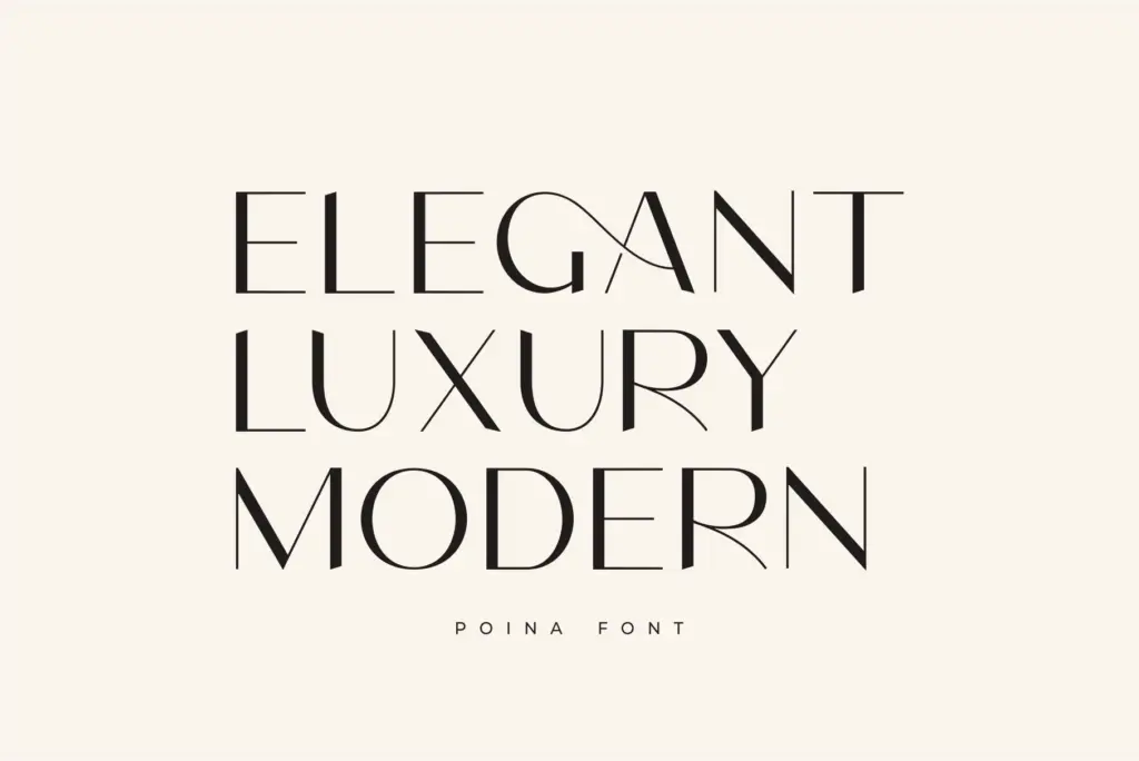
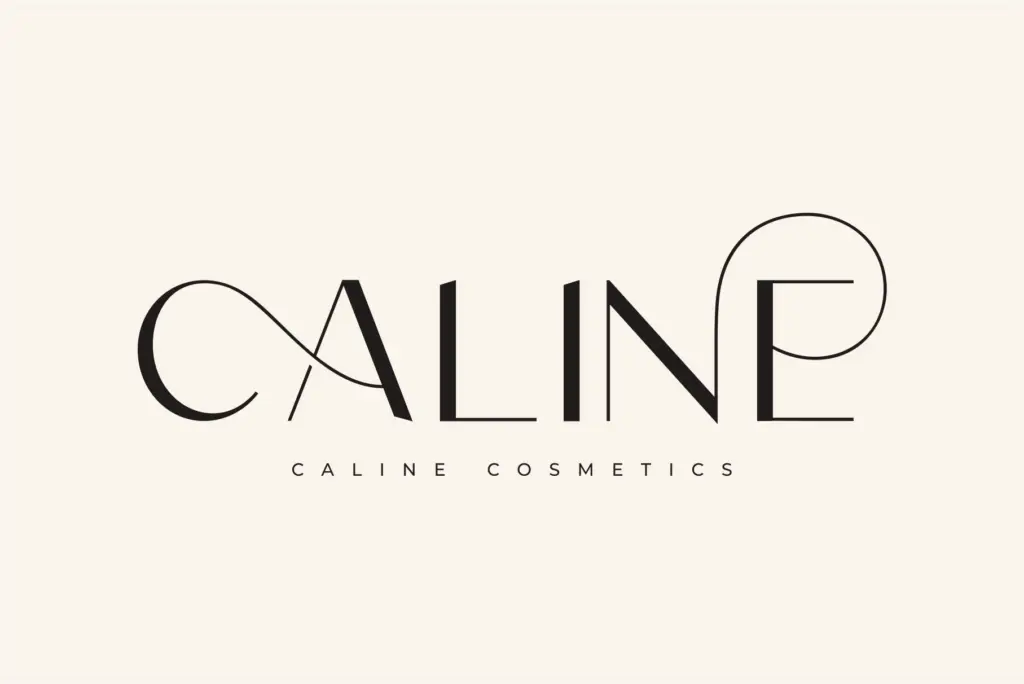
The obvious home for Poina is short-form identity work: a brand name for a cosmetics line, a monogram, a logotype for a boutique or a fashion label, a badge on packaging. In those contexts the ligatures do real work — they give a single word a custom, hand-fitted feel that a generic caps sans can’t match, and that’s genuinely useful for anyone building a wordmark from scratch rather than commissioning custom lettering.
It’s less suited to editorial or long-form use. A magazine masthead, sure — a single word set large works fine. But body text, subheads, or anything requiring lowercase and sentence-level reading is outside what this font is built to do. Social media graphics, business cards, and short packaging copy are all reasonable fits; a full page of text is not. Treat it as a display accent to be paired with a proper text face for anything longer, and it’ll do exactly the job it was drawn for.
What we liked, and what we didn’t
Strengths
- Ligature pairs give short words a custom, hand-fitted feel rather than generic tracked caps.
- Light, upright letterforms suit cosmetics and fashion branding without looking heavy-handed.
- Works well at logo and monogram scale where a single word is the whole composition.
Trade-offs
- No lowercase means it can't handle body copy or mixed-case headlines on its own.
- Some ligature pairs sit tight enough that spacing needs manual checking per word.
Poina is a narrow, well-considered ligature sans that earns its keep on short words — logos, monograms, packaging marks — but its caps-only character set keeps it firmly out of body-text territory. Buy it for a wordmark, not a layout system.

Tmfonts writes independent reviews of typefaces: what each font does well, where it falls short, what it suits, and where it is sold.