
Mekgen Font Free Download
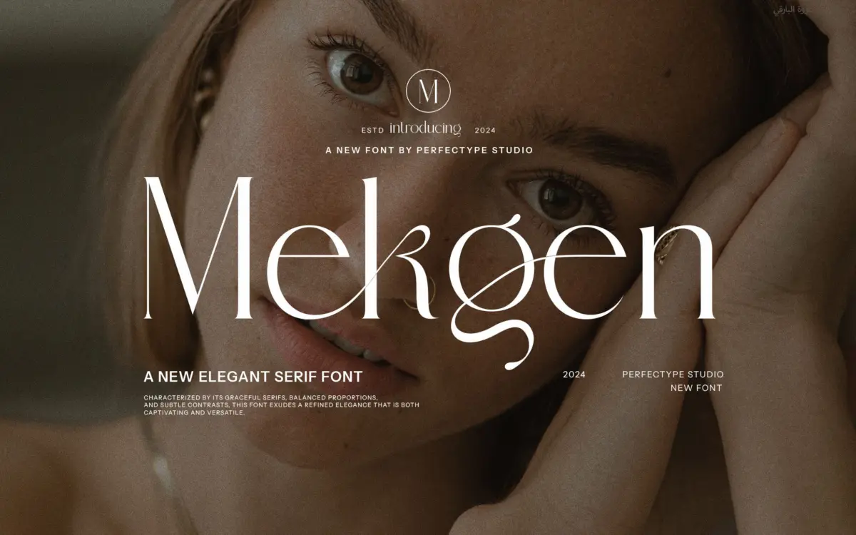
Is Mekgen free to download?
Mekgen is a commercial font sold on Creative Market, so the full version needs a paid license. Get it from the official listing: Mekgen font download.
Need something free? These serif fonts from Google Fonts are free for personal and commercial use:
Design style
Mekgen sits in the decorative serif camp rather than the text-serif one. The letterforms carry the usual markers of a ‘classic’ serif build — bracketed serifs, moderate stroke contrast, a slightly compressed x-height — but the whole thing is drawn with an eye toward flourish rather than restraint. Terminals flare, some strokes swell before tapering off, and the overall rhythm favours character over consistency. It reads as a font built for a single word or short phrase set large, not a font built to disappear into a paragraph.
The contrast is present but not extreme, which keeps it from looking fragile at smaller display sizes. Where it gets interesting is in the connections: several letters are drawn with entry and exit strokes that clearly anticipate ligature use, giving the face a handwritten, almost calligraphic undertone even though the base skeleton is serif, not script. That hybrid quality is really the whole pitch of Mekgen — a serif that wants to behave a little like a script when you let it.
Character set and features
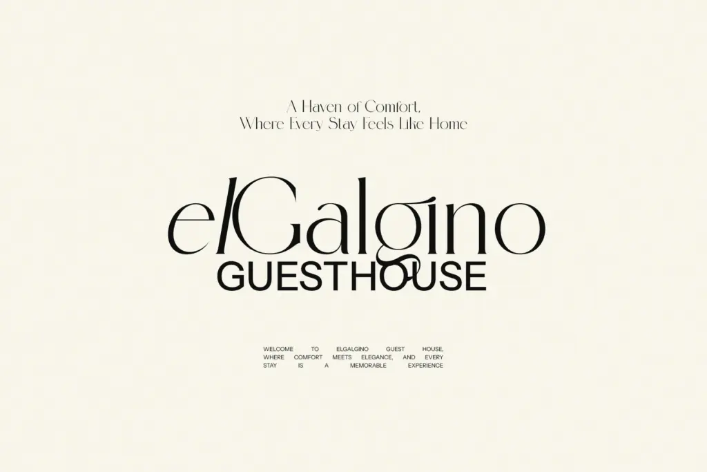
The set includes ligatures and alternate characters, which is the actual working feature here rather than a bullet-point add-on. Swapping in the alternates changes the texture of a word noticeably — a plain setting looks fairly conventional, while the alternate/ligature version pulls in the swashes and joins that give the font its personality. That means the font needs a font-savvy hand to get the good version of itself; left on default settings in a program that doesn’t expose OpenType features, Mekgen loses a good portion of what it’s for.
Spacing is generous enough to keep the swash strokes from colliding in most combinations, though anyone setting long strings of the alternate characters should proof carefully — decorative ligature sets are exactly where kerning collisions tend to hide. There’s no indication here of extended language support beyond basic Latin, so multilingual projects should be tested before commitment.
Use cases
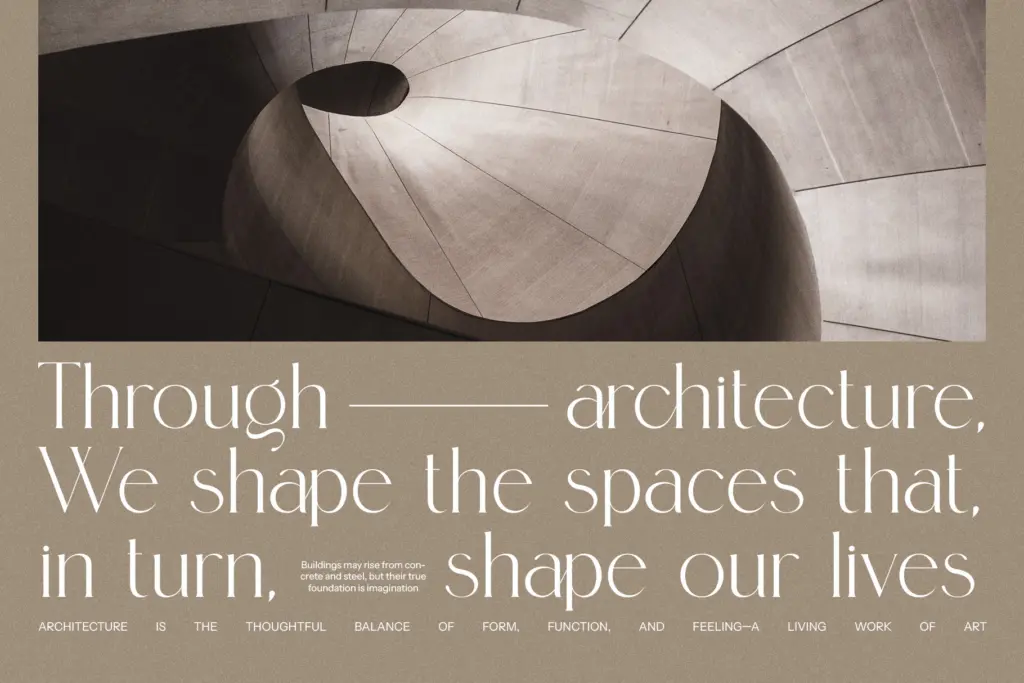
This is a logo and headline font first. It’s well suited to short branding lines, product names, packaging headers, and the kind of single-word treatments that show up on labels or social posts — anywhere the letterforms get to breathe at a large size and the ligatures can do their job uninterrupted. Wedding and stationery work is a reasonable fit too, given the classic-with-a-flourish feel, though it competes with a crowded field of similar serif-script hybrids in that space.
It is not a body-copy font. The stroke contrast and decorative joins that make it interesting at 60pt work against it at 10pt — set in a paragraph, the flourishes just add noise. Pair it with a plain, quiet sans or serif for supporting text and let Mekgen carry the headline. Anyone buying it expecting a flexible workhorse across sizes will be disappointed; anyone buying it for a wordmark or a handful of display words will likely get exactly what they’re after.
What we liked, and what we didn’t
Strengths
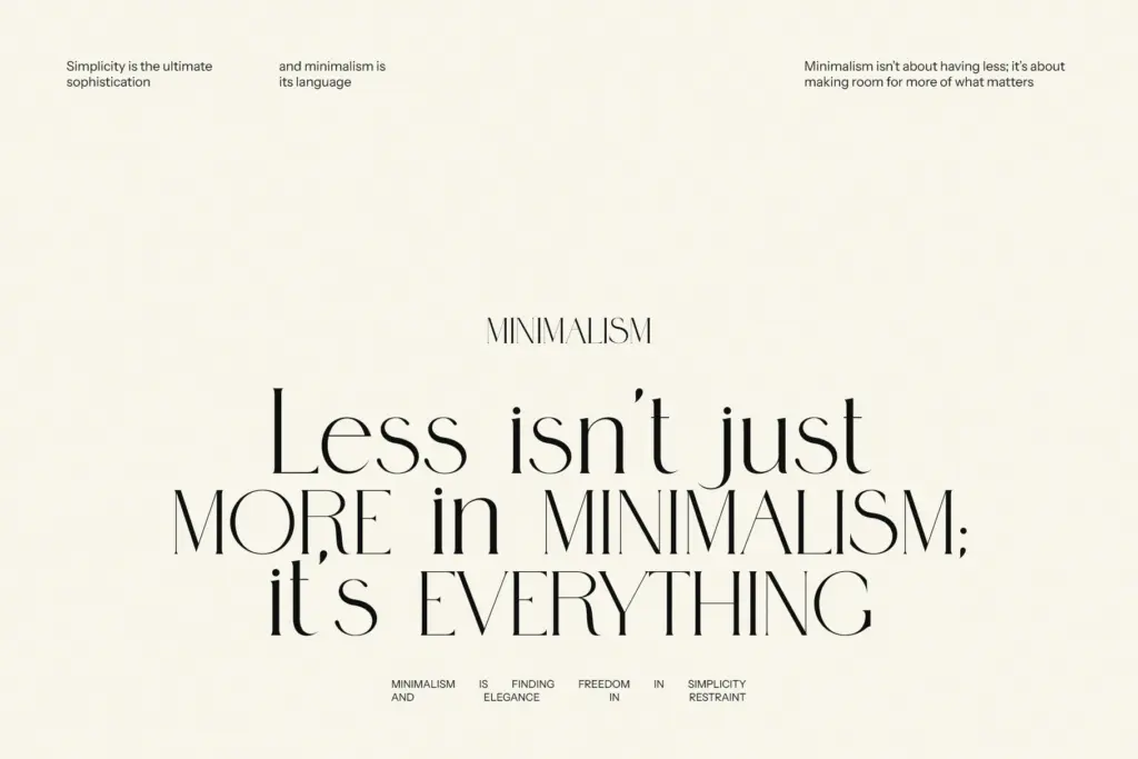
- Ligatures and alternates genuinely change the character of a word, not a cosmetic afterthought
- Stroke contrast is moderate enough to hold up at logo and label sizes
- Handwritten undertone gives it more personality than a typical classic-revival serif
Trade-offs
- Not legible at body-copy sizes — decorative joins and flourishes work against small-scale reading
- Full effect depends on activating OpenType features, which not every design tool exposes easily
Mekgen is a decorative serif whose real value lives in its ligature and alternate set, not its base letterforms. It's a solid pick for logotypes, packaging headers and short display lines, but it has no ambitions as a text face and needs an OpenType-aware workflow to look its best.

Tmfonts writes independent reviews of typefaces: what each font does well, where it falls short, what it suits, and where it is sold.