
ED Celandine Font Free Download
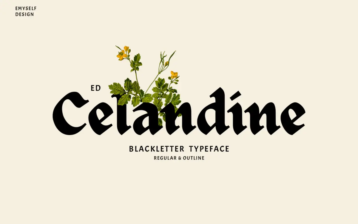
Most people looking for an ED Celandine free download want a gothic wordmark for a T-shirt, a band or a barbershop without the fussy ornament of an old manuscript hand. ED Celandine is a commercial font, though. Emyself Design, the Indonesian foundry behind it, sells it under paid licences and offers no free or demo version.
ED Celandine free download: what the designer actually gives away
Emyself Design does have a Freebie section on its website. When we checked on October 15, 2026 it held four fonts: ED Cairate, ED Clementi, ED Daydream and ED Piedmont. ED Celandine is not one of them, and its product page sells licences only. A copy offered as an ED Celandine free download elsewhere has not come from the designer and does not include a licence.
Official prices we found:
- Emyself Design shop: a range from $12 to $300, depending on which of six licences you choose: Desktop, Webfont, E-pub, App, Server or Extended.
- Creative Market: Desktop $15 per seat, Webfont $15, E-pub $65 and App $120 at our last check, with discounted figures sometimes shown.
Either route gets you both styles, Regular and Outline, with the stylistic set and ligatures. Prices move, so confirm on the listing.
Get ED Celandine — official listing
ED Celandine specimen and verified specs
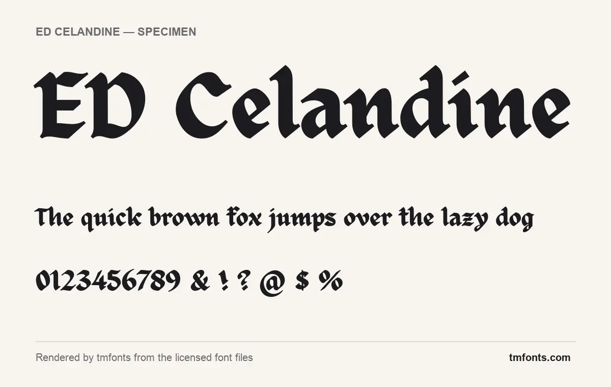
- Styles: 2 (Outline, Regular)
- File formats: OTF
- Glyphs: 364
- Language support: Basic Latin (English), Western European
- OpenType features: standard ligatures, discretionary ligatures, stylistic alternates, kerning, fractions, 1 stylistic set
- PUA-encoded extras: 16 glyphs (usable in Canva and Cricut)
- Designer: Eko Setiawan
Checked by tmfonts from the licensed font files.
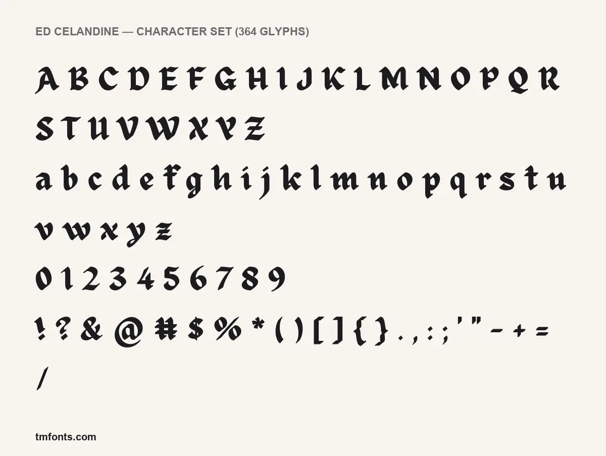
A heavy, pen-made gothic
The designer calls ED Celandine a blackletter “designed in a modern style, minimalist and looks elegant, but doesn’t lose its classic look.” In the specimens rendered from the licensed files, it looks like confident pen lettering: an angled nib makes each stroke go from thick to thin, stroke ends are cut off as sharp points, and the whole alphabet tilts slightly forward, so a line of text seems to move.
Readers who struggle with old gothic type will find this one friendlier. Small letters stand tall next to the capitals, the o is a soft oval, a and d close up with curves instead of broken corners, and the dot over the i is cut as a tiny diamond. On the f and t, the crossbar runs right through the stem. In the specimen line, the T in “The” stretches its bar over the h, the sort of joined pair the font’s ligatures produce.
The capitals are compact and solid. The A has a hooked foot, the Q a short tail, and the E and D in the large title pick up thin hairline flicks on their left edges, a small nod to traditional gothic capitals. Numerals are drawn with the same pen, with a slanted 7 and round 0, and the ampersand, @ and # are all calligraphic rather than borrowed from a plain font.
Our images show the Regular style only. According to Emyself Design, the Outline style has its own ligature designs rather than a hollow copy of the Regular’s.
What you get with a licence
- Styles: Regular and Outline.
- Glyphs: 364 in the Regular.
- Formats: OTF in the files we rendered; the Creative Market listing adds TTF and WOFF.
- Designer: Eko Setiawan, named in the font files. His Gumroad page says he founded Emyself Design in 2018.
- Version: 1.000.
Character support and OpenType extras
The files include Basic Latin and the Western European accented set, so English, French, German, Spanish, Italian, Portuguese and similar languages are covered. The features, explained:
- Standard ligatures: joined letter pairs that switch on automatically in most design software.
- Discretionary ligatures: extra decorative pairs you turn on yourself.
- Stylistic alternates and one stylistic set: different versions of some letters, chosen one by one or applied as a set.
- Kerning: built-in spacing fixes for awkward pairs.
- Fractions: builds proper fractions from typed numbers like 1/4.
Illustrator and InDesign show all of these in the OpenType panel; Photoshop offers ligatures and stylistic sets in the Character panel and single swaps in the Glyphs panel. Affinity apps have similar controls. Canva and Cricut Design Space have none, but the font maps 16 glyphs to the Private Use Area, a range of code points used for extras. Copy them from Character Map on Windows or the Character Viewer on a Mac, then paste them into your design while the text is set in ED Celandine.
Strong uses and sensible pairings
The designer lists posters, branding, logos, apparel, cards and tattoos. Its weight and even texture make it a good fit for a one- or two-word mark printed on fabric or a label: a streetwear brand, a craft beer, a barber shop, a metal band. Use the Outline style when a layered print needs a lighter second colour. Keep it to headlines; even a readable blackletter slows people down in full sentences.
- Barlow Condensed in capitals for taglines, sizes and prices on apparel and labels.
- IBM Plex Sans for website copy and product descriptions in a modern brand.
- Crimson Pro for menus or heritage labels where you want a classic serif under the gothic headline.
Which licence covers your project
There is no free personal-use tier, so every project needs a paid licence. Creative Market’s per-seat Desktop licence covers work you create on your computer, including logos, printed goods, merchandise and images for the web and social media. Embedding the font in a website, e-book or app needs the Webfont, E-pub or App licence. Emyself Design’s own shop also sells Server and Extended licences for uses outside the standard tiers. Read the licence in your download for the exact terms; this overview is not legal advice.
Install it in under a minute
Windows: unzip the download, select the Regular and Outline OTF files, right-click and pick Install. Mac: unzip, double-click each file and press Install Font in Font Book. Close and reopen your design apps so the new fonts appear.
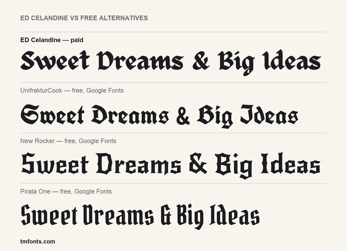
UnifrakturCook, New Rocker and Pirata One side by side
The comparison image sets one phrase in ED Celandine and in three free Google Fonts under the SIL Open Font License. If an ED Celandine free download was the goal because of cost, here is how they differ:
- UnifrakturCook: a traditional Fraktur with ornate capitals, such as an S that most readers won’t recognise at first glance. Darker and more historical, and harder to read in title case.
- New Rocker: pointed, angular and rock-poster flavoured, with crisper cuts than Celandine’s softer pen curves. The closest in weight.
- Pirata One: narrow and condensed, so it fits long names into tight spaces. Its ampersand looks like a G, and the overall feel is lighter and more casual.
ED Celandine, briefly answered
Is any part of ED Celandine free?
No. The designer’s free fonts are other families; ED Celandine needs a paid licence, starting at $15 on Creative Market at our last check.
What is the difference between Regular and Outline?
Regular is solid; Outline renders each letter as a line around its shape and, according to the designer, has its own ligature designs.
Can I set a whole paragraph in it?
You can, but it isn’t made for that. Use it for headlines and wordmarks and set body text in a plain font.
Do the ligatures turn on automatically?
Standard ligatures do in most design apps. Discretionary ligatures and the stylistic set need to be switched on.
Who is behind Emyself Design?
Eko Setiawan, a type and graphic designer based in Indonesia.

Tmfonts writes independent reviews of typefaces: what each font does well, where it falls short, what it suits, and where it is sold.