
Bromos Font Free Download
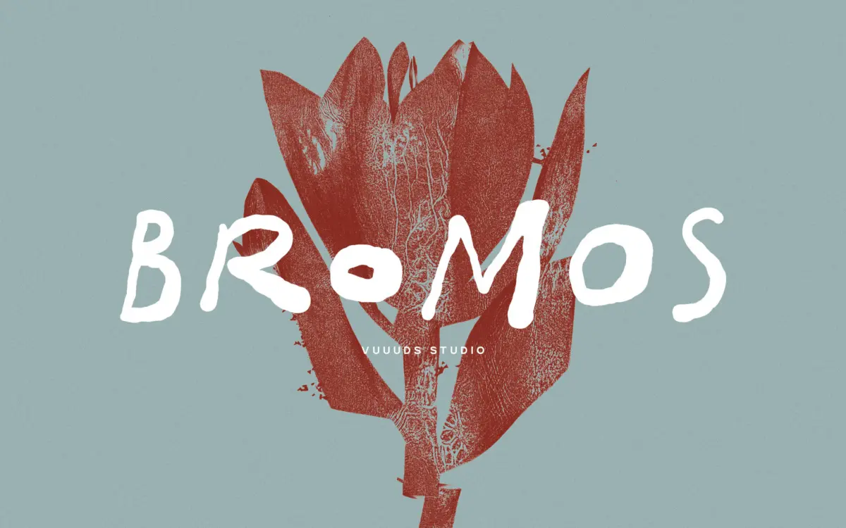
Is Bromos free to download?
Bromos is a commercial font sold on Creative Market, so the full version needs a paid license. Get it from the official listing: Bromos font download.
Need something free? These handwritten fonts from Google Fonts are free for personal and commercial use:
Design style
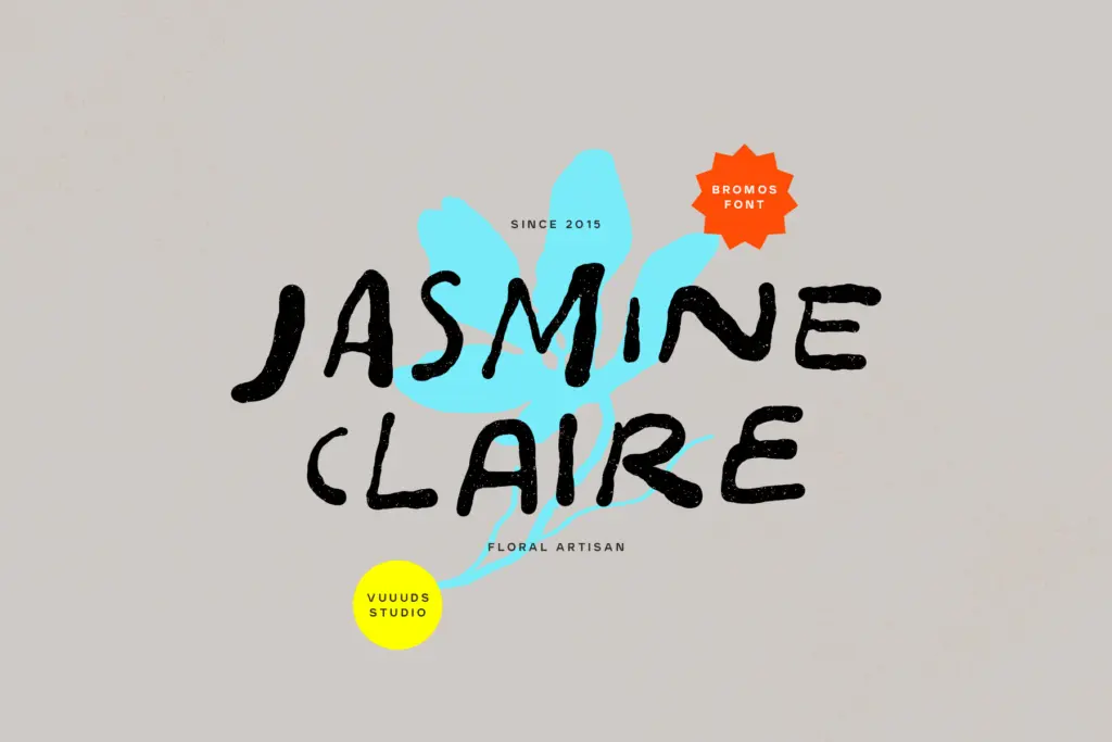
Bromos sits in the brush-grunge corner of the handwritten category — thick, dry-brush strokes with ragged edges rather than a clean, controlled script. The letters look like they were written fast with a worn marker, then left slightly rough on purpose. Stroke weight varies noticeably within single letters, and the baseline wanders a bit, which is consistent with the genre but worth knowing going in: this is not a font built for calm, even setting.
The joins between letters lean loose and improvised. Some connections read as continuous brush drags, others as separate letters sitting close together. That inconsistency is part of the appeal if you want something that feels unpolished, but it also means the font asks to be used at a size and in a context where that roughness reads as intentional texture, not as a rendering problem.
Character set and features
Bromos includes alternate glyphs, accessed manually through Font Book or Character Map rather than through automatic OpenType substitution — worth flagging for anyone expecting a contextual alternates feature to do the swapping for them. The alternates give you a way to vary repeated letters across a headline or logotype, which matters with a brush style like this where identical repeated letterforms can look mechanical and undercut the handmade effect.
Language support extends to accented Latin characters — À, Ä, Æ, Ø, Ñ and their lowercase equivalents are included, so the font covers a reasonable spread of Western European diacritics beyond basic English. There’s no mention of small caps, ligature sets, or numeral alternates, so treat this as a display script with core coverage rather than a feature-dense OpenType build. The package delivers OTF and WOFF, covering desktop layout and basic web use.
Use cases
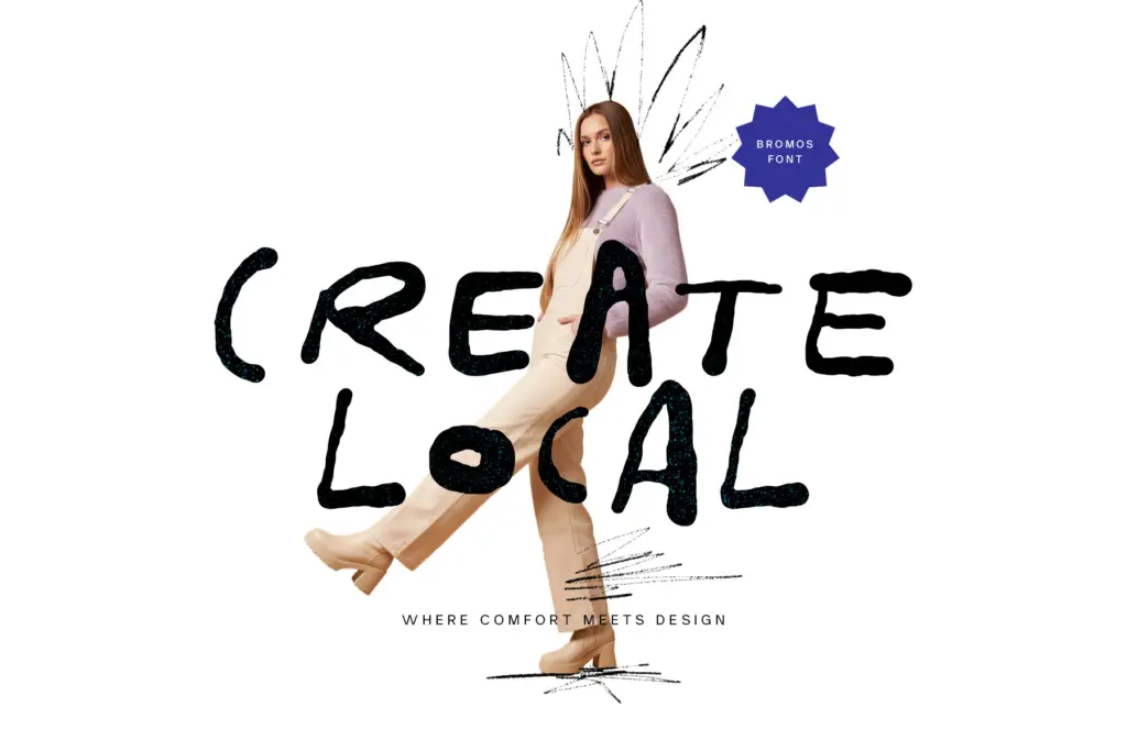
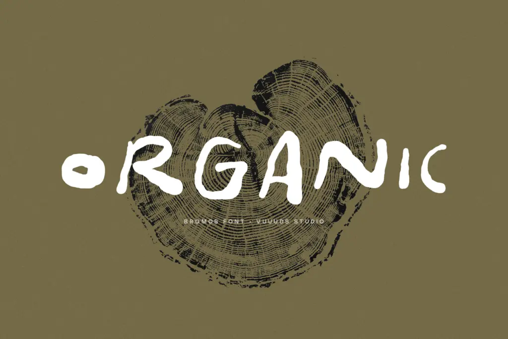
Bromos works best short — a wordmark, a single line on a poster, a stamp-like logo treatment, packaging that wants a handmade or artisanal signal. Streetwear labels, coffee and craft-food branding, gig posters, and anything leaning into a lo-fi or DIY aesthetic will get the most out of it. The grunge texture and irregular strokes photograph and print well at large sizes, where the roughness reads as character rather than noise.
It is not a font for body copy or anything that needs to be read quickly and repeatedly — the irregular baseline and variable stroke weight will fight against sustained reading. It also isn’t the right choice for a brand aiming for polish or restraint; the grunge treatment carries a strong, specific mood that won’t recede into the background. Used as a lockup on a plain sans-serif base, though, it can carry a logotype or headline on its own without needing much else around it.
What we liked, and what we didn’t
Strengths
- Convincing dry-brush texture that reads as handmade rather than digital
- Alternate glyphs help break up repeated letters in a wordmark
- Reasonable accented Latin coverage for Western European languages
Trade-offs
- Alternates require manual glyph access rather than automatic OpenType substitution
- Irregular baseline and stroke weight make it unsuitable for anything beyond short-form text
Bromos is a solidly drawn brush-grunge script with genuine handmade texture, best kept to short lockups and headlines. The manual-only alternates and limited feature set hold it back from being a fully modern OpenType build, but for craft and streetwear branding it does the job it's designed for.

Tmfonts writes independent reviews of typefaces: what each font does well, where it falls short, what it suits, and where it is sold.