
En Clair Font Free Download
Is En Clair free to download?
En Clair is a commercial font sold on Creative Market, so the full version needs a paid license. Get it from the official listing: En Clair font download.
Need something free? These script fonts from Google Fonts are free for personal and commercial use:
Design style
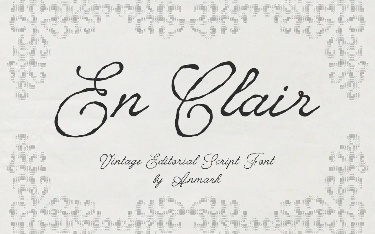
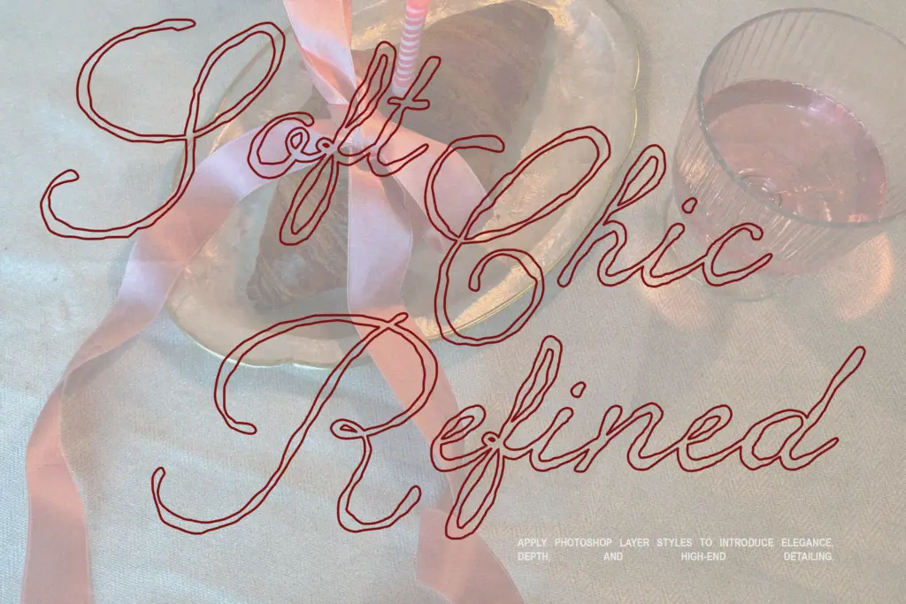
En Clair sits in the well-populated field of vintage calligraphy scripts, but its selling point is texture rather than pure form. The strokes carry a deliberate roughness — edges that break slightly, ink that seems to thin and pool the way a real pen would behave on absorbent paper. This isn’t a smooth, machine-perfect script with uniform contrast; it reads more like a fast, confident hand that hasn’t been cleaned up in a vector program afterward.
The letterforms lean into a classic cursive structure: connected strokes, moderate slant, looping ascenders and descenders that give the baseline some movement. Where it distinguishes itself from cleaner calligraphy scripts is in that surface irregularity — the roughness reads as handmade rather than digitally rendered, which is the whole appeal if you’re after something that doesn’t look like every other wedding script on a stationery table.
Character set and features
As a script built for stationery and branding work, En Clair needs to handle names, dates and short phrases gracefully, and the connecting logic between letters does the heavy lifting here. Multilingual support is mentioned in the brief, which matters if you’re setting names with accented characters — a common failure point in scripts that were only ever tested against English.
The rough texture is baked into the letterforms themselves rather than applied as a separate effect, which means consistency depends on how many alternate glyphs or ligature substitutions are available to break up repeated letter shapes. A script this textured lives or dies on whether repeated letters — a double ‘l’, a run of ‘e’s — look varied enough to avoid a stamped, repetitive rhythm. Without seeing extensive alternates confirmed, treat this as something to test with your actual copy before committing to a large print run.
Use cases
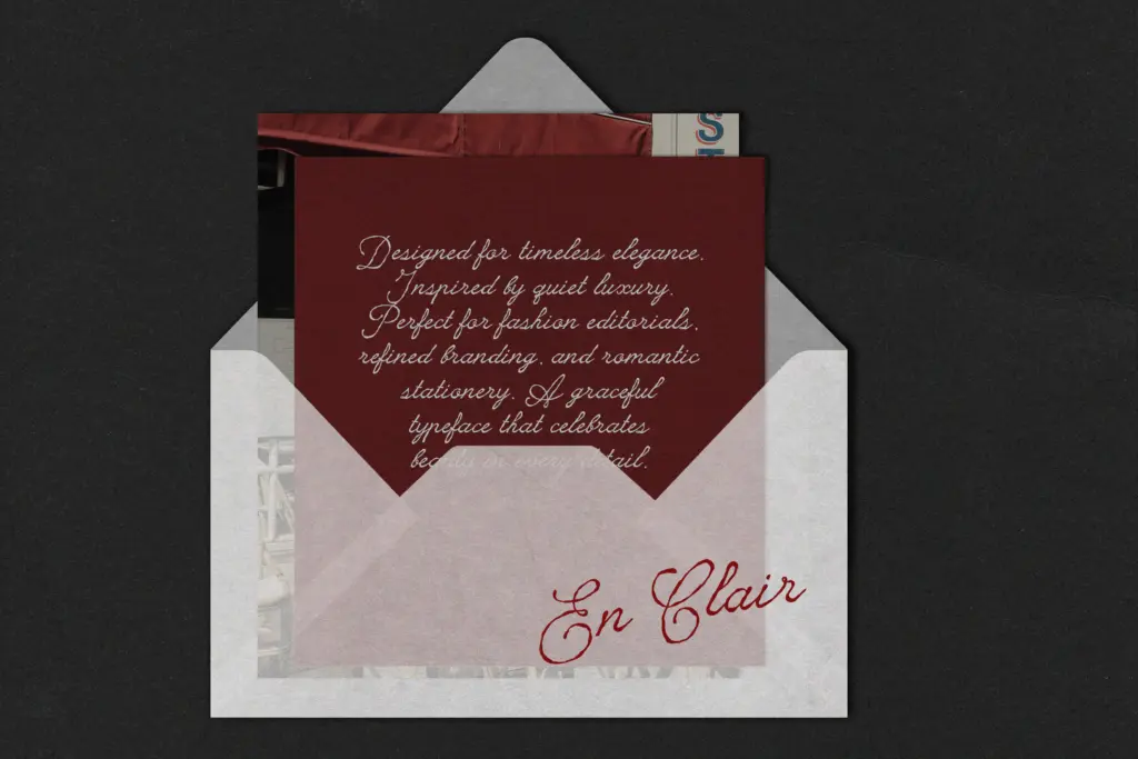
Wedding stationery is the obvious home for this — invitations, save-the-dates, vow booklets, monograms — anywhere a romantic, slightly imperfect script signals handmade care rather than corporate polish. The texture also suits editorial work: a pull quote in a lifestyle magazine, a book cover title, a fashion brand’s logotype where a bit of grit reads as authenticity rather than sloppiness.
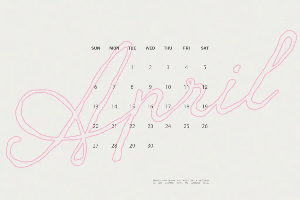
Where it will struggle is at small sizes and in dense settings. Rough-edged scripts lose their texture and start to look muddy once you’re below display size, and body copy is never the job here — nobody should be setting paragraphs in this. It’s a headline, a name, a monogram, a single line of type meant to be looked at rather than read quickly. Pair it with a clean sans or a restrained serif for supporting text, and let En Clair do the one thing it’s built for: a title or a name that needs some warmth and imperfection in the ink.
What we liked, and what we didn’t
Strengths
- The rough ink texture feels genuinely handmade rather than digitally filtered on top
- Well suited to monograms, single names, and short editorial headlines
- Multilingual support means accented names won't need a workaround
Trade-offs
- Loses definition at small sizes, so it's display-only, not for body text
- Repetitive letter combinations may look stamped without enough alternate glyphs
En Clair delivers real handmade texture rather than a polished, generic script look, which makes it a solid pick for wedding stationery and editorial titling. It's not built for small sizes or long text, and its success depends heavily on how well repeated letters vary — worth testing with your actual names and copy first.

Tmfonts writes independent reviews of typefaces: what each font does well, where it falls short, what it suits, and where it is sold.