
Tropi Land Font Free Download
Is Tropi Land free to download?
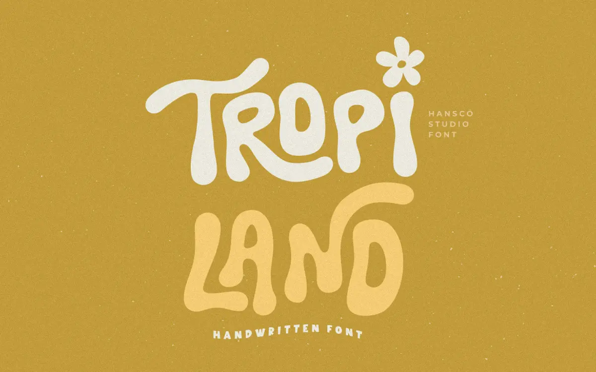
Tropi Land is a commercial font sold on Creative Market, so the full version needs a paid license. Get it from the official listing: Tropi Land font download.
Need something free? These handwritten fonts from Google Fonts are free for personal and commercial use:
Design style
Tropi Land sits in that loose family of handwritten sans faces that trade the pen’s calligraphic swells for a flatter, felt-tip kind of mark. The strokes stay close to a single weight rather than swinging from thick to thin, which is what gives it its sans-serif character even though it reads as handwriting. Letters wobble slightly off baseline, curves overshoot a touch, and the whole thing has an unforced, sketchbook energy rather than the polished swash of a formal script.
The construction is casual by design. Ascenders and descenders lean at slightly different angles from letter to letter, and the x-height sits generously tall, which keeps the lowercase from feeling cramped even with all that movement. It reads as friendly rather than chaotic, though it does not try to hide its handmade origin — you can see the pen lift and re-approach in places, and that is clearly the point.
Character set and features
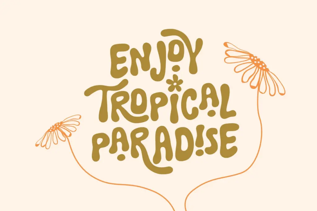
The face comes with a set of ligatures and alternate characters, which matters more here than in most display faces because the whole appeal rests on avoiding mechanical repetition. Common letter pairs get joined forms so words don’t look like they were typed and then wobbled after the fact, and the alternates give you a way to break up repeated letters within a single word or across a short line of text.
Because it is handwriting-derived, the rhythm is uneven by nature — that’s a feature at short lengths and a liability at long ones. Setting a full paragraph in Tropi Land will fight itself; the eye has to work to find the baseline and word shapes start to blur together. It is built for words and short phrases, not for reading blocks of copy.
Use cases
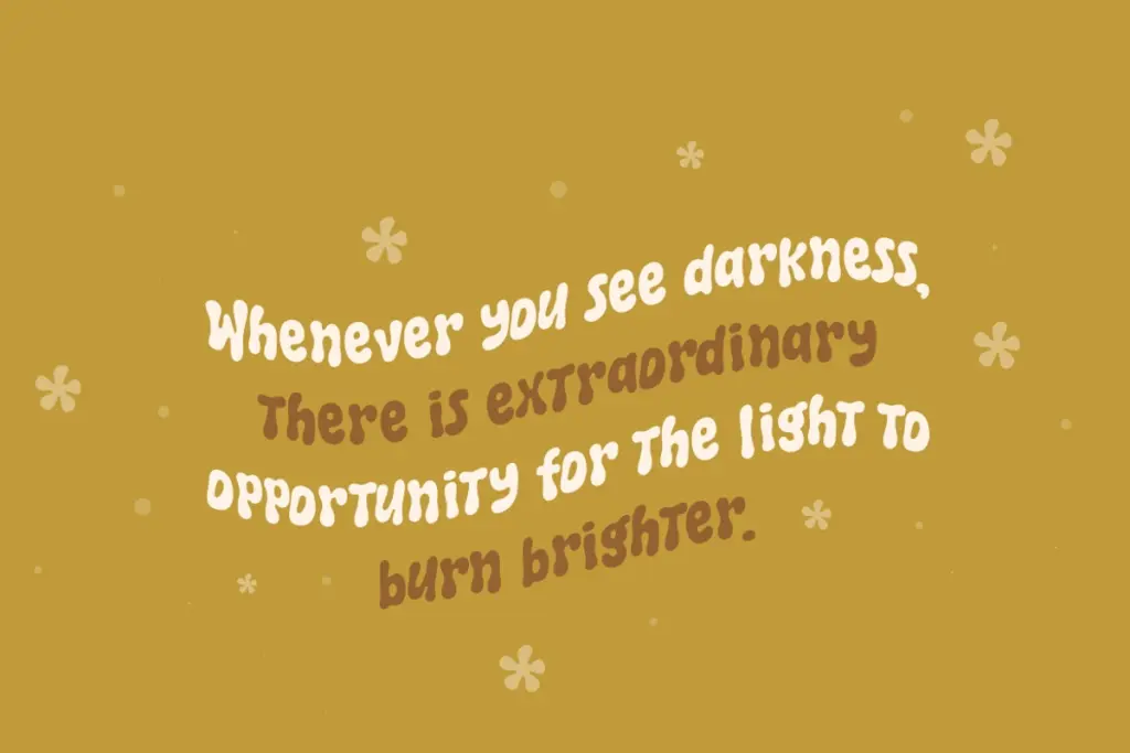
This is a font for a single line doing a specific job: a logotype, a watermark, a tagline under a headline, a short quote card, a name on a wedding invitation. In all of those contexts the irregularity reads as personality rather than noise, because there’s nothing else on the page competing with it for attention.
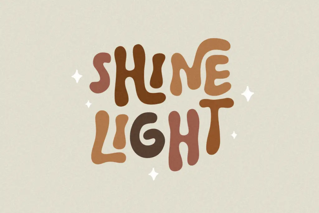
It works well anywhere a brand wants to signal approachability — children’s products, boho or retro-leaning shops, craft and lifestyle brands, anything that wants to look hand-touched rather than corporate. Cricut and Canva users doing single-word cut files or social quote graphics are squarely in its lane; the ligatures and alternates give just enough variation to make repeated letters look intentional in short pieces of text like that.
Pair it with a plain, quiet sans or serif for any supporting text — it needs a calm neighbour, not another decorative face, and it should never be asked to carry body copy on its own.
What we liked, and what we didn’t
Strengths
- Ligatures and alternate letters break up repetition well in short words and phrases
- Consistent stroke weight gives it a sans-serif clarity that pure calligraphic scripts lack
- Generous x-height keeps the casual wobble from turning into illegibility at small sizes
Trade-offs
- Uneven baseline rhythm makes anything longer than a line or two tiring to read
- Needs a plain supporting typeface nearby, as it can't share a page with another decorative face
Tropi Land is a solid, cheerful handwritten sans for short-form work — logos, taglines, quote cards, watermarks. It's not built for reading at length and shouldn't be asked to, but within its lane the ligatures and alternates do real work keeping repeated letters from looking robotic.

Tmfonts writes independent reviews of typefaces: what each font does well, where it falls short, what it suits, and where it is sold.