
Seasalt Font Free Download
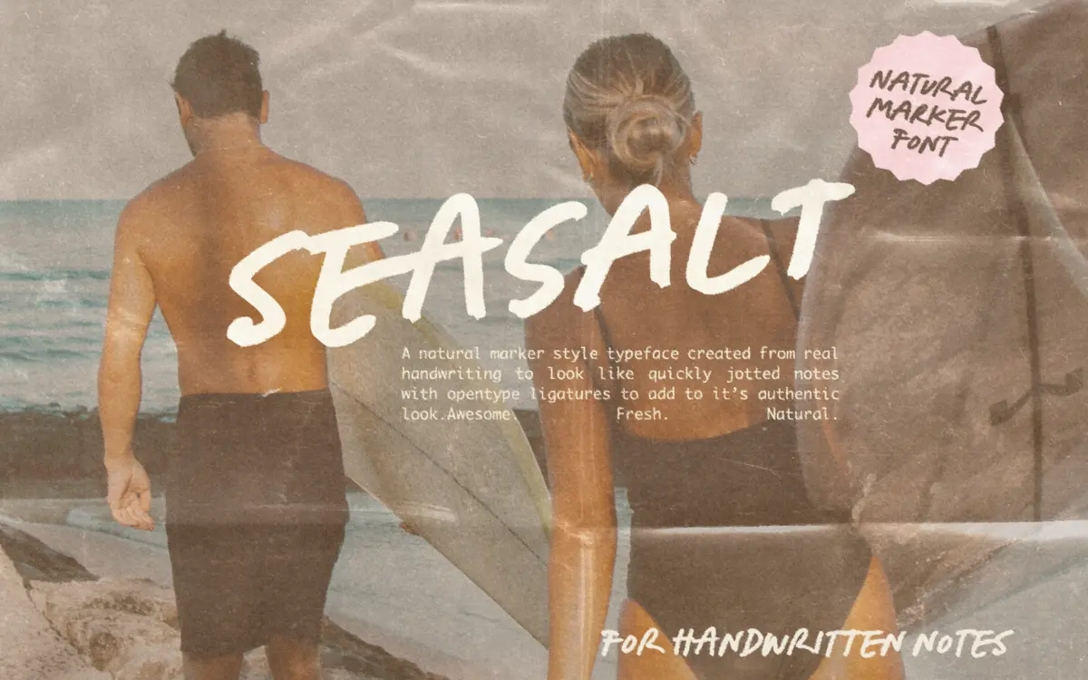
Is Seasalt free to download?
Seasalt is a commercial font sold on Creative Market, so the full version needs a paid license. Get it from the official listing: Seasalt font download.
Need something free? These script fonts from Google Fonts are free for personal and commercial use:
Design style
Seasalt sits in the broad territory of marker-tip scripts: the kind of lettering you’d expect from a felt pen dragged across a notebook rather than a brush or a ballpoint. The strokes are consistent in width with only mild contrast, which keeps it feeling like a tool-drawn mark rather than a calligraphic gesture. Letters lean slightly forward in the base cut and have a loose, unhurried rhythm — baselines drift a touch, x-heights aren’t perfectly regimented, and that’s clearly the point rather than an oversight.
What keeps it from tipping into novelty is restraint in the details. Terminals are blunt rather than flicked, loops are open, and the overall pitch is closer to handwriting you’d actually produce quickly than to an ornamental script built for a single hero word. It reads as friendly and a bit domestic, not glamorous.
Character set and features
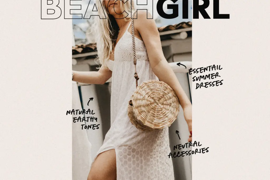
The typeface ships in three variants — Upright, Regular and Slanted — which is the most practical decision in the package. Rather than forcing one slant angle to do every job, you get a genuinely more neutral setting alongside the leaning version, so a whole layout doesn’t have to commit to the same degree of casualness throughout.
OpenType ligatures are built in to smooth over repeated letter combinations and stop the joins from looking mechanical when characters repeat in a word. That’s a sensible move for a script trying to pass as real handwriting rather than a font doing an impression of it — though it’s worth noting these ligatures don’t activate in Canva, so anyone working there gets the base letterforms only, without the extra polish.
A separate doodles set is included: arrows, scribbles, underlines and similar marks meant to sit alongside the type rather than replace it. These are genuinely useful as accents — a circled word, an arrow pointing to a call-out — but they’re an addition to the script, not a feature of the letterforms themselves, and treating them as a bonus rather than a headline is the right way to think about them.
Language coverage extends across a handful of European languages including German, French, Spanish, Portuguese and the Scandinavian set, which is more than a casual script strictly needs but useful if a project spans regions.
Use cases
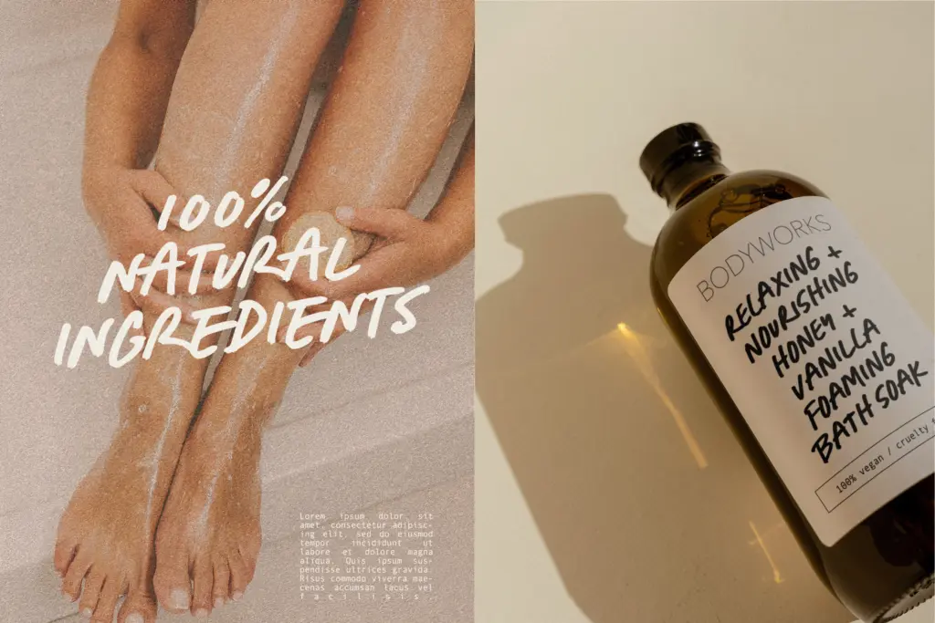
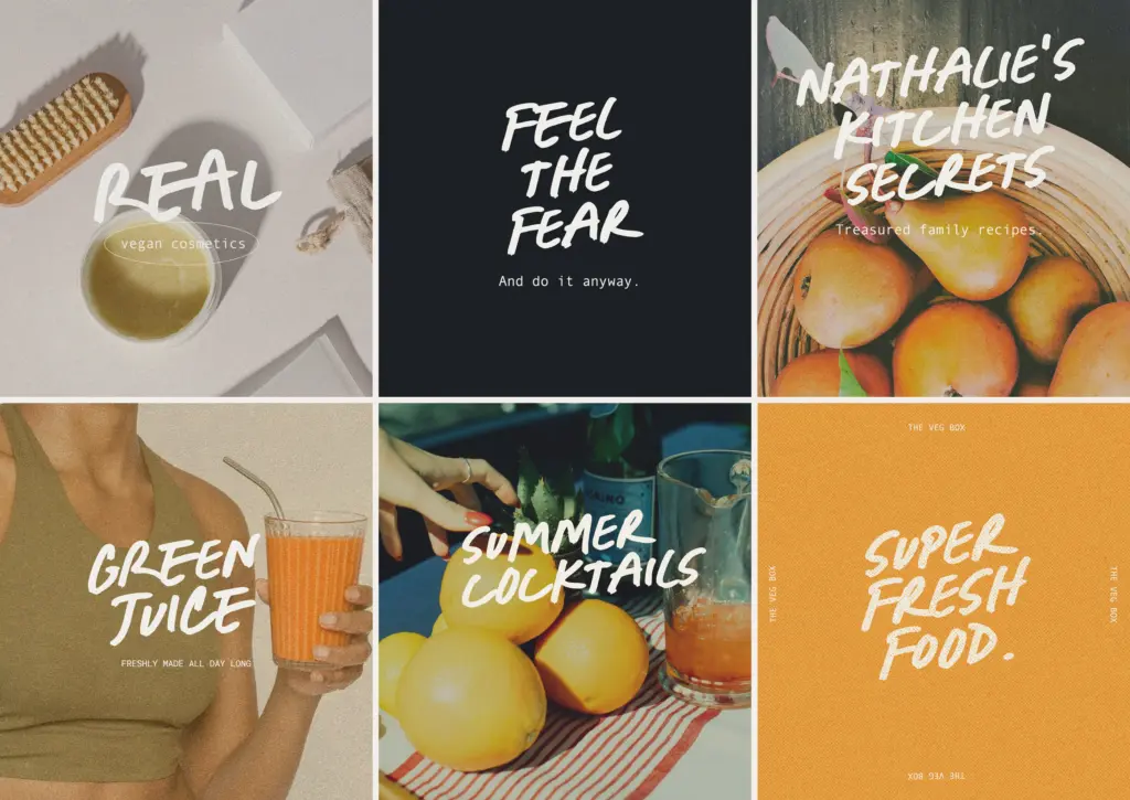
Seasalt is built for the kind of work that wants to look handmade without looking difficult: recipe cards, packaging that leans rustic or homemade, notebook covers, journaling layouts, social graphics that want a friendly, unpolished voice. The three variants give some flexibility — Upright for anything that needs to sit calmer next to body text, Slanted for a more energetic feel, Regular as the middle ground.
It’s not a script built for formal invitations or anything wanting elegance or drama — the looseness that makes it convincing as handwriting also caps its ambition. At small sizes in dense copy it can blur, so it wants generous size or short runs of text: a headline, a label, a scrawled note in the corner of a layout rather than a paragraph.
What we liked, and what we didn’t
Strengths
- Three variants (Upright, Regular, Slanted) give practical flexibility without changing character
- OpenType ligatures smooth repeated letters for a more convincing handwritten feel
- Bundled doodle marks are genuinely handy for call-outs and accents
Trade-offs
- Loose baseline and moderate contrast make it strain at small sizes or in dense text
- Ligatures — one of its better features — don't work for Canva users
Seasalt does one thing convincingly: casual, marker-drawn handwriting without pretension. The three-variant setup and ligatures show real thought, but it's a short-text specialist, not a font for paragraphs, and the doodle extras are a nice-to-have rather than a differentiator.

Tmfonts writes independent reviews of typefaces: what each font does well, where it falls short, what it suits, and where it is sold.