
Organic Hand Font Free Download
Is Organic Hand free to download?
Organic Hand is a commercial font sold on Creative Market, so the full version needs a paid license. Get it from the official listing: Organic Hand font download.
Need something free? These handwritten fonts from Google Fonts are free for personal and commercial use:
Design style
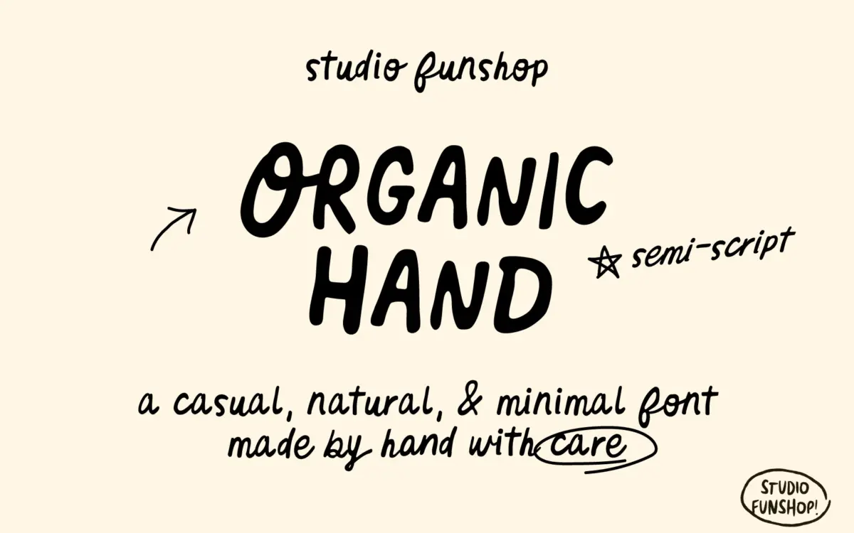
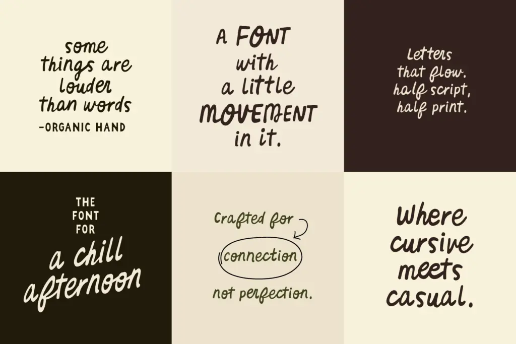
Organic Hand sits in the space between print and script, and it’s honest about that split. Letters keep the upright, separated posture of handprinting rather than a joined cursive, but the strokes carry the loose pressure changes and slight wobble of someone writing at a normal pace, not performing calligraphy. Curves are irregular in a controlled way — you can tell the drawing was done by hand and left alone rather than smoothed into uniformity afterward.
That restraint is the font’s whole argument. It doesn’t reach for flourish or drama. There’s no dramatic swash on the caps, no exaggerated ascender loops. The energy comes from small inconsistencies: a slightly shortened stem here, a curve that doesn’t quite close there. It reads as casual without reading as sloppy, which is a harder balance to hit than it looks.
Character set and features
The set covers uppercase and lowercase A–Z, numerals, symbols and punctuation, which is table stakes but worth confirming since semi-script fonts sometimes ship thin. Alternates are included for natural variation, letting you break up repeated letters within a word so the handwritten illusion holds up over longer stretches of text — a genuine practical feature rather than a marketing bullet, since repeated identical letterforms are usually what gives a
What we liked, and what we didn’t
Strengths
- Alternates and ligatures genuinely reduce the repetition problem common in handwriting fonts
- The semi-script structure keeps individual letters legible even with hand-drawn irregularity
- Casual tone feels understated rather than performative, useful for brands avoiding an overly cute look
Trade-offs
- Limited to Latin basics with no indication of extended language support
- The relaxed, imperfect character makes it a poor fit for dense body copy or anything needing formal polish
Organic Hand does one job well: casual, handmade-feeling branding text that doesn't tip into full script territory. It's not a typeface for long-form reading or formal work, but for the niche it targets — packaging notes, social captions, small brand marks — it's a solid, honestly drawn option.

Tmfonts writes independent reviews of typefaces: what each font does well, where it falls short, what it suits, and where it is sold.