
Gathering Calligraphy Wedding Script Font Free Download
Is Gathering Calligraphy Wedding Script free to download?
Gathering Calligraphy Wedding Script is a commercial font sold on Creative Market, so the full version needs a paid license. Get it from the official listing: Gathering Calligraphy Wedding Script font download.
Need something free? These script fonts from Google Fonts are free for personal and commercial use:
Design style
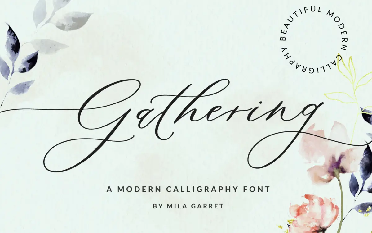
Gathering Calligraphy Wedding Script sits in the crowded field of brush-and-pen-style wedding scripts, and it plays the role well without trying to reinvent it. The letters lean toward a loose, organic pen stroke rather than a stiff, geometric calligraphic model — you can see variation in stroke weight that suggests a flexible nib or brush rather than a ruled hand. Ascenders and descenders swing generously, and lowercase letters connect with a natural slope that avoids the mechanical look you get from scripts built purely on connector logic.
The joins are the real test of a script like this, and here they mostly hold up: entry and exit strokes are angled consistently enough that words read as a continuous line rather than a string of separate glyphs stitched together. Where it loosens up is in the swash capitals, which are drawn with real flourish and asymmetry — good for a couple’s names on an invitation, less good if you need a calm, restrained wordmark.
Character set and features
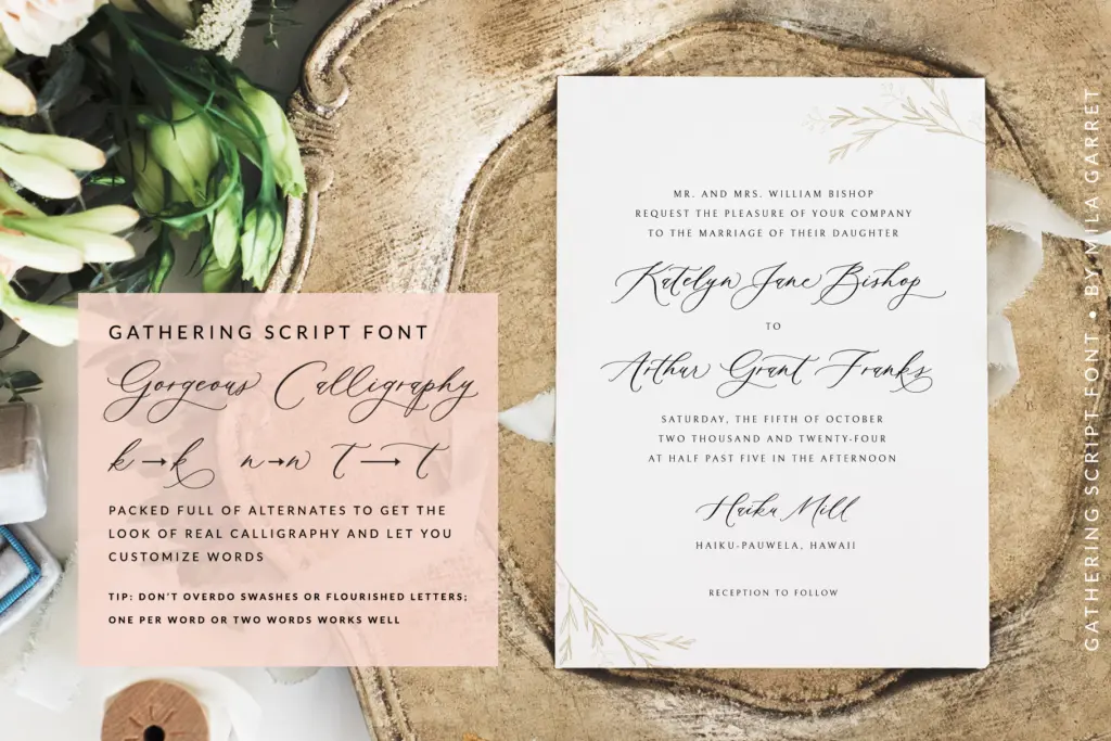
The alternate glyphs are the headline feature, and they do the job the seller promises: swapping in alternates on repeated letters within a word breaks up the sameness that plagues cheaper scripts, where every ‘a’ or ‘t’ looks identical and the rhythm goes flat. Used with discretion, this is what gives the font its handwritten credibility — it’s the difference between a font that looks typed in a script style and one that looks like it was actually written.
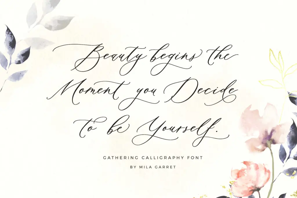
Tails and swashes extend well beyond the baseline and cap height, which means generous line spacing is not optional here — it’s structural. Set this too tight and the flourishes will collide with the line above or below. The letterforms are built for display sizes; there’s no pretense of body-text legibility, and the font doesn’t ask you to use it that way.
Use cases
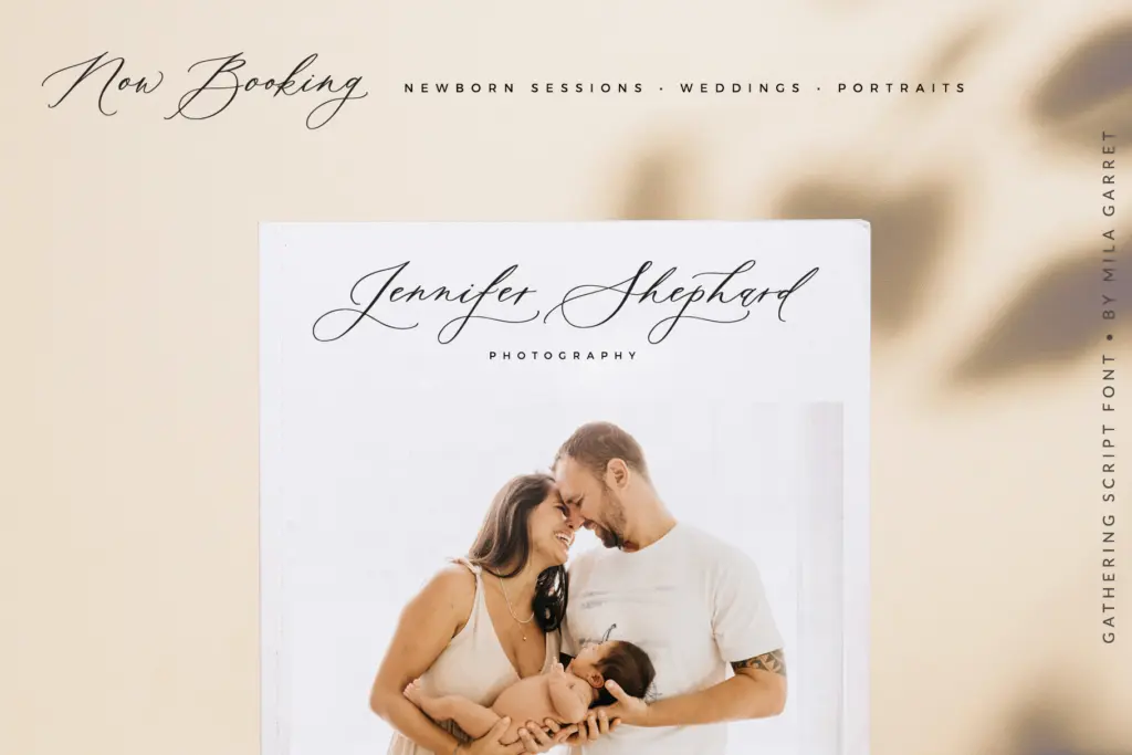
This is a font for the specific job its name describes: wedding stationery, save-the-dates, place cards, and the kind of soft, romantic branding that wants a handwritten signature rather than a polished logotype. It reads well as a large focal element — a couple’s names, a single word on a menu card, a monogram-adjacent lockup — where its irregularities and flourishes are a feature rather than a distraction.
It’s less suited to anything that needs it small or in long strings: a paragraph set in this face will fight the reader, and the swash-heavy capitals can crowd tight layouts if you don’t budget the whitespace they need. Pair it with a plain sans or a quiet serif for supporting text — dates, locations, the practical information a wedding suite still has to carry — and let this script carry only the emotional weight of the piece: the names, the greeting, the occasional pull quote.
What we liked, and what we didn’t
Strengths
- Alternate glyphs genuinely vary repeated letters instead of just padding out the character count
- Joins between lowercase letters read as continuous handwriting rather than stitched-together glyphs
- Swash capitals give couples' names and monograms real presence at large sizes
Trade-offs
- Tails and swashes demand generous line spacing, making tight layouts awkward
- Not legible enough for anything beyond short display-size phrases
Gathering Calligraphy Wedding Script does exactly what its name promises: a warm, organic hand for wedding stationery and soft branding. It needs room to breathe and a plainer companion typeface for supporting text, but within its lane it's convincing.

Tmfonts writes independent reviews of typefaces: what each font does well, where it falls short, what it suits, and where it is sold.