
Black Paint Font Free Download
Is Black Paint Font free to download?
Black Paint Font is a commercial font sold on Creative Market, so the full version needs a paid license. Get it from the official listing: Black Paint font download.
Need something free? These display fonts from Google Fonts are free for personal and commercial use:
Design style
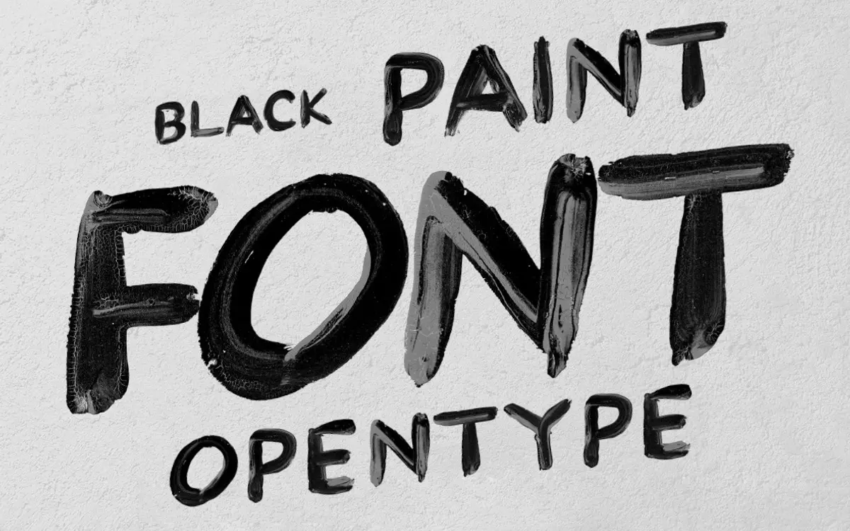
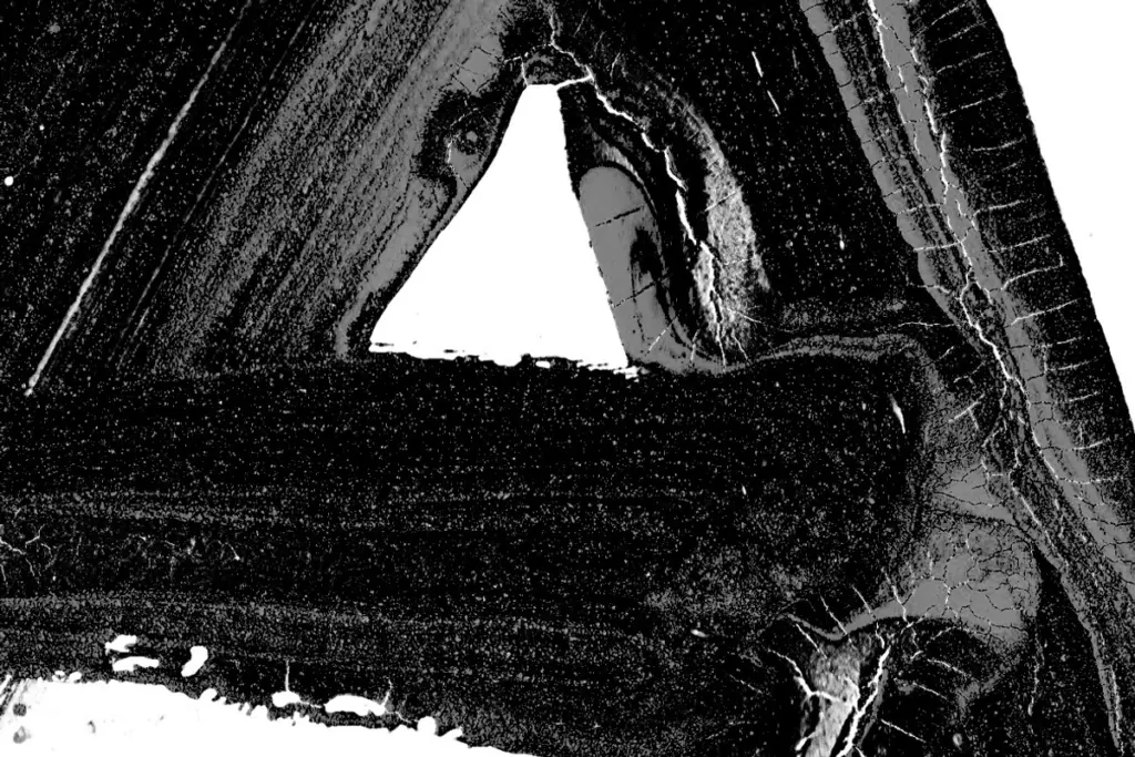
Black Paint Font is built from actual brushed strokes rather than a smoothed-over vector interpretation of one. Each letter looks like it was loaded with heavy black paint and dragged across paper in a single pass, so the strokes taper unevenly, edges fray, and the ink pools slightly at the start and end of certain letters. That roughness is the whole point. Where a lot of “brush” fonts sand down their edges until the texture becomes decorative wallpaper, this one keeps the accidents: a bristle skip on the leg of an R, a blot at the top of a T. It reads as handmade because it was handmade, not simulated.
Weight is heavy and consistent across the set, with almost no contrast between thick and thin strokes. That gives it presence at a glance but also means it doesn’t do the elegant, whippy calligraphic thing some brush scripts chase. This is a blunt instrument, not a fine pen. Letters sit upright rather than slanted, which keeps the set closer to hand-painted signage than to expressive script.
Character set and features
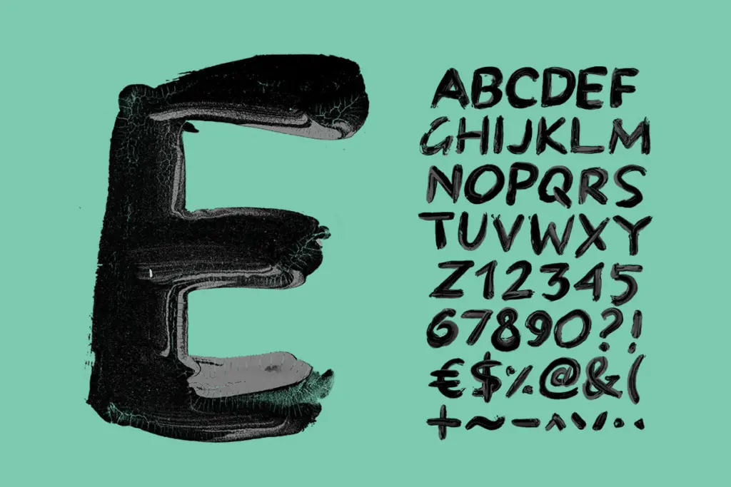
The set is capitals only, plus numerals and a short list of punctuation and symbols (! ? – . ‘ $ € %). There’s no lowercase, so any layout using this font will be set entirely in uppercase — plan your copy accordingly rather than expecting a full-sentence typesetting experience. Two L’s are included, likely to give some variation when the letter repeats, but there’s no broader system of alternates or ligatures.
Technically, this is delivered as a colour OpenType-SVG file, which means it depends on software that supports bitmap/SVG colour glyphs — Photoshop, Illustrator, Procreate and a handful of others. If your workflow doesn’t include one of those apps, the font itself won’t render correctly, which is a real limitation to know about before committing a layout to it. To get around that, every character also ships as a separate 2000×2000px PNG on a transparent background, 52 files in total. That’s the more dependable path for most people: drop individual letters into whatever software you’re already using rather than relying on the OpenType file behaving everywhere.

Use cases
This suits short, punchy uses: a logotype, a poster headline, a single word on a t-shirt or product label, a badge or sticker. The brush texture reads well at large sizes where the ink irregularities are visible and add character; at small sizes those same details muddy together and the letters lose definition, so this isn’t a font for body copy or dense signage. Because it’s all-caps and fairly loud, it also isn’t a subtle choice — it wants to be the dominant element on the page, not a supporting one. Pieces going for a raw, painted, DIY feel — craft branding, band merch, nature or outdoor-themed graphics, packaging that wants to look hand-touched rather than manufactured — are where it earns its keep. Anything needing a polished, restrained, corporate tone should look elsewhere.
What we liked, and what we didn’t
Strengths
- Uneven, hand-loaded brush texture that avoids the smoothed-out look of most digital brush fonts.
- Every character is also supplied as a high-resolution transparent PNG, so it works outside color-font-capable software.
- Strong at large display sizes — posters, logotypes, packaging — where the ink texture reads clearly.
Trade-offs
- No lowercase, and only a short list of punctuation, so it can't handle general text setting.
- The rough, heavy texture loses definition at small sizes and doesn't suit fine calligraphic or elegant use.
Black Paint Font delivers genuine, unpolished brush texture that works well in short bursts at large sizes. It's limited to capitals, punctuation and numerals, and the colour OpenType file only behaves in software that supports SVG glyphs, though the included PNG set covers that gap. Best treated as a logo or headline tool, not a general-purpose typeface.

Tmfonts writes independent reviews of typefaces: what each font does well, where it falls short, what it suits, and where it is sold.