
Bold Money Font Free Download
Is Bold Money free to download?
Bold Money is a commercial font sold on Creative Market, so the full version needs a paid license. Get it from the official listing: Bold Money font download.
Need something free? These sans serif fonts from Google Fonts are free for personal and commercial use:
Design style
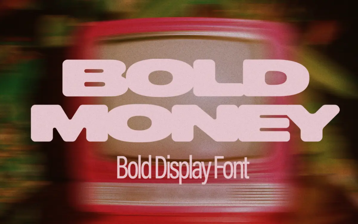
Bold Money is a heavyweight all-caps display face built around a single conceit: the letters look like they’re fusing into each other, as if the type were drawn in a semi-liquid state and left to slump before it set. Strokes are thick and rounded, joins between adjacent letters sag and bridge rather than sit apart, and corners are softened into blobby curves. It reads as part graffiti tag, part slime toy, part sticker-pack lettering — a style that’s been circulating in display type for a while, but this version leans harder into the connectedness than most.
The weight is uniformly heavy throughout, with almost no contrast between thick and thin strokes. That’s consistent with the brief and gives the face its chunky, confident presence, but it also means every letter is fighting for the same visual space. Counters are tight, and where two rounded forms meet — an O next to a C, say — the melted joins can blur the boundary between characters if you’re not careful with spacing.
Character set and features
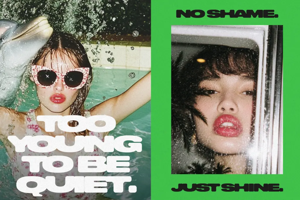
This is an uppercase-only font: there are no lowercase glyphs, so anything you set will render in caps regardless of how you type it. That’s a real constraint, not a style choice you can opt out of, and it rules out body copy or anything needing sentence case for legibility reasons.
The connected letterforms are baked into the design rather than achieved through ligatures, which means the melting effect is fixed per letter pair rather than context-sensitive. The seller is upfront that kerning and tracking may need manual adjustment depending on the word — worth taking seriously, since the default spacing on a font like this rarely suits every combination of letters straight out of the box. Budget time for tightening or opening tracking on a per-project basis rather than expecting it to sit right by default.
Use cases
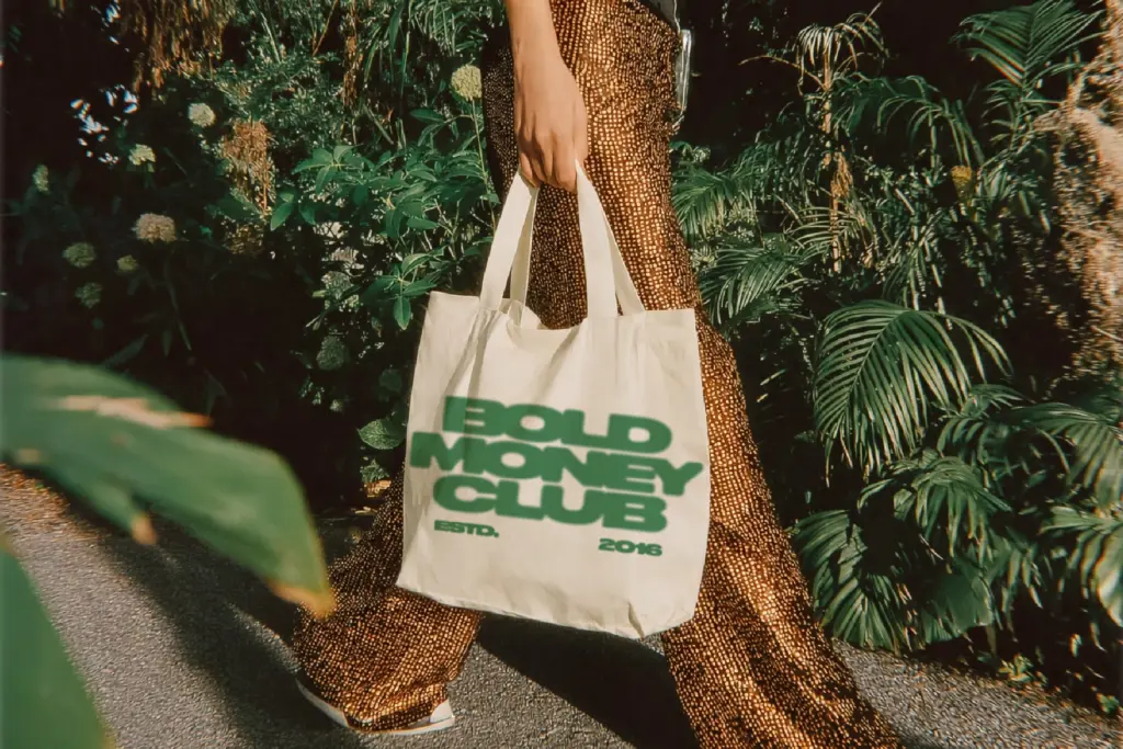
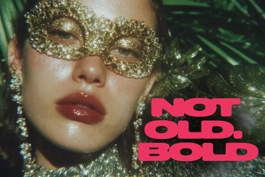
This is a font for short bursts of text, not paragraphs: logotypes, single-word headlines, poster titles, merch graphics, thumbnail text. The melted connection between letters gives it a tactile, almost dimensional quality that works well printed large — on a hoodie, a gig poster, a YouTube thumbnail — where the eye has room to take in the whole word as a shape before parsing individual letters.
It’s less suited to anything that needs quick, unambiguous reading at small sizes: captions, subheads in a layout with other competing type, or any context where a viewer only gets a glance. The connected structure that makes it distinctive at large sizes is the same thing that will slow reading down when it’s shrunk.
Given the uppercase-only limitation, it also won’t function as a full display/text pairing on its own — you’ll need a second typeface for anything requiring lowercase, body copy, or a calmer register alongside it. Think of Bold Money as a single loud voice for a headline or wordmark, not a flexible family to build a whole identity system from.
What we liked, and what we didn’t
Strengths
- The melted, sticky connection between letters gives it a distinctive, tactile presence at large sizes
- Uniform heavy weight reads confidently on posters, merch and thumbnails
- Simple to drop into a single headline or wordmark without much setup
Trade-offs
- Uppercase-only glyph set rules out lowercase text or full sentence composition
- Default spacing needs manual kerning adjustments to avoid letters blurring together
Bold Money commits fully to one loud idea — melted, connected caps — and does it with conviction at large sizes. It's a narrow tool: no lowercase, tight spacing that needs hand-tuning, and limited use below headline scale.

Tmfonts writes independent reviews of typefaces: what each font does well, where it falls short, what it suits, and where it is sold.